07.27.2026
Liquidity Isn’t Free
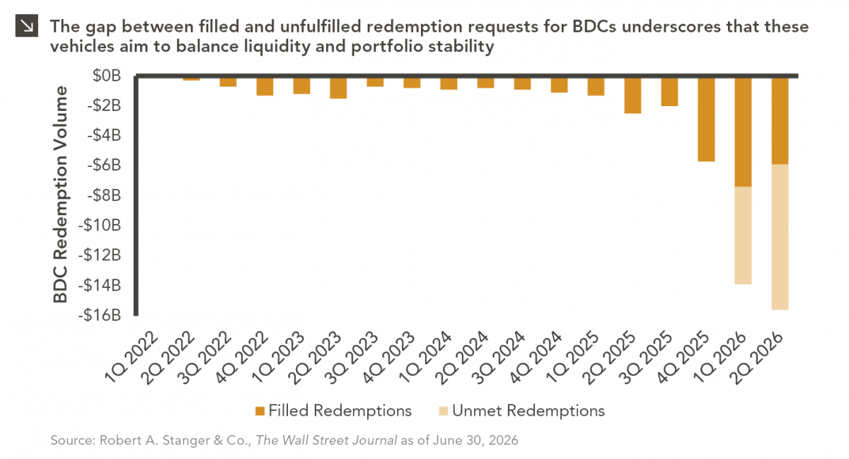
The rapid growth of non-traded business development companies (BDCs), which are investment vehicles that pool investor capital to make loans…

U.S. venture capital deployment in 2021 smashed the previous record set in 2020, as $329.8 billion of funds were infused (+98% from 2020) into over 15,500 deals (+27% from 2020). While this tremendous volume of investment was deployed across the market, late-stage deals in particular raised over $100 million in capital in the last year. In fact, within the U.S. venture capital market, the substantial amount of late-stage venture deployment alone eclipsed the previous overall deployment record by 15%, as $190.8 billion of investments were deployed across 4,704 late-stage deals during 2021.
The growth trajectory of the late-stage venture capital market has been steadily climbing over the past decade as part of a broader evolution of the space, as private market companies have become larger and more durable due to capital availability, increased transparency, and minimal reporting requirements. That being said, the market may have now reached a size at which investors could begin to view early-stage venture capital and late-stage growth equity as distinct asset classes given the different investment considerations associated with each (e.g., duration, risk, returns, etc.) and separate the two within portfolios. Indeed, as late-stage deals become larger in size they become increasingly different investments, as many growth companies that have previously been supported by early-stage venture investors evolve into more established businesses with substantial revenues, proven product-market fits, much shorter duration (five years or fewer), lower loss potential, and valuations that are more aligned with public market peers.
As the venture capital market continues to expand due to new participants and existing investors increasing their allocations to the space, it is worth considering allocation mixes within portfolios with an eye toward having specific and dedicated early- and late-stage venture capital deployment targets.
Print PDF > 2021 Smashes VC Records as Late-Stage Deals Reshape the Market
The opinions expressed herein are those of Marquette Associates, Inc. (“Marquette”), and are subject to change without notice. This material is not financial advice or an offer to purchase or sell any product. Marquette reserves the right to modify its current investment strategies and techniques based on changing market dynamics or client needs.
07.27.2026
The rapid growth of non-traded business development companies (BDCs), which are investment vehicles that pool investor capital to make loans…

07.24.2026
This video is a recording of a live webinar held July 23 by Marquette’s research team analyzing the first half…

07.20.2026
Our most recent Chart of the Week publication discussed how the AI investment opportunity has expanded beyond…

07.13.2026
One of the enduring lessons of the California Gold Rush is that the greatest fortunes were often made not by…

07.06.2026
Since traditional exit routes have remained constrained in recent years due to higher interest rates, valuation gaps, and a subdued…

06.29.2026
This week’s chart highlights the varying return profiles across key infrastructure sectors by illustrating the split between income and capital…
Research alerts keep you updated on our latest research publications. Simply enter your contact information, choose the research alerts you would like to receive and click Subscribe. Alerts will be sent as research is published.
We respect your privacy. We will never share or sell your information.
If you have questions or need further information, please contact us directly and we will respond to your inquiry within 24 hours.
Contact Us >