And the Beat Goes On…

August 20, 2020 | ,

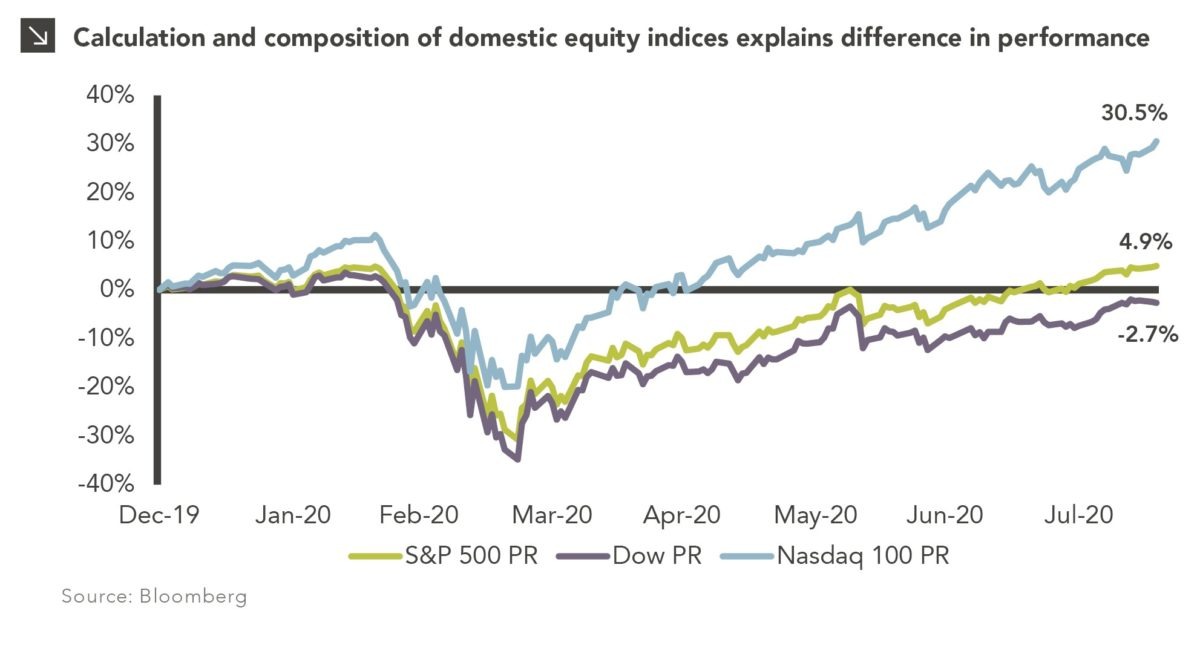
This week, the S&P 500 index closed at 3,389.78, setting its first record high since previously peaking on February 19th, 2020; it is up 4.9% year to date. This post-bear market recovery is officially the fastest ever. For the sake of comparison, it took more than three years for the S&P 500 to reclaim its peak after the Global Financial Crisis. However, the S&P 500 was not the first broad market index to reclaim its high in 2020. The NASDAQ 100 index surpassed its previous peak more than two months ago on June 5th and is up 30.5% year to date. On the other hand, the Dow Jones Industrials Average (DJIA) is still more than 5% off its record high and negative for the year.

How is it that each of these indices is considered to represent the broad domestic equity market, but they have such wide performance differences? The main reason is the calculation and composition of the indices. Let us begin with the Dow, the oldest index out of the three indices. Founded in 1896, the Dow is comprised of 30 stocks that are selected by their size and influence on American business (with the latter clearly being subjective). In addition, the DJIA is a price-weighted index which means that the companies with the highest share price have the highest weighting in the index. For instance, Apple, which trades at $462 a share¹ is the largest constituent in the DJIA with an 11.4% weight. The next largest constituent is UnitedHealth Group, which trades at $316 a share² and has a 7.8% weight in the DJIA. As a result, large price increases or declines in these stocks will have an outsized effect on the returns of the index. Consequently, the price decline in Boeing, a top 10 Dow constituent, due to delays in the Max 8 and lower demand from the COVID-19 pandemic has had a large impact on the Dow’s year-to-date return.

The S&P 500 and NASDAQ 100 indices are market capitalization-weighted indices. This means that the weightings of their constituents are based on the product of the stock price and the outstanding shares. As a result, stocks with high prices and the largest number of shares outstanding will have the greatest impact on the index’s return. In the case of the S&P 500, which tracks the largest 500 companies in America, this means that Apple, Microsoft, Amazon, Google, and Facebook are the largest constituents in the index. As discussed in my previous post, “There’s FAAMG and Everyone Else,” investor enthusiasm has propelled these stocks to new highs even though most of the companies in the S&P 500 are still negative for the year.

Technology companies have been the biggest beneficiaries of the COVID-19 pandemic and the NASDAQ 100, a proxy for the Technology sector, is more concentrated than the S&P 500 and more tech-centric than the DJIA. The NASDAQ 100, which was created in 1985, tracks the largest non-financial companies listed on the NASDAQ exchange. The FAAMG stocks are still the largest constituents in the NASDAQ 100, but Technology makes up over 55% of the NASDAQ 100 relative to 27.5% for the S&P 500 and 26.9% for the DJIA. It is also important to note that the Dow does not include Amazon, Google, or Facebook.

Over the short term, index calculation methods and composition differences can cause wide performance divergences. However, these divergences come and go based on the performance of the underlying sectors and companies. This year’s divergence has been exacerbated by the COVID-19 pandemic and the outperformance of Technology. As other non-Technology sectors rise in economic importance, we would expect the S&P 500 and DJIA to post more attractive relative returns.

Print PDF > And the Beat Goes On…

¹ Apple’s closing price as of August 18, 2020. Apple has also announced a 4-for-1 split effective August 31, 2020, which will reduce its price to ~$115 a share. Thus, Apple’s weight in the DJIA will decline accordingly.
² UnitedHealth Group’s closing price as of August 18, 2020.


The opinions expressed herein are those of Marquette Associates, Inc. (“Marquette”), and are subject to change without notice. This material is not financial advice or an offer to purchase or sell any product. Marquette reserves the right to modify its current investment strategies and techniques based on changing market dynamics or client needs.

Related Content

This chart description is for illustrative purposes only and its accuracy cannot be guaranteed. Please see full disclosures at end of PDF document in the web post. General description: Table describing categories and criteria of MSCI indices. Chart subtitle: Despite its rapid ascendancy in recent decades, China is categorized as an emerging country by MSCI due to the market classification framework utilized by the index provider. Chart source: Source: MSCI as of June 30, 2023. ATVR: Annualized Traded Value Ratio, which is a liquidity measure used to assess liquidity of securities in the MSCI Global Investable Market Indices. The ATVR corresponds to the Annualized Traded Value of a security relative to its Free Float‐Adjusted Market Capitalization. Chart description: First column is Criteria, second is Frontier, third is Emerging, and fourth is Developed. First row section is Economic Development, detailed with “Sustainability of economic development.” Frontier: No requirement. Emerging: No requirement. Developed: Country GNI per capita 25% above the World Bank high income threshold for 3 consecutive years. Second section is Size and Liability Requirements, with four sub-rows. First: Number of companies meeting the following Standard Index criteria: Frontier: 2 Emerging: 3. Developed: 5. Second: Company size (full market cap, USD): Frontier: $1,033M. Emerging: $2,066M. Developed: $4,133M. Third: Security size (float market cap, USD): Frontier: $73M. Emerging: $1,033M. Developed: $2,066M. Fourth: Security liquidity: Frontier: 2.5% ATVR. Emerging: 15% ATVR. Developed: 20% ATVR. Third section is Market Accessibility, with five sub-rows. First: Openness to foreign ownership: Frontier: At least some. Emerging: Significant. Developed: Very high. Second: Ease of capital inflows / outflows: Frontier: At least partial. Emerging: Significant. Developed: Very high. Third: Efficiency of operational framework: Frontier: Modest. Emerging: Good and tested. Developed: Very high. Fourth: Availability of investment instruments: Frontier: High. Emerging: High. Developed: Unrestricted. Fifth: Stability of the institutional framework: Frontier: Modest. Emerging: Modest. Developed: Very high. End chart description. See disclosures at end of document.

12.04.2023

Is China Guilty of Category Fraud?

With movie awards season around the corner, some entertainment pundits may use the term “category fraud” to describe races in…

This chart description is for illustrative purposes only and its accuracy cannot be guaranteed. Please see full disclosures at end of PDF document in the web post. General description: Combination column and line chart comparing recent holiday spending by U.S. consumers. Chart subtitle: Spending is on track to reach record levels this holiday season, despite mounting economic pressures faced by American consumers. Chart source: Adobe Analytics and CNN Business as of October 31, 2023. Chart description: Left Y-axis is labeled “Spending” and ranges from $0B to $250B. Right Y-axis is labeled “YoY Growth” and ranges from 0% to 50%. X-axis labels each column: 2019, 2020, 2021, 2022, and 2023 (Projected). Holiday Spending by U.S. Consumers is plotted in dark teal columns. Holiday Spending Growth is plotted with light purple line and markers. 2019 saw $143B in spending and 13.1% YoY growth; 2020 $188B, 32.1%; 2021 $205B, 8.7%; 2022 $212B, 3.5%, and 2023 is projected at $222B and 4.8%. End chart description. See disclosures at end of document.

11.30.2023

‘Tis the Season to Spend!

The holiday spending frenzy is well underway as some of the biggest shopping days of the year, including Black Friday…

11.16.2023

The Taming of the VIX

October proved tumultuous for investors as all major U.S. equity indices were negative and the CBOE VIX Index, which serves…

This chart description is for illustrative purposes only and its accuracy cannot be guaranteed. Please see full disclosures at end of PDF document in the web post. General description: Combination stacked column and line chart comparing unrealized gains/losses with effective federal funds rate. Chart subtitle: Unrealized losses across depository institutions have increased in recent quarters thanks to higher interest rates. Chart source: Federal Deposit Insurance Corporation and Federal Reserve Bank of St. Louis as of June 30, 2023. Chart description: Left Y-axis is labeled “Unrealized Gains/Losses” and ranges from -$800B to +$800B, corresponding to stacked columns. Right Y-axis is labeled “Rate” and ranges from -6% to +6%, corresponding to line. X-axis ranges from 1Q08 to 2Q23; labels are at 3-quarter increments to fit so last label is for 1Q23. Available-For-Sale Securities are plotted in dark green base of stacked columns; Held-To-Maturity Securities are plotted in lighter green as second half of column. Effect Federal Funds Rate line is plotted in light blue. Unrealized losses are at significant levels for chart losses; since the fed funds rate has increased since 1Q22, losses have totaled over $300B. Most recent datapoints, as of 2Q23 are as follows: Available-For-Sale Securities at -$248.9B, Held-To-Maturity Securities at -$309.6B, and Effective Federal Funds Rate at 5.3%. Please contact us for the full dataset. End chart description. See disclosures at end of document.

11.08.2023

Realizing the Impact of Unrealized Losses

Earlier this year, the regional banking crisis and eventual collapses of Silicon Valley Bank, Signature Bank, First Republic Bank, and…

This chart description is for illustrative purposes only and its accuracy cannot be guaranteed. Please see full disclosures at end of PDF document in the web post. General description: Three-line chart showing cumulative return for various U.S. equity indices. Chart subtitle: Domestic stock indices enter correction territory after recent slide. Chart source: Bloomberg as of October 31, 2023. Chart description: Y-axis is labeled “Cumulative Return” and ranges from -15% to +10%. X-axis is labeled in monthly increments, from Jun-23 to Oct-23. Data ranges 6/30/23 through 10/31/23. S&P 500 Index is plotted in orange line, Nasdaq-100 Index in light tan line, and Russell 2000 Index in dark purple line. Most recent data points, respectively, -5.31%, -4.84%, -11.61%. Please contact us for the full dataset. End chart description. See disclosures at end of document.

11.01.2023

The Chart for Red October

U.S. equities declined for the third consecutive month in October amid an environment of higher yields and underwhelming earnings reports…

10.13.2023

3Q 2023 Market Insights Video

This video is a recording of a live webinar held on October 26 by Marquette’s research team, featuring in-depth analysis…

More articles

Subscribe to Research Email Alerts

Research Email Alert Subscription

Research alerts keep you updated on our latest research publications. Simply enter your contact information, choose the research alerts you would like to receive and click Subscribe. Alerts will be sent as research is published.

We respect your privacy. We will never share or sell your information.

Thank You

We appreciate your interest in Marquette Associates.

If you have questions or need further information, please contact us directly and we will respond to your inquiry within 24 hours.

Contact Us >