05.04.2026
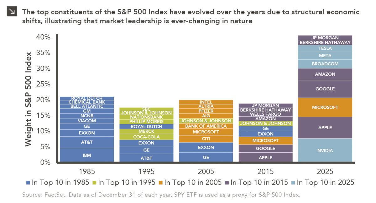
This Too Shall Reconstitute
Rooted in medieval Persian Sufi thought, the adage “this too shall pass” speaks to the fleeting and impermanent nature of…


Bond spreads¹ now appear tight based on the traditional method of calculating spreads² as positive momentum with the U.S.-China trade deal over the fourth quarter of 2019 culminated in the recent signing of the Phase One agreement.³ This week we examine another way of viewing spreads for an additional perspective on how tight spreads really are and, therefore, how rich bond valuations might truly be at the moment. The left chart shows investment grade bond spreads while the right chart shows high yield bond spreads. Both charts display the traditional way of calculating spreads — yield minus U.S. Treasury yield — in purple, with the dotted purple line representing the average spread. As we can see, today spreads for both investment grade and high yield are tighter than their respective averages using the traditional approach to calculating spreads.
The rationale for examining an alternative way of measuring spreads comes from the fact that the 10-year U.S. Treasury yield has fallen dramatically over time. In 1987 it was 9.1% whereas today it is 1.7%. A corporate bond yielding 10.1% in 1987 had a spread of 100bp (10.1% minus 9.1%), while a corporate bond yielding 2.7% today also has a 100bp spread (2.7% minus 1.7%). Since they both have the same spread, the traditional method of calculating spreads using subtraction would deem both to have the same value. Even though the 10.1% yield from 1987 produced a lot more yield than the current 2.7% value, a relative value comparison suggests a different conclusion. In 1987, the ratio of high yield to the 10-yr Treasury was only 1.1x (10.1/9.1), whereas today it is 1.6x (2.7/1.7).
The teal lines in both charts show this alternate view of spreads, by taking the bond’s yield as a multiple of the U.S. Treasury yield. The teal dotted lines show the averages of the spreads using this alternate method. The results are surprising as they show that both investment grade and high yield spreads, using this approach, are actually wider today than their averages, which one might interpret as indicating that both investment grade and high yield are actually attractively priced at the moment and there is still room for further spread tightening.
While there may be some justification behind this novel view of spreads, one key rebuttal is that the broader market does not view spreads using this approach. We would recommend that investors take into consideration both methods when assessing bond valuations as well as where we are in the broader market cycle to inform asset allocation decisions.
Print PDF > Another Way to Look at Spreads
¹ Bond spreads are used as an industry standard for assessing bond valuations.
² The traditional method of calculating bond spreads is the yield of the bond, for example, an investment grade corporate bond or a high yield corporate bond, minus the U.S. Treasury yield. If the spread is tight then the bond is richly priced, if the spread is wide then the bond is cheaply priced.
³ Concern over this past week’s global spread of the coronavirus widened spreads slightly but spreads still remain tight overall based on traditional calculations.
The opinions expressed herein are those of Marquette Associates, Inc. (“Marquette”), and are subject to change without notice. This material is not financial advice or an offer to purchase or sell any product. Marquette reserves the right to modify its current investment strategies and techniques based on changing market dynamics or client needs.
05.04.2026
Rooted in medieval Persian Sufi thought, the adage “this too shall pass” speaks to the fleeting and impermanent nature of…
04.27.2026
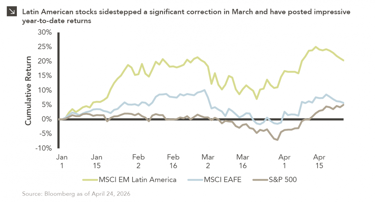
Latin American equity markets have shown remarkable strength in 2026. After a strong start to the year, the MSCI Emerging…
04.20.2026
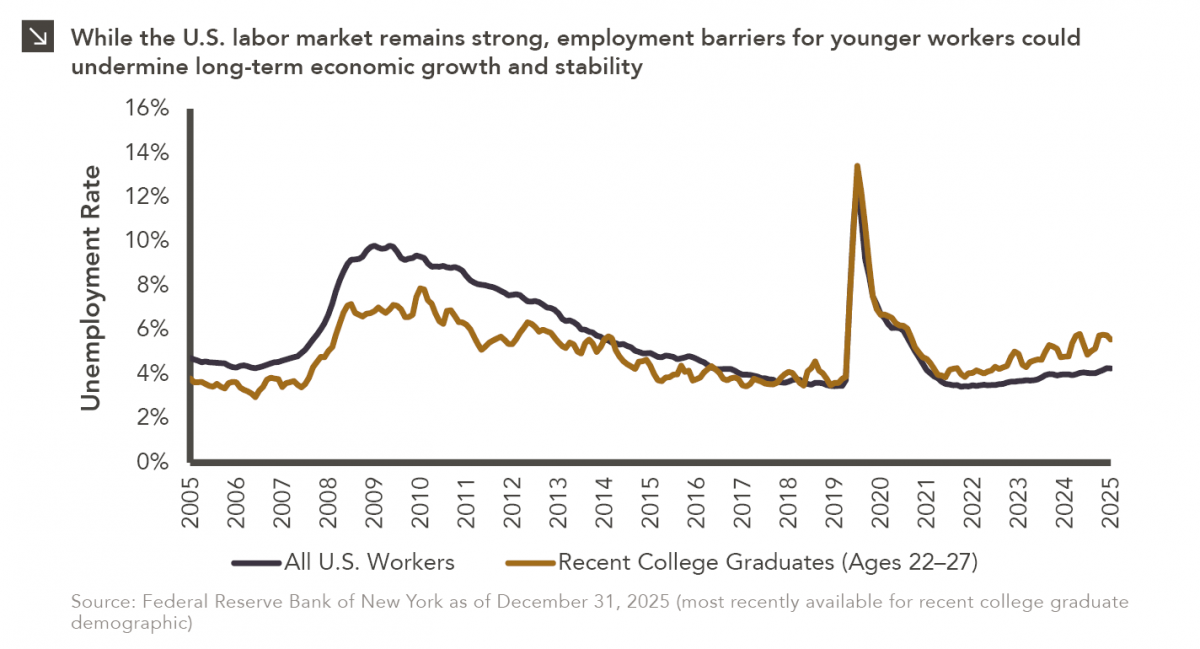
Entry-level jobs have traditionally served as the primary bridge between education and stable employment, offering young workers a foothold from…
04.13.2026
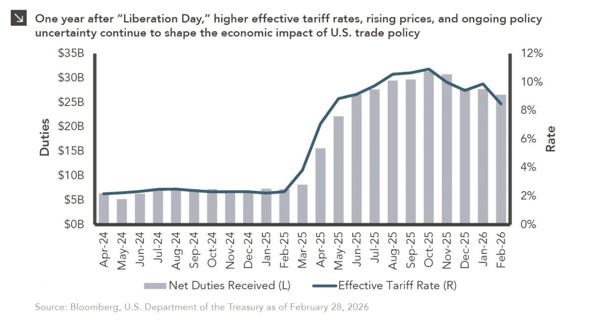
On April 2, 2025, President Donald Trump announced a sweeping set of tariffs on imports into the United States. Dubbed…
04.06.2026
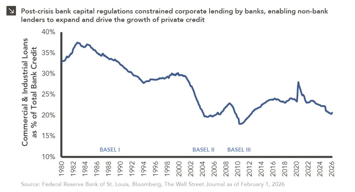
The Basel capital framework was created to ensure that banks maintain sufficient capital to absorb losses and reduce the risk…

04.02.2026
This video is a recording of a live webinar held April 16 by Marquette’s research team analyzing the first quarter…
Research alerts keep you updated on our latest research publications. Simply enter your contact information, choose the research alerts you would like to receive and click Subscribe. Alerts will be sent as research is published.
We respect your privacy. We will never share or sell your information.
If you have questions or need further information, please contact us directly and we will respond to your inquiry within 24 hours.
Contact Us >