04.27.2026
Let’s Hear It for Latin America
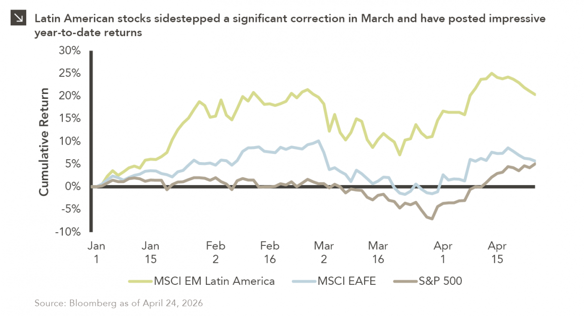
Latin American equity markets have shown remarkable strength in 2026. After a strong start to the year, the MSCI Emerging…


Since peaking late in the third quarter of 2018, U.S. equities have experienced large swings in performance. Following the worst December performance since 1931, the S&P 500 staged a dramatic rebound logging its best quarterly return since the first quarter of 1998. Equities continued their march higher culminating with the S&P 500 reaching an all-time closing high of 3,025.86 on Friday, July 26th. The year-to-date rally is attributable to a multitude of factors, however, a dovish pivot by the Fed and optimism around U.S.-China trade relations were key macro drivers facilitating the rebound.
However, fortunes quickly changed last week as the S&P 500 logged its worst weekly performance so far this year with a 3.1% drop and the sell-off continued into Monday with a steep one-day drop of 3%. Recent market volatility centers around changing expectations with respect to the economic outlook, market participants reconciling a smaller rate cut than was priced in, and an escalation in the trade war with China. U.S. officials had hinted throughout the year that a deal was close — and progress was being made — however that trade deal optimism is now in doubt. An additional 10% tariff on $300 billion worth of Chinese goods was announced last week and is set to take effect on September 1st. China retaliated by telling its state-owned companies to suspend U.S. agricultural imports and allowing its currency to fall to decade lows against the U.S. dollar.
Volatility is likely to stay elevated over the near-term as the economic and trade outlooks remain uncertain. Historically, August is a volatile month and on average the third quarter produces muted returns. It is worth noting that the S&P 500 still has a double-digit year-to-date return and is trading nearly 5% below all-time highs; whether or not the index remains in positive territory for the duration of 2019 will no doubt depend at least partly on how the U.S.-China trade issues play out over the next 5 months.
Print PDF > August Off to a Difficult Start
The opinions expressed herein are those of Marquette Associates, Inc. (“Marquette”), and are subject to change without notice. This material is not financial advice or an offer to purchase or sell any product. Marquette reserves the right to modify its current investment strategies and techniques based on changing market dynamics or client needs.
The opinions expressed herein are those of Marquette Associates, Inc. (“Marquette”), and are subject to change without notice. This material is not financial advice or an offer to purchase or sell any product. Marquette reserves the right to modify its current investment strategies and techniques based on changing market dynamics or client needs.

04.27.2026
Latin American equity markets have shown remarkable strength in 2026. After a strong start to the year, the MSCI Emerging…
04.23.2026
Diversify. Rebalance. Stay invested. Every one of these letters has concluded with that same advice in some shape or form….

04.20.2026
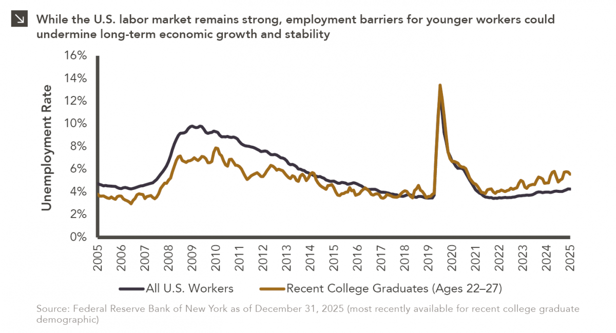
Entry-level jobs have traditionally served as the primary bridge between education and stable employment, offering young workers a foothold from…

04.13.2026
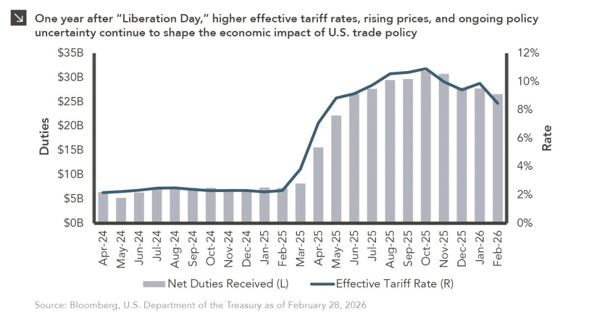
On April 2, 2025, President Donald Trump announced a sweeping set of tariffs on imports into the United States. Dubbed…
04.07.2026
On March 30, 2026, the Department of Labor (DOL) issued its proposed regulation: Fiduciary Duties in Selecting Designated Investment Alternatives….

04.06.2026
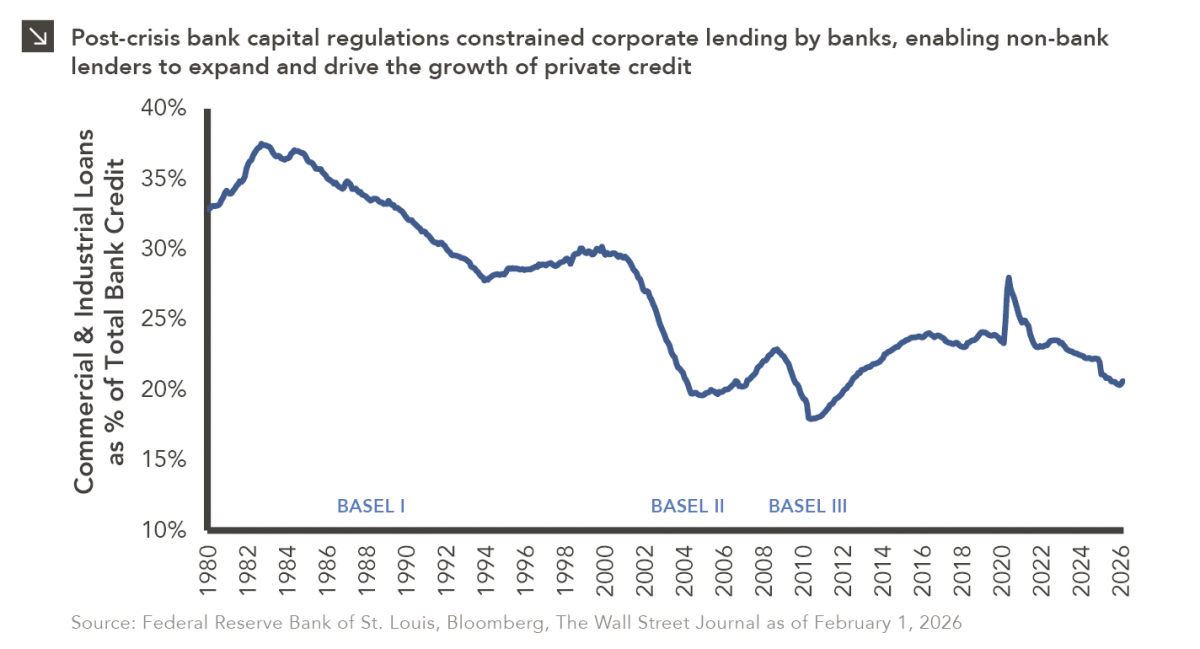
The Basel capital framework was created to ensure that banks maintain sufficient capital to absorb losses and reduce the risk…
Research alerts keep you updated on our latest research publications. Simply enter your contact information, choose the research alerts you would like to receive and click Subscribe. Alerts will be sent as research is published.
We respect your privacy. We will never share or sell your information.
If you have questions or need further information, please contact us directly and we will respond to your inquiry within 24 hours.
Contact Us >