10.08.2026
3Q 2026 Market Insights
This video is a recording of a live webinar held October 22 by Marquette’s research team analyzing the third quarter…


Our chart for this week examines the shape of the U.S. Treasury yield curve. With the 10-year Treasury yield recently rising above 3%, the yield curve is now as flat as it was in 2007, just before it inverted as a precursor to the 2008 financial crisis. An inverted yield curve shows that the market does not expect future interest rates to be as high as today’s interest rates, and may signify an economic downturn — going hand-in-hand with an equity and credit correction — to come.
The horizontal axis shows the maturities of U.S. Treasury bonds while the vertical axis shows their yields. Each line is a cross-sectional snapshot — rather than a time-series — of the U.S. Treasury yield curve. The bottom-most line is the spot curve, which shows the current¹ U.S. Treasury yield curve. The next line up is a Treasury forward curve that shows where the market expects the yield curve to be at the end of 2018. The next line up after that shows the forward curve for one year later, at the end of 2019; and the highest line shows the forward curve for the end of 2020.
As we can see, the market expects the curve to pivot at the long end, and rise at the short end, suggesting further flattening.
While it is comforting to know that the Federal Reserve now has in its toolbox the ability to cut rates to support the economy, it is a concern how easily the curve could invert, say, if the Fed hikes only a few more times coupled with a drop in the long end of the curve. This drop could be due to a resurgence of geopolitical tensions or slower growth expectations.
The Fed continues to have the dual mandate of minimizing unemployment while containing inflation. As inflation and inflation expectations continue to rise, we may see the Fed continue its rate hikes in order to rein in the economy, making inversion that much more likely. Because of this, we encourage investors to be on guard for curve inversion, which means taking moderate risk in portfolios, remaining diversified and maintaining a suitable amount of duration. We will continue to monitor the likelihood of curve inversion in the quarters to come — in the context of key metrics such as valuations, fundamentals and technicals — to help ensure that our clients’ portfolios are well-positioned.
¹ Data as of May 18, 2018
The opinions expressed herein are those of Marquette Associates, Inc. (“Marquette”), and are subject to change without notice. This material is not financial advice or an offer to purchase or sell any product. Marquette reserves the right to modify its current investment strategies and techniques based on changing market dynamics or client needs.
The opinions expressed herein are those of Marquette Associates, Inc. (“Marquette”), and are subject to change without notice. This material is not financial advice or an offer to purchase or sell any product. Marquette reserves the right to modify its current investment strategies and techniques based on changing market dynamics or client needs.

10.08.2026
This video is a recording of a live webinar held October 22 by Marquette’s research team analyzing the third quarter…

10.22.2026
Anyone who has run a marathon knows the last six miles are brutal — no matter how well the first…
10.19.2026
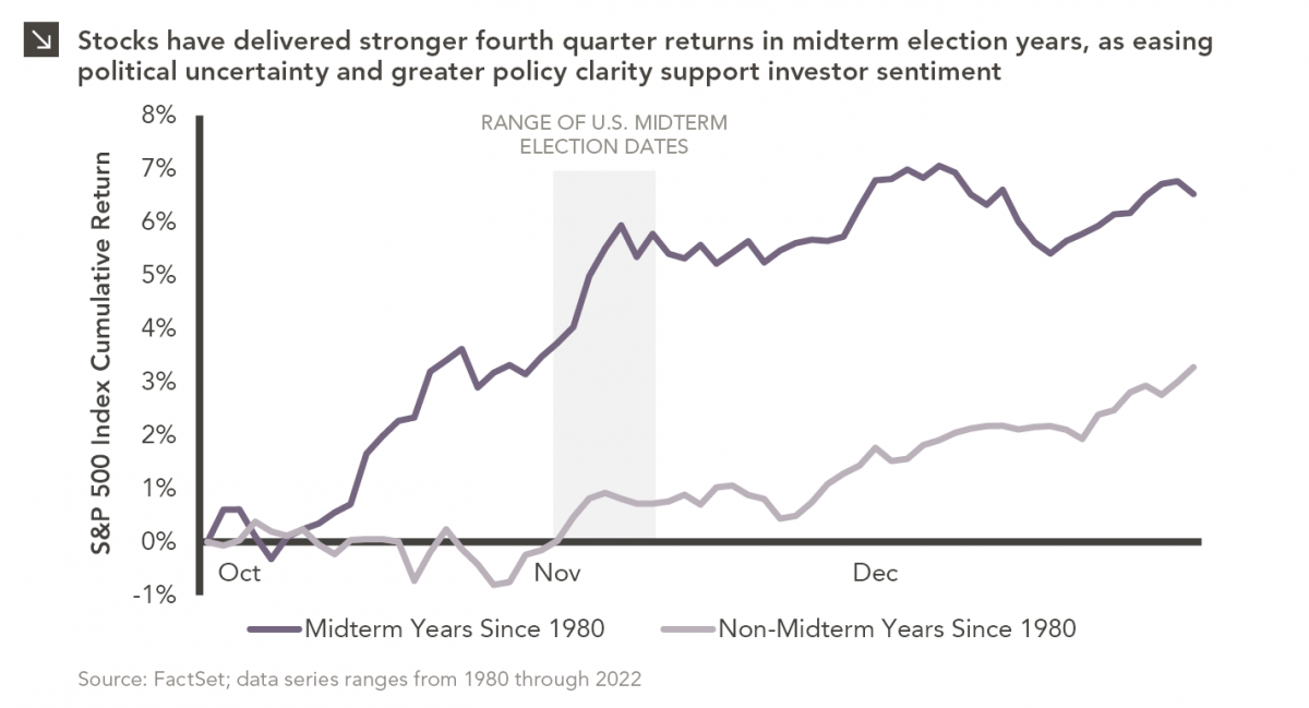
Since 1980, the S&P 500 Index has generally performed well in the weeks surrounding U.S. midterm elections. Specifically, the index…

10.12.2026
This week’s chart highlights the accelerating growth of electricity demand in the U.S., which has been driven primarily by the…

10.05.2026
For investors, the spookiest thing about October might not be the ghosts and monsters that are bound to show up…

09.28.2026
The phrase “expectations of higher inflation” has become a staple in financial news to explain the increase in nominal U.S….
Research alerts keep you updated on our latest research publications. Simply enter your contact information, choose the research alerts you would like to receive and click Subscribe. Alerts will be sent as research is published.
We respect your privacy. We will never share or sell your information.
If you have questions or need further information, please contact us directly and we will respond to your inquiry within 24 hours.
Contact Us >