07.24.2026
2026 Halftime Market Insights
This video is a recording of a live webinar held July 23 by Marquette’s research team analyzing the first half…
Biotech company Moderna’s announcement earlier this week that its coronavirus vaccine successfully helped healthy adults produce antibodies against COVID-19 sent the S&P 500 up 3% and the 10-year Treasury yield rebounding from 0.64% to 0.73% on Monday. In this pandemic, the last week of March marked a pivotal turning point when investors started seeing some light at the end of the tunnel. That week was when new infections and hospitalizations started peaking and declining in Italy and Japan, soon to be joined by New York and Washington state. That week also coincided with the Federal Reserve’s and U.S. Treasury’s — later followed by Congress’s — announcement of their substantial stimulus. Credit spreads have gradually been tightening ever since as stimulus ramped up, a number of vaccines and treatments reached Phase I and Phase II clinical trial milestones, and more recently, various states have started to reopen. Moderna’s favorable results added fuel to this positive sentiment and the market’s upswing.
In this newsletter, we examine the evolution of credit spreads and yields in 2020 to gauge the attractiveness of holding investment grade and sub-investment grade credit. Vaccine development is central to assessing the markets today as it is the ultimate permanent solution, and we detail the prospects of various vaccine candidates as well as discuss how investors should allocate to credit in light of vaccine progress in conjunction with key market metrics. Although the vaccine is a permanent solution, fiscal and monetary stimulus have proven to be critical for mitigating damage to the economy and markets in the interim and are still integral to assessing the markets today. We take a closer look at these lifelines from the U.S. government in an attempt to answer the all-important question: how much runway is there with this stimulus? The hope is that current programs coupled with any future policies will be sufficient to sustain and ultimately revive the economy until a vaccine allows for complete resumption of economic activity. Lastly, we dive into the fallen angels (bonds downgraded from investment grade to sub-investment grade), defaults, and bankruptcies that are threatening the credit markets right now and how to address these as investors. Throughout this discussion, we highlight three perspectives that are critical to measuring the attractiveness of an investment or an asset class: valuations, technical factors, and fundamentals.
Read > Brighter Lights at the End of a Shorter Tunnel
The opinions expressed herein are those of Marquette Associates, Inc. (“Marquette”), and are subject to change without notice. This material is not financial advice or an offer to purchase or sell any product. Marquette reserves the right to modify its current investment strategies and techniques based on changing market dynamics or client needs.

07.24.2026
This video is a recording of a live webinar held July 23 by Marquette’s research team analyzing the first half…
07.22.2026
The usual midyear version of these letters has touched on year-to-date performance as well as the most influential macroeconomic and…
06.25.2026
Commodities represent a unique asset class within global financial markets. Like equities and bonds, commodity prices are influenced by the…

06.15.2026
The rapid buildout of artificial intelligence infrastructure is reshaping the U.S. investment landscape. According to recent Census Bureau data, spending…
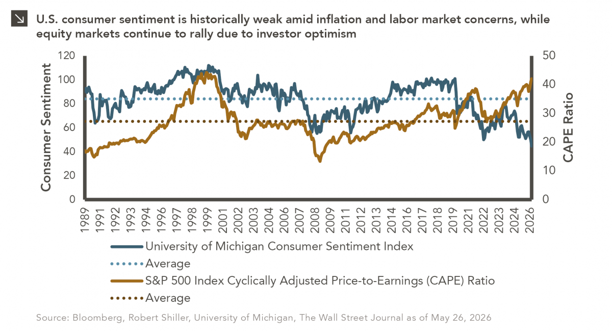
05.26.2026
The classic novel A Tale of Two Cities by Charles Dickens begins with the line “It was the best of…
05.18.2026
Over the last few years, equity markets have been defined by a group of stocks often referred to as the…
Research alerts keep you updated on our latest research publications. Simply enter your contact information, choose the research alerts you would like to receive and click Subscribe. Alerts will be sent as research is published.
We respect your privacy. We will never share or sell your information.
If you have questions or need further information, please contact us directly and we will respond to your inquiry within 24 hours.
Contact Us >