07.27.2026
Liquidity Isn’t Free
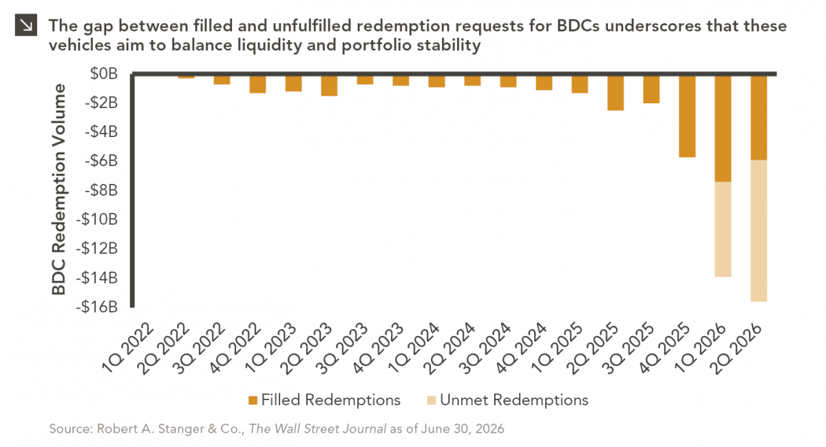
The rapid growth of non-traded business development companies (BDCs), which are investment vehicles that pool investor capital to make loans…

North American private equity managers have consistently outperformed the Russell 3000 as well as other broad equity indices over the last 20 years.¹ Key value drivers that have contributed to this outperformance include information asymmetry, a longer-term strategic focus, use of leverage, improved management and governance, and effective value creation plans. But for private equity managers to continue to achieve these outsized returns, they must first find the right opportunities and then be able to effectively monetize their investments.
In the U.S. there are approximately 17,500 private companies with annual revenue greater than $100 million, compared to roughly 2,600 public companies above the same revenue threshold. For every one public opportunity at this level, there are almost seven private opportunities. There are also more than 340,000 private businesses with revenue between $5 and $100 million. As private markets continue to grow and evolve, private companies will be able to access capital with greater ease than they have historically. This, in addition to the disadvantages of going public, should extend the trend of companies staying private for longer. This sets the stage for private equity managers to continue to deliver attractive risk-adjusted returns, with a robust opportunity set and a number of unique investment advantages.
Print PDF > Can Private Equity Outperformance Persist?
¹Pitchbook as of Q320, latest data available.
Sources: Capital IQ, Forbes, and PitchBook
The opinions expressed herein are those of Marquette Associates, Inc. (“Marquette”), and are subject to change without notice. This material is not financial advice or an offer to purchase or sell any product. Marquette reserves the right to modify its current investment strategies and techniques based on changing market dynamics or client needs.
07.27.2026
The rapid growth of non-traded business development companies (BDCs), which are investment vehicles that pool investor capital to make loans…

07.24.2026
This video is a recording of a live webinar held July 23 by Marquette’s research team analyzing the first half…
07.22.2026
The usual midyear version of these letters has touched on year-to-date performance as well as the most influential macroeconomic and…

07.20.2026
Our most recent Chart of the Week publication discussed how the AI investment opportunity has expanded beyond…

07.13.2026
One of the enduring lessons of the California Gold Rush is that the greatest fortunes were often made not by…

07.06.2026
Since traditional exit routes have remained constrained in recent years due to higher interest rates, valuation gaps, and a subdued…
Research alerts keep you updated on our latest research publications. Simply enter your contact information, choose the research alerts you would like to receive and click Subscribe. Alerts will be sent as research is published.
We respect your privacy. We will never share or sell your information.
If you have questions or need further information, please contact us directly and we will respond to your inquiry within 24 hours.
Contact Us >