10.08.2026
3Q 2026 Market Insights
This video is a recording of a live webinar held October 22 by Marquette’s research team analyzing the third quarter…


This week’s Chart of the Week focuses on debt levels of the U.S. consumer and federal government. For consumer debt, all forms of debt other than mortgages are included in the analysis. As of the fourth quarter of 2012, U.S. consumers collectively held debt of $2.8T. Over the 32 year time frame since 1981 (when data was first collected), consumer debt has increased from $378B to $2.8T, a whopping increase of 635%. However, this still constitutes a relatively small percentage of U.S. debt, and has hovered between 5 and 10% over the years.
On the other hand, federal debt has not only been a much higher dollar amount (not surprising), but has also been a much more volatile component of overall U.S. debt. As of the fourth quarter of 2012, the Federal Government’s debt was $11.6T. In the 32 year time frame, Federal debt has increased from $821B to $11.6T, an even larger jump of 1313%. Federal debt has averaged 22% of total U.S. debt ranging from a low of 16% to a high of 29%.
The chart above depicts these four debt data points: households’ consumer credit dollar amount, Federal government’s dollar amount, consumer debt percentage of total U.S. debt, and Federal debt percentage of total U.S. debt. The takeaways are quite evident. The Federal debt has increased significantly since the 3rd quarter of 2008 (onset of the Global Financial Crisis), and appears to be maintaining this trajectory. On the other hand, while consumers’ household debt has increased in absolute terms, there have not been dramatic spikes in the debt level. Additionally, it has maintained its weight in the overall debt picture. Given the disparity in both dollar amount and share of overall debt, the level (and trend) of federal debt will continue to have a much more notable impact on the economy and financial markets than consumer debt.
The opinions expressed herein are those of Marquette Associates, Inc. (“Marquette”), and are subject to change without notice. This material is not financial advice or an offer to purchase or sell any product. Marquette reserves the right to modify its current investment strategies and techniques based on changing market dynamics or client needs.

10.08.2026
This video is a recording of a live webinar held October 22 by Marquette’s research team analyzing the third quarter…

10.22.2026
Anyone who has run a marathon knows the last six miles are brutal — no matter how well the first…
10.19.2026
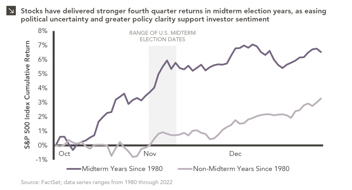
Since 1980, the S&P 500 Index has generally performed well in the weeks surrounding U.S. midterm elections. Specifically, the index…

10.12.2026
This week’s chart highlights the accelerating growth of electricity demand in the U.S., which has been driven primarily by the…

10.05.2026
For investors, the spookiest thing about October might not be the ghosts and monsters that are bound to show up…

09.28.2026
The phrase “expectations of higher inflation” has become a staple in financial news to explain the increase in nominal U.S….
Research alerts keep you updated on our latest research publications. Simply enter your contact information, choose the research alerts you would like to receive and click Subscribe. Alerts will be sent as research is published.
We respect your privacy. We will never share or sell your information.
If you have questions or need further information, please contact us directly and we will respond to your inquiry within 24 hours.
Contact Us >