10.19.2026
Divided We Rise?
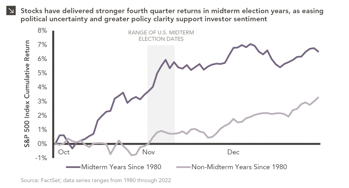
Since 1980, the S&P 500 Index has generally performed well in the weeks surrounding U.S. midterm elections. Specifically, the index…


As commodity prices around the globe continue their steady march upward, convention would suggest that inflation in the U.S. isn’t far behind. However, as many developing nations have already felt the sting of rising costs, inflation in the U.S. remains largely absent. Headline CPI rose only 1.6% in December over the previous year despite surging costs for oil, gold, cotton and many other commodities.
The cause for the divergence is a split between the pace of increases in the prices of goods and those for services. Producers, largely unable to absorb further increases in input costs, have begun to signal to consumers that price increases are inevitable. Thus the red line on the graph, which represents the cost of goods, has recently risen and is above its long term average, therefore adding inflationary pressure to the economy. Goods included in this metric include commodities and non-durables, less food and beverages. Meanwhile, the costs for many services (such as rent, electricity, and medical care) in the U.S. have grown at a much slower pace since the beginning of the crisis as high unemployment has stifled wage growth. The cost of services is shown by the blue line on the graph; the most recent values sit well below the long term average, therefore lessening inflationary pressure on the economy. At the end of January, inflation for goods registered an increase of 2.2% over the previous year while prices for services only advanced 1.2%. On average over the past 20 years, prices for services have grown 1.75 times faster than those for goods, but cheap labor from developing nations has kept prices for goods in check. So while rising commodity prices can be a driver of inflation here in the U.S., it will likely take acceleration in the prices of services before headline inflation can take off.
The opinions expressed herein are those of Marquette Associates, Inc. (“Marquette”), and are subject to change without notice. This material is not financial advice or an offer to purchase or sell any product. Marquette reserves the right to modify its current investment strategies and techniques based on changing market dynamics or client needs.
10.19.2026
Since 1980, the S&P 500 Index has generally performed well in the weeks surrounding U.S. midterm elections. Specifically, the index…

10.12.2026
This week’s chart highlights the accelerating growth of electricity demand in the U.S., which has been driven primarily by the…

10.05.2026
For investors, the spookiest thing about October might not be the ghosts and monsters that are bound to show up…

09.28.2026
The phrase “expectations of higher inflation” has become a staple in financial news to explain the increase in nominal U.S….

09.21.2026
For much of the past several years, the conventional view has been that higher interest rates and stretched valuations would…

09.14.2026
There are many great things about working at Marquette Associates, but “Free Lunch Tuesday” is right at the top of…
Research alerts keep you updated on our latest research publications. Simply enter your contact information, choose the research alerts you would like to receive and click Subscribe. Alerts will be sent as research is published.
We respect your privacy. We will never share or sell your information.
If you have questions or need further information, please contact us directly and we will respond to your inquiry within 24 hours.
Contact Us >