Doug Oest, CAIA
Partner
The challenges facing the money market industry continue to mount, with investors and asset managers growing more frustrated with recent trends. Investors have now experienced several years of near zero returns out of money market funds. The low rate environment has also forced nearly all money market funds to waive part or all of their fees to ensure a positive or flat yield for investors. Revisions to SEC Rule 2a-7 have created money market funds with shorter maturities, higher credit quality and improved liquidity, all of which have added to lower potential returns for money market funds. In addition, the crisis surrounding Lehman Brothers in 2008 which led to the Reserve Primary Fund “breaking the buck” caused large outflows from money market funds into deposit accounts. Not surprisingly, assets in money market funds have dropped dramatically since 2008. As the chart shows, while the decline has stabilized, the downward trend has yet to reverse itself.
Proposed reforms to money market funds seem to further cloud the issue. The Financial Stability Oversight Committee (“FOSC”) recently outlined three possible reform options, while the Financial Stability Board (“FSB”) proposed similar measures. The FOSC proposals are as follows:
The FSB is endorsing a recommendation that would convert stable NAV funds to floating NAV funds where possible. The money market industry has come out against these proposals, arguing that such moves would undermine the money market product and drive cash to less regulated financial instruments as investment managers come out with new, more profitable cash management strategies.
Investors rely on money market funds for principal protection, and converting to a floating NAV would have a large effect on the cash management industry. Investors would be left to choose between the safety of the underlying assets of a floating NAV money market fund, versus the creditworthiness of a banking institution, were they to allocate assets to a bank in a deposit account above the FDIC limit. If such regulations were made, the market would likely respond as it has done in the past by creating a product that allows investors to invest in a single product that reduces the administrative complexity of allocating assets to multiple bank deposit accounts to ensure FDIC protection.

The opinions expressed herein are those of Marquette Associates, Inc. (“Marquette”), and are subject to change without notice. This material is not financial advice or an offer to purchase or sell any product. Marquette reserves the right to modify its current investment strategies and techniques based on changing market dynamics or client needs.

07.06.2026
Since traditional exit routes have remained constrained in recent years due to higher interest rates, valuation gaps, and a subdued…

06.29.2026
This week’s chart highlights the varying return profiles across key infrastructure sectors by illustrating the split between income and capital…

06.22.2026
When Benchmark, one of Silicon Valley’s most renowned early-stage venture capital firms, closed $2 billion across two new funds this…

06.15.2026
The rapid buildout of artificial intelligence infrastructure is reshaping the U.S. investment landscape. According to recent Census Bureau data, spending…
06.08.2026
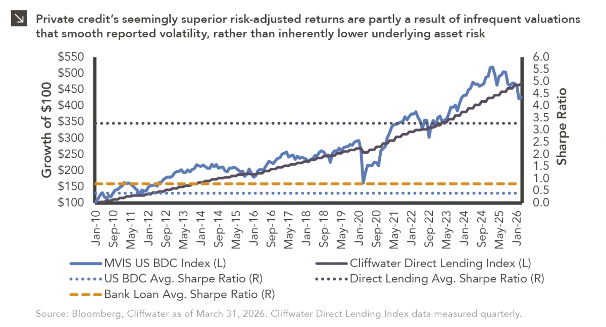
Hi, James Torgerson here! Volatility can be an unsightly blemish on portfolios and lead to inferior risk-adjusted returns. Private credit…

06.01.2026
The MSCI Emerging Markets Index has undergone a significant structural transformation in recent years. For much of the past decade,…
Research alerts keep you updated on our latest research publications. Simply enter your contact information, choose the research alerts you would like to receive and click Subscribe. Alerts will be sent as research is published.
We respect your privacy. We will never share or sell your information.
If you have questions or need further information, please contact us directly and we will respond to your inquiry within 24 hours.
Contact Us >