07.27.2026
Liquidity Isn’t Free
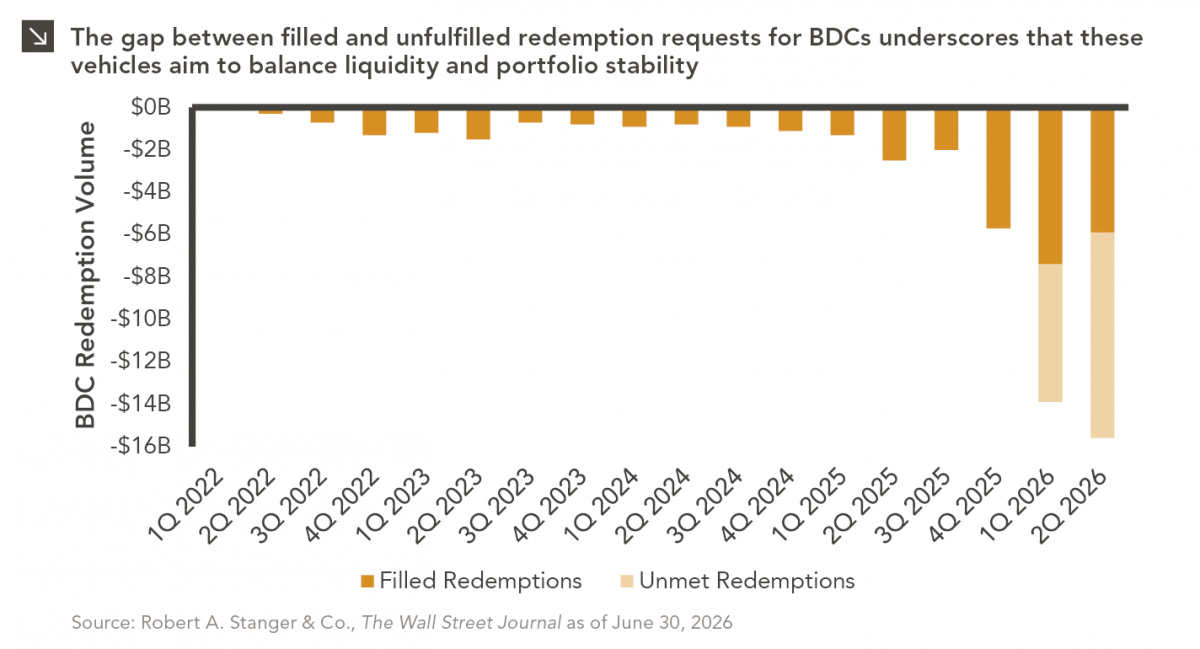
The rapid growth of non-traded business development companies (BDCs), which are investment vehicles that pool investor capital to make loans…

Innovation and structural change were hallmarks of 2020 as the spread of COVID-19 accelerated technological advancements across many areas of the global economy. The electric vehicle (“EV”) space is one area of innovation that has especially captured the attention of global investors. While battery-powered and alternative energy vehicles have been available in some form since the early 19th century, it was not until significant developments in rechargeable lithium-ion battery technology were made in the 1970s that meaningful capital began to flow to the space. Since then, interest in EV technology has ebbed and flowed with oil prices, but the recent global push toward green energy has revitalized enthusiasm in the space.
For the three years ended 2019, the NYSE FactSet Global Autonomous Driving and Electric Vehicle Index, which tracks developed and emerging market companies that specialize in self-driving and EV innovation, underperformed the broader MSCI ACWI Index — up an annualized 8.8% versus the ACWI up 10.2%. Since then, over the 14 months from the start of 2020 through February 2021, the Global Autonomous Driving and Electric Vehicle Index is up 63.1% versus the MSCI ACWI Index up 16.3%.
To dive deeper into the different components of the electric vehicle landscape, we look at the newly-created Bloomberg Intelligence Electric Vehicle Basket, a group of 60 global companies expected to benefit from and contribute to the success of EV development. These 60 companies, equal-weighted, have outperformed the MSCI ACWI by 10.3% over the trailing three months ended February 28th. Of the four unique sub-groups,¹ Raw Materials has outperformed by the widest margin, returning 46.3% since December. This cohort includes a diverse group of specialty chemical and mining companies that produce the inputs for a variety of industries, many of which, including those tangential to EVs, have seen increased demand over the last few months. The Battery and EV Component groups have also outperformed the broader MSCI ACWI Index. EV Vehicle Manufacturer stocks have struggled more recently amid profitability concerns given the cost of inputs and headwinds to EV adoption, particularly in the U.S. Despite the push from lawmakers, still limited charging infrastructure and a lack of consistency in charging connectors across manufacturers are issues for consumers. While we expect these and other points of friction will be resolved and EV market share will continue to grow over the next several decades, in the near term, market momentum can push innovation themes ahead of expected earnings or scalability. Investors should exercise caution when allocating to a burgeoning segment of the market and always maintain portfolio diversification.
Print PDF > Driving Toward a Green Future
¹A fifth Bloomberg exposure, EV Charging, included only one company and was included in the EV Components categorization for this analysis.
The opinions expressed herein are those of Marquette Associates, Inc. (“Marquette”), and are subject to change without notice. This material is not financial advice or an offer to purchase or sell any product. Marquette reserves the right to modify its current investment strategies and techniques based on changing market dynamics or client needs.
07.27.2026
The rapid growth of non-traded business development companies (BDCs), which are investment vehicles that pool investor capital to make loans…

07.24.2026
This video is a recording of a live webinar held July 23 by Marquette’s research team analyzing the first half…
07.22.2026
The usual midyear version of these letters has touched on year-to-date performance as well as the most influential macroeconomic and…

07.20.2026
Our most recent Chart of the Week publication discussed how the AI investment opportunity has expanded beyond…

07.13.2026
One of the enduring lessons of the California Gold Rush is that the greatest fortunes were often made not by…

07.06.2026
Since traditional exit routes have remained constrained in recent years due to higher interest rates, valuation gaps, and a subdued…
Research alerts keep you updated on our latest research publications. Simply enter your contact information, choose the research alerts you would like to receive and click Subscribe. Alerts will be sent as research is published.
We respect your privacy. We will never share or sell your information.
If you have questions or need further information, please contact us directly and we will respond to your inquiry within 24 hours.
Contact Us >