05.04.2026
This Too Shall Reconstitute
Rooted in medieval Persian Sufi thought, the adage “this too shall pass” speaks to the fleeting and impermanent nature of…

Emerging markets debt (“EMD”) represents an outstanding asset class for investors to diversify away from U.S.-centric core bonds, which includes U.S. Treasury, U.S. investment grade corporate and U.S. mortgage-backed bonds, as well as U.S.-centric bank loans and high yield bonds. It gives investors a large and expanding investment opportunity set that has very low correlation with U.S. equities and U.S. bonds.
In addition to stronger yields, where EMD is currently between 6% to 10% versus developed market bond yields between 0% to 6%, emerging markets also exhibit much stronger fundamentals versus their developed markets counterparts. Case in point, GDP growth has been much stronger in the emerging world than the developed world, especially so in the last few years, and is expected to continue for some time. Moreover, demographics are much more favorable for the emerging world, where population growth, especially in the younger, working segment, is expected to outstrip the developed world for quite some time. Lastly, as shown above, emerging market countries have much stronger debt and deficit profiles than developed market countries.
The left axis shows the debt as a percentage of GDP. The greater a country’s debt, the further towards the bottom of the chart it will show. The top axis shows the country’s fiscal deficit as a percentage of its GDP. The greater a country’s fiscal deficit, the further to the right it will show.
Emerging market countries are clustered toward the top left, due to their lower debt-to-GDP ratios and lower fiscal deficits. Developed market countries are clustered towards the bottom right, due to their higher debt-to-GDP ratios and higher fiscal deficits. Greece and Japan are in especially dire straits, and are literally off the charts.
What this chart tells us is that, as a whole, EMD represents a relatively secure asset class as the countries in question have much less debt to service than their developed market counterparts. In addition, they have been more fiscally sound, with lower deficits than their developed market counterparts. All of this adds up to strong support for emerging market countries and corporations to pay both the interest and principal on their bonds. Couple this with their higher yields and low correlations to other asset classes, and it makes it a must-have for most institutional portfolios.
Investors can take advantage of this space through a dedicated emerging markets debt manager that provides a U.S. dollar-denominated “hard currency” sovereign EMD focus, a “local currency” sovereign EMD focus, a corporate EMD focus, or a blended strategy that invests in both hard and local currency EMD bonds as well as sovereign and corporate EMD bonds. Marquette recommends a blended EMD allocation for investors to take advantage of the broadest diversification.
The opinions expressed herein are those of Marquette Associates, Inc. (“Marquette”), and are subject to change without notice. This material is not financial advice or an offer to purchase or sell any product. Marquette reserves the right to modify its current investment strategies and techniques based on changing market dynamics or client needs.
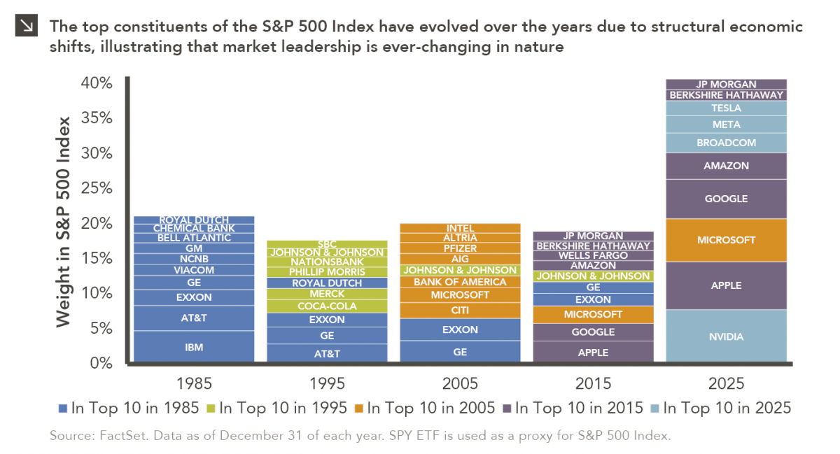
05.04.2026
Rooted in medieval Persian Sufi thought, the adage “this too shall pass” speaks to the fleeting and impermanent nature of…
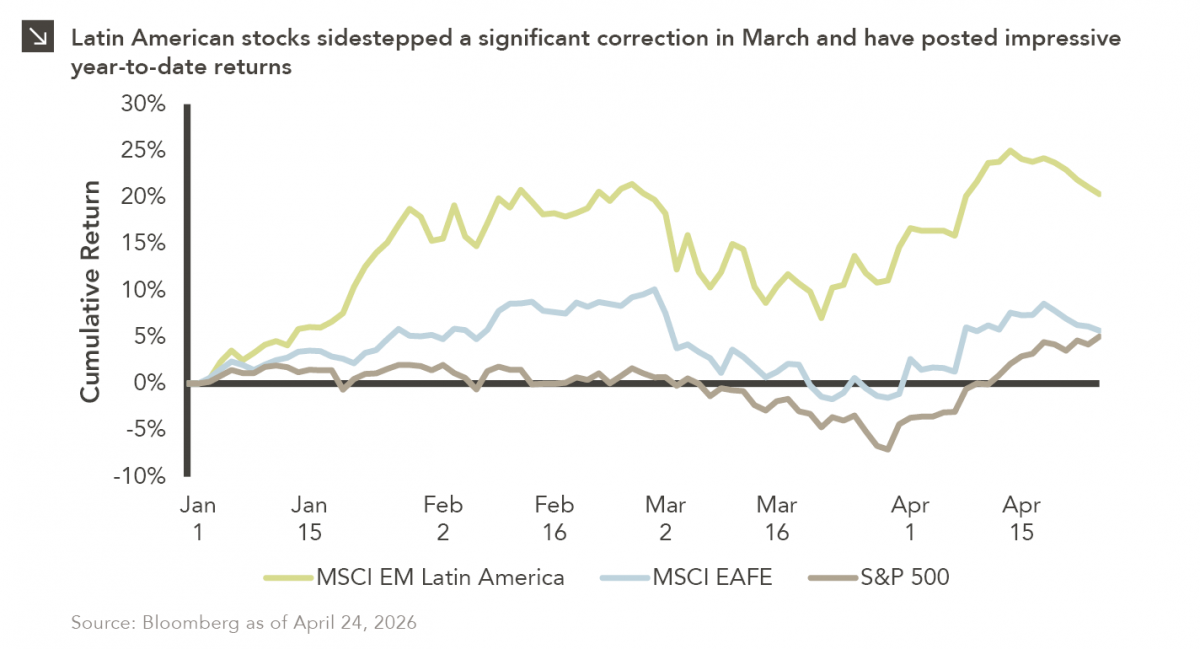
04.27.2026
Latin American equity markets have shown remarkable strength in 2026. After a strong start to the year, the MSCI Emerging…
04.23.2026
Diversify. Rebalance. Stay invested. Every one of these letters has concluded with that same advice in some shape or form….
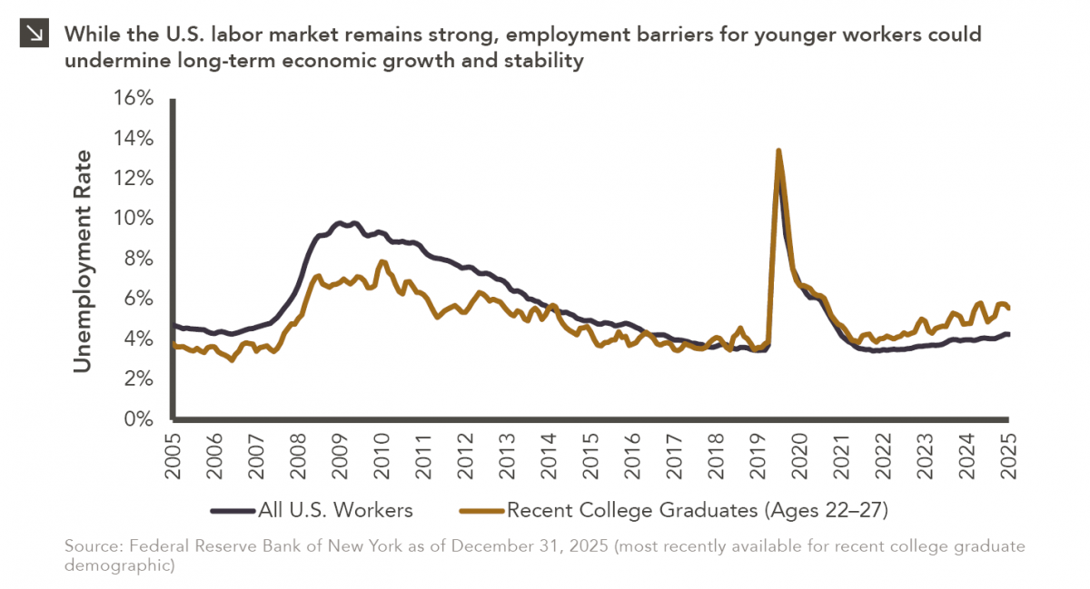
04.20.2026
Entry-level jobs have traditionally served as the primary bridge between education and stable employment, offering young workers a foothold from…
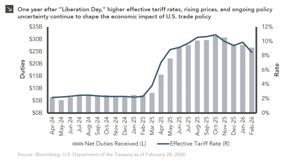
04.13.2026
On April 2, 2025, President Donald Trump announced a sweeping set of tariffs on imports into the United States. Dubbed…
04.06.2026
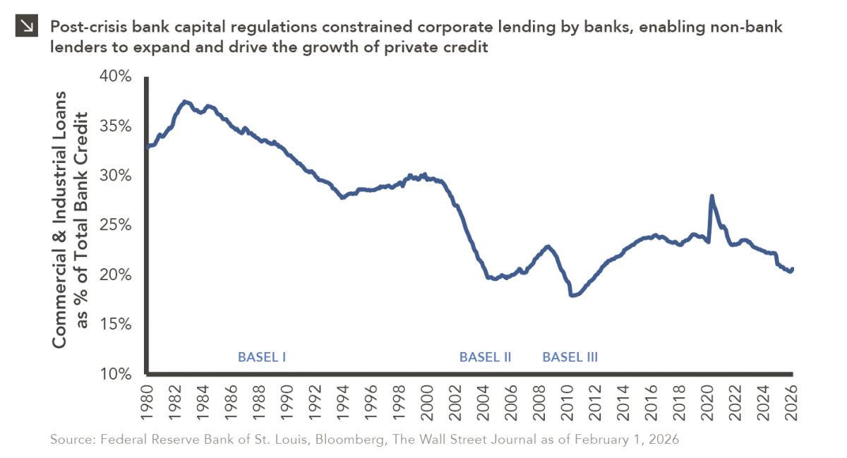
The Basel capital framework was created to ensure that banks maintain sufficient capital to absorb losses and reduce the risk…
Research alerts keep you updated on our latest research publications. Simply enter your contact information, choose the research alerts you would like to receive and click Subscribe. Alerts will be sent as research is published.
We respect your privacy. We will never share or sell your information.
If you have questions or need further information, please contact us directly and we will respond to your inquiry within 24 hours.
Contact Us >