10.08.2026
3Q 2026 Market Insights
This video is a recording of a live webinar held October 22 by Marquette’s research team analyzing the third quarter…


For most of 2017, we were fixated on the unusually low volatility environment. Despite a number of geopolitical challenges, markets continued their sanguine march to higher heights. A month ago, we reviewed the latest U.S. equity market correction (defined as a market decline of at least 10%). At the beginning of the year, the S&P 500 Index had not had a negative month since October 2016 and January 2018 was already off to a strong start. However, cracks started to appear at the end of January as generally positive news (i.e. higher wage growth and low unemployment) precipitated February’s market decline and the first U.S. equity market correction since January 2016.
Periods of higher volatility and market corrections are not unusual at all. In the chart above, we have plotted the CBOE Volatility Index, also known as the VIX. The VIX shows the market’s expectation of 30-day volatility for the S&P 500 Index. Twenty is the average level of the VIX. Since the VIX’s inception, there have been vacillations between periods of high and low volatility, as noted in the chart. Coming off a period of extended low volatility, it is not surprising that current signals suggest elevated volatility in the near future. First, volatility regimes have lasted a little over five years on average; the current period is at the end of its sixth year. Second, the Federal Reserve is embarking on an interest rate normalization process and investors are afraid that the Fed may have to tighten faster due to stronger economic growth and inflation pressures. Excessive Fed tightening could constrain growth and thus equity markets, which explains the market drop in February.
However, higher volatility does not necessarily mean markets will be negative. From December 1996 through January 2003 and from July 2007 through June 2012 — the last two periods of higher volatility — the market posted positive returns. The former period included the bursting of the Tech Bubble and two U.S. recessions while the latter period encompassed the Global Financial Crisis. So while market volatility has risen from extremely low levels over the past six weeks, volatility is part of a functioning and healthy equity market.
The opinions expressed herein are those of Marquette Associates, Inc. (“Marquette”), and are subject to change without notice. This material is not financial advice or an offer to purchase or sell any product. Marquette reserves the right to modify its current investment strategies and techniques based on changing market dynamics or client needs.
The opinions expressed herein are those of Marquette Associates, Inc. (“Marquette”), and are subject to change without notice. This material is not financial advice or an offer to purchase or sell any product. Marquette reserves the right to modify its current investment strategies and techniques based on changing market dynamics or client needs.

10.08.2026
This video is a recording of a live webinar held October 22 by Marquette’s research team analyzing the third quarter…

10.22.2026
Anyone who has run a marathon knows the last six miles are brutal — no matter how well the first…
10.19.2026
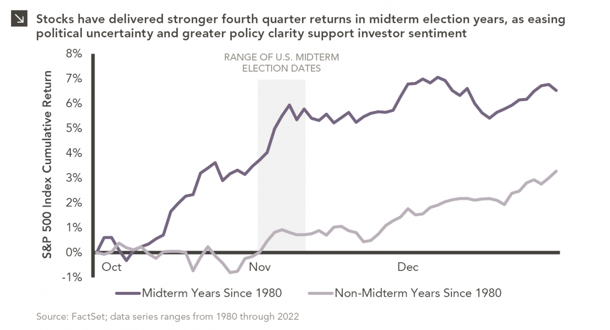
Since 1980, the S&P 500 Index has generally performed well in the weeks surrounding U.S. midterm elections. Specifically, the index…

10.12.2026
This week’s chart highlights the accelerating growth of electricity demand in the U.S., which has been driven primarily by the…

10.05.2026
For investors, the spookiest thing about October might not be the ghosts and monsters that are bound to show up…

09.28.2026
The phrase “expectations of higher inflation” has become a staple in financial news to explain the increase in nominal U.S….
Research alerts keep you updated on our latest research publications. Simply enter your contact information, choose the research alerts you would like to receive and click Subscribe. Alerts will be sent as research is published.
We respect your privacy. We will never share or sell your information.
If you have questions or need further information, please contact us directly and we will respond to your inquiry within 24 hours.
Contact Us >