04.27.2026
Let’s Hear It for Latin America
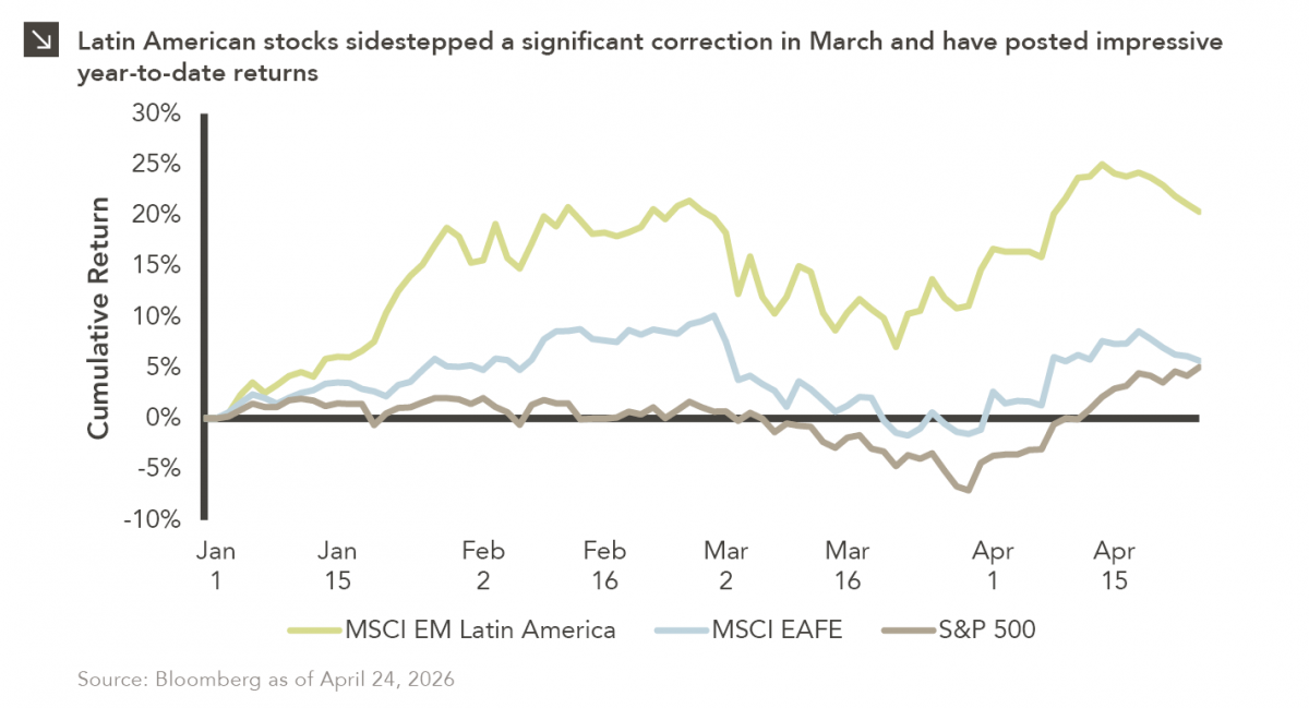
Latin American equity markets have shown remarkable strength in 2026. After a strong start to the year, the MSCI Emerging…


Inflation has been at the forefront of the minds of many investors in recent months as higher price levels have resulted from economic reopenings and supply chain dislocations across the globe. For instance, the consumer price index — which measures the cost of a basket of goods purchased for consumption by urban households in the United States — rose 0.4% during the month of September, coming in slightly above expectations and translating to a 5.4% jump on a year-over-year basis. Notably, the yearly spike in the CPI is the most significant in over a decade. While the debate on whether current inflation levels are transitory in nature or pose a longer-term threat to the economic health of the world is of great importance and will clearly continue for some time, the question of how investors can mitigate risks stemming from price level increases through the use of different asset classes is also worth exploring.
Real assets, including commodities and real estate, are known to be robust inflation hedges due to the fact that input costs, along with property values and rental income streams, tend to rise in tandem with overall price levels. The case for equities as a guard against higher inflation can be argued by pointing out that revenues and earnings of companies with inelastic demand for their goods and services may also rise along with inflation, due to the fact that firms with strong customer bases are able to pass on price increases to end consumers with relative ease. Generally speaking, this argument has held true in recent decades, as U.S. equity indices have tended to appreciate during inflationary periods going back to the late 1970s. Specifically, and as displayed in this week’s chart, equities have demonstrated hedge-like performance characteristics during periods of moderate inflation (CPI increases of 1–10%) and have largely generated positive real returns during those time frames. It is important to note that recent performance trends are likely aberrational, as equity indices have bounced back quite strongly after pandemic-induced troughs that occurred around the same time as the beginning of the current inflationary period. During times of significant inflation (CPI increases of 10% and above), equity performance has been more mixed, with returns of various style indices usually positive (though often coming in below the prevailing inflation rate). Regardless of whether or not the current inflationary regime is transient or long-term in nature, the data clearly indicate that equities can play a role in helping to lessen the impact of price level increases on the purchasing power of investment portfolios. Prudence and diversification across the asset class spectrum can also help investors endure elevated inflation levels that may persist into the near future.
Print PDF > Can Equities Provide a Hedge Against Inflation?
The opinions expressed herein are those of Marquette Associates, Inc. (“Marquette”), and are subject to change without notice. This material is not financial advice or an offer to purchase or sell any product. Marquette reserves the right to modify its current investment strategies and techniques based on changing market dynamics or client needs.

04.27.2026
Latin American equity markets have shown remarkable strength in 2026. After a strong start to the year, the MSCI Emerging…
04.23.2026
Diversify. Rebalance. Stay invested. Every one of these letters has concluded with that same advice in some shape or form….

04.20.2026
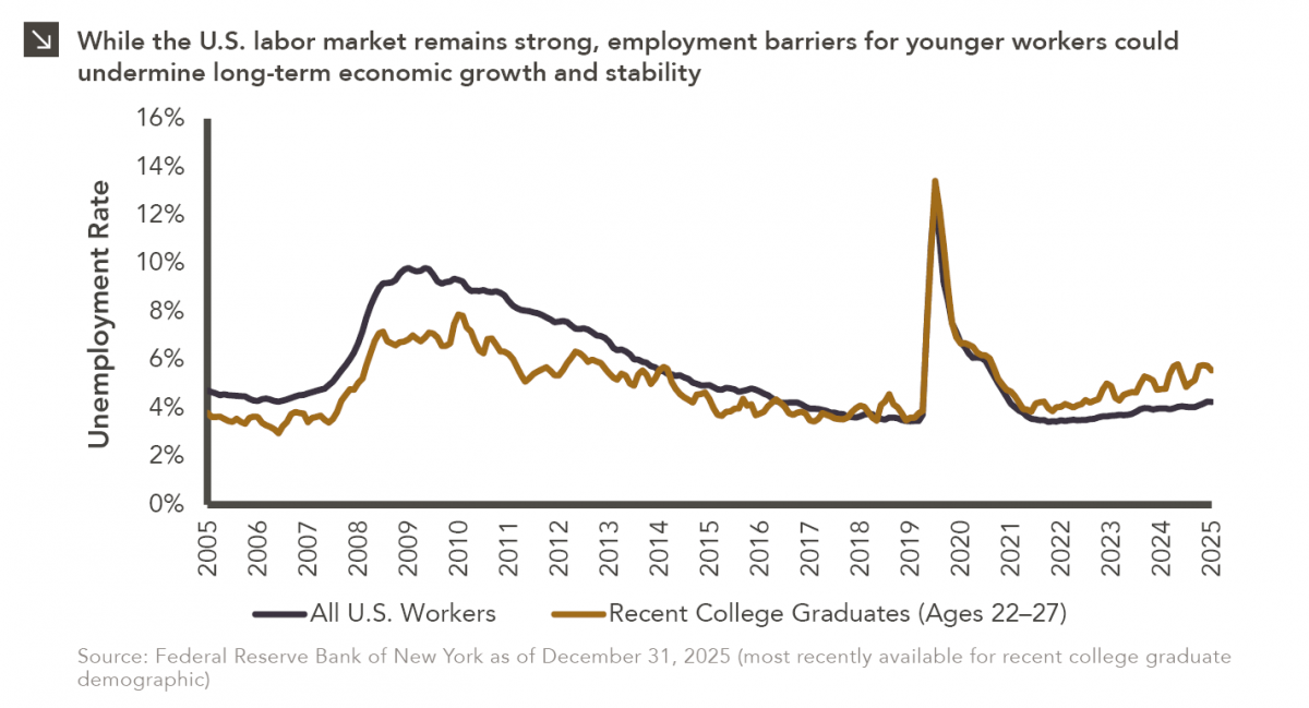
Entry-level jobs have traditionally served as the primary bridge between education and stable employment, offering young workers a foothold from…

04.13.2026
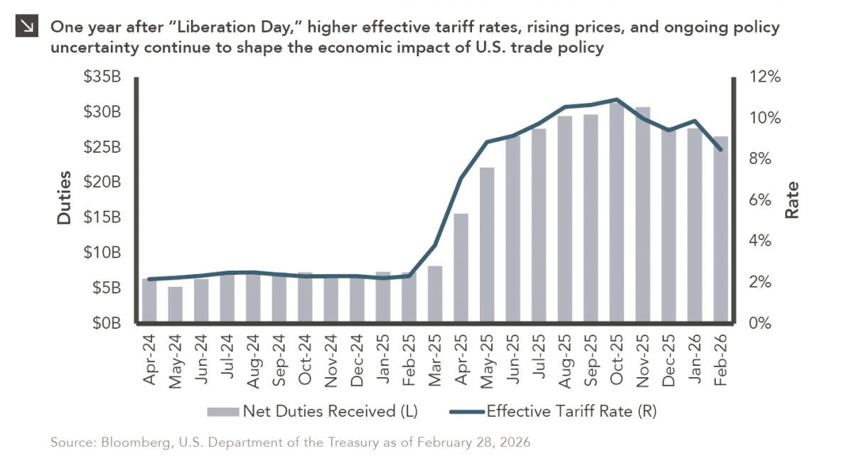
On April 2, 2025, President Donald Trump announced a sweeping set of tariffs on imports into the United States. Dubbed…
04.07.2026
On March 30, 2026, the Department of Labor (DOL) issued its proposed regulation: Fiduciary Duties in Selecting Designated Investment Alternatives….

04.06.2026
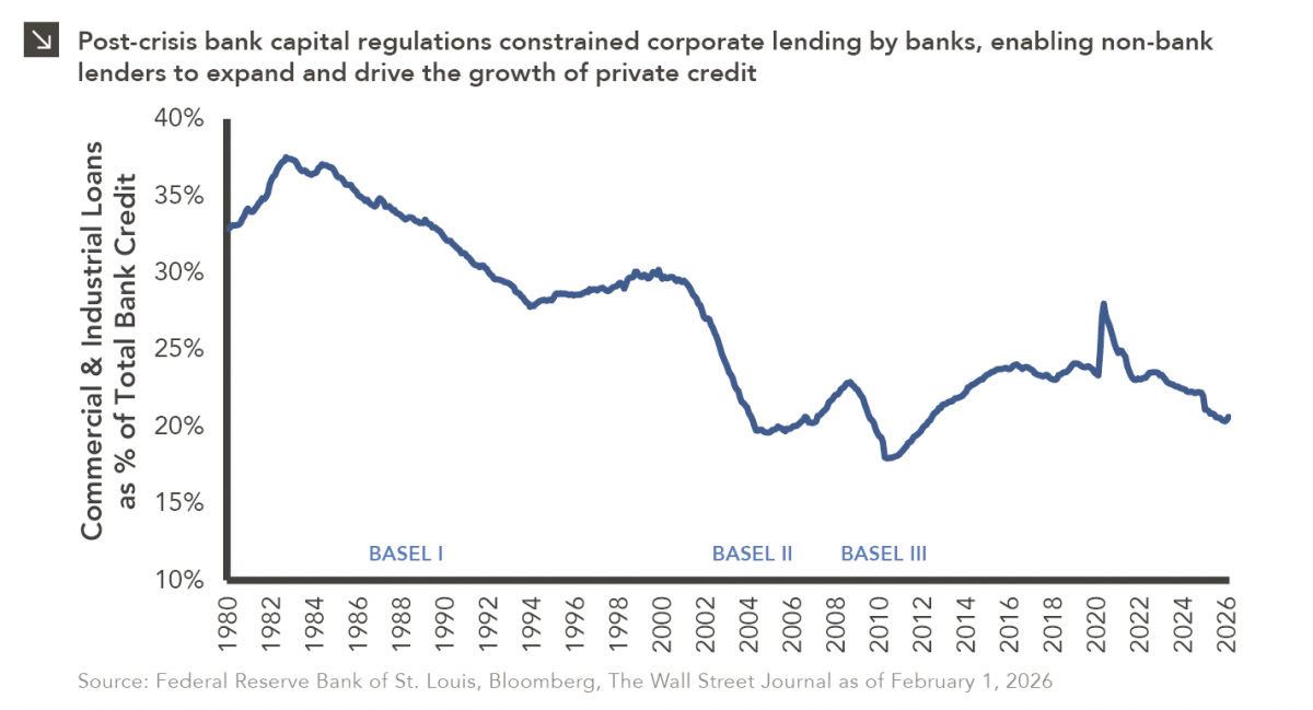
The Basel capital framework was created to ensure that banks maintain sufficient capital to absorb losses and reduce the risk…
Research alerts keep you updated on our latest research publications. Simply enter your contact information, choose the research alerts you would like to receive and click Subscribe. Alerts will be sent as research is published.
We respect your privacy. We will never share or sell your information.
If you have questions or need further information, please contact us directly and we will respond to your inquiry within 24 hours.
Contact Us >