04.27.2026
Let’s Hear It for Latin America
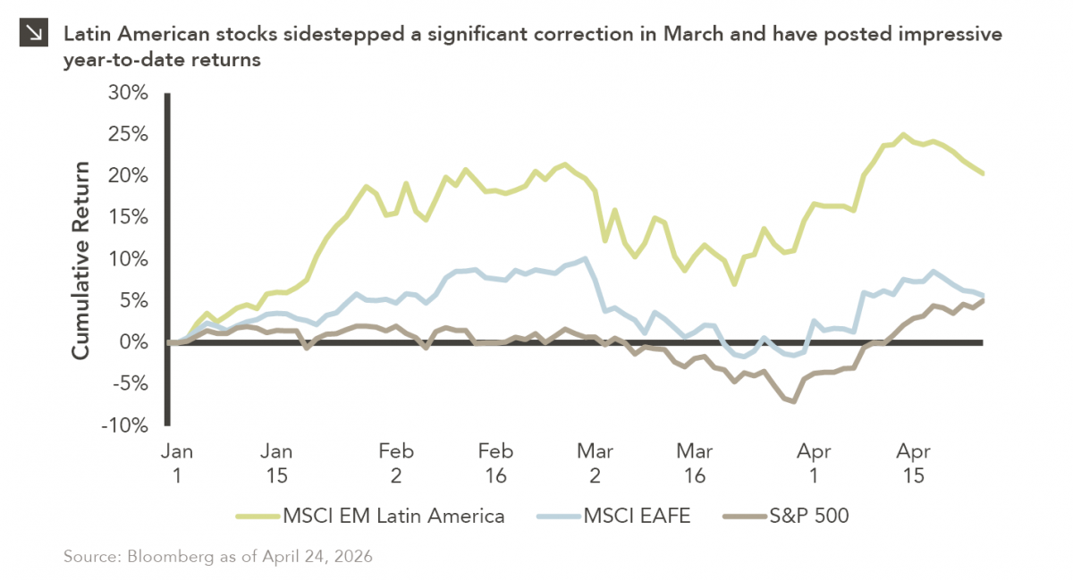
Latin American equity markets have shown remarkable strength in 2026. After a strong start to the year, the MSCI Emerging…


As January closes, it is not uncommon for New Year’s resolutions to go up in smoke; one publication has suggested that as many as 80% of commitments for change are gone come February.¹ Regardless, many such resolutions target weight loss in the New Year, and an obvious winner in this game would seem to be Weight Watchers. However, January’s performance for this stock appears surprisingly unrelated to news of increased subscribers. Instead, it appears that the influential figurehead Oprah Winfrey had an unanticipated — and unconventional — impact on Weight Watcher’s January performance.
Since Oprah took a 10% stake and joined the board of directors at Weight Watchers in late 2015, her $43 million investment has grown to exceed $400 million. Compare that 847% growth to the S&P’s 39% increase and the Oprah effect cannot be denied. Her powerful speech at the Golden Globes on January 7th incited social media to explode with excitement over a theorized 2020 run for the presidency. Weight Watchers shares jumped over 12% the Monday following her speech and an additional 9% the next day; the stock continued to climb through January, though this was likely due to more typical reasons such as the company’s strong growth outlook. Once news broke on the 25th that Oprah was officially not planning to run for president, shares tumbled 7% intraday and ended the month down 5% from their January peak.
An announcement from a board member regarding a lack of intent to run for president is certainly not a typical cause for a depression in stock price, and this situation is only a recent example of the growing importance of a company’s brand. Stock prices are no longer solely affected by their fundamentals; a seemingly unrelated blip in the news cycle can now blow up on social media and essentially override a company’s true fundamentals to impact its share price. While an event like this can be unpredictable, it forces management across all industries to have a stronger brand awareness, which is ultimately a good thing as it can lead to increased responsiveness to consumer feedback. As it relates to portfolio management, actively managed funds that can successfully account for this trend are more likely to outperform both their peers and respective indices. As capital markets unfold in 2018, this is a pattern that bears watching.
The opinions expressed herein are those of Marquette Associates, Inc. (“Marquette”), and are subject to change without notice. This material is not financial advice or an offer to purchase or sell any product. Marquette reserves the right to modify its current investment strategies and techniques based on changing market dynamics or client needs.
The opinions expressed herein are those of Marquette Associates, Inc. (“Marquette”), and are subject to change without notice. This material is not financial advice or an offer to purchase or sell any product. Marquette reserves the right to modify its current investment strategies and techniques based on changing market dynamics or client needs.

04.27.2026
Latin American equity markets have shown remarkable strength in 2026. After a strong start to the year, the MSCI Emerging…
04.23.2026
Diversify. Rebalance. Stay invested. Every one of these letters has concluded with that same advice in some shape or form….

04.20.2026
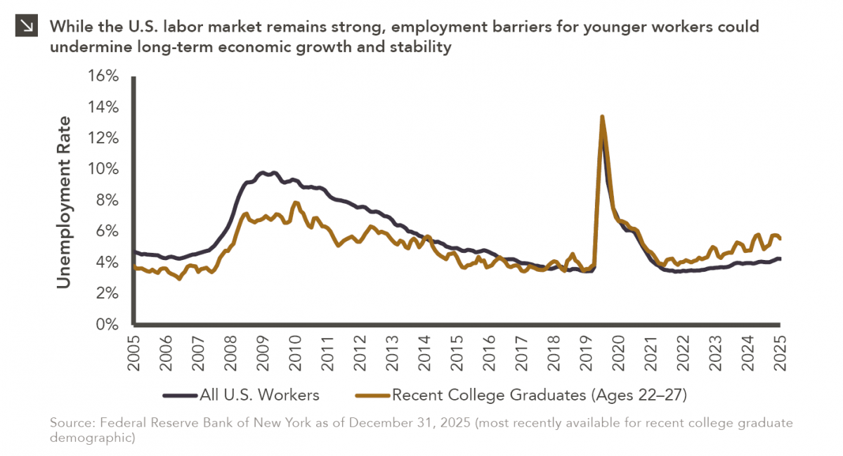
Entry-level jobs have traditionally served as the primary bridge between education and stable employment, offering young workers a foothold from…

04.13.2026
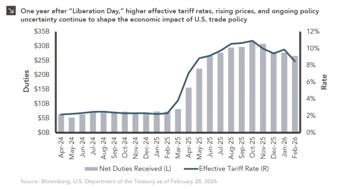
On April 2, 2025, President Donald Trump announced a sweeping set of tariffs on imports into the United States. Dubbed…
04.07.2026
On March 30, 2026, the Department of Labor (DOL) issued its proposed regulation: Fiduciary Duties in Selecting Designated Investment Alternatives….

04.06.2026
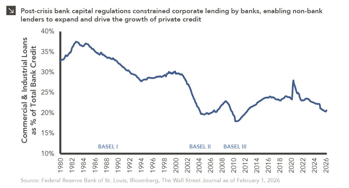
The Basel capital framework was created to ensure that banks maintain sufficient capital to absorb losses and reduce the risk…
Research alerts keep you updated on our latest research publications. Simply enter your contact information, choose the research alerts you would like to receive and click Subscribe. Alerts will be sent as research is published.
We respect your privacy. We will never share or sell your information.
If you have questions or need further information, please contact us directly and we will respond to your inquiry within 24 hours.
Contact Us >