Tom Salemy, CFA, CAIA
Partner


This week’s chart compares non-profit health care organizations’ (“HCOs”) cost of debt versus their size. The chart illustrates the financial characteristics of 630 HCOs divided into quartiles based on borrowing costs measured by option-adjusted spread1 (“OAS”). The HCOs examined show a wide dispersion of borrowing costs. Top quartile HCOs have an average OAS of 0.76%, while bottom quartile HCOs have an average OAS of 3.69%.
Looking at the data, there is a clear positive correlation between an HCO’s size, as defined by revenue and assets, and its OAS. Higher revenue and more assets appear to equate to lower borrowing costs. In addition to revenue and assets, average days cash-on-hand is a financial metric commonly used to assess HCOs financial health. The table illustrates that a higher days cash-on-hand metric typically, but not always, translates into lower borrowing costs.
It appears that while days cash-on-hand is an important determinant of an HCO’s financial health, an HCO’s size, as defined by revenue and assets, is the primary determinant of borrowing costs. If size continues to be the main determinant of HCOs borrowing costs, we would expect to see smaller HCOs continue to merge with larger peers.
1The option adjusted spread is the spread over U.S. Treasuries that would discount a bond’s future cash flows back to its current price.

The opinions expressed herein are those of Marquette Associates, Inc. (“Marquette”), and are subject to change without notice. This material is not financial advice or an offer to purchase or sell any product. Marquette reserves the right to modify its current investment strategies and techniques based on changing market dynamics or client needs.
10.19.2026
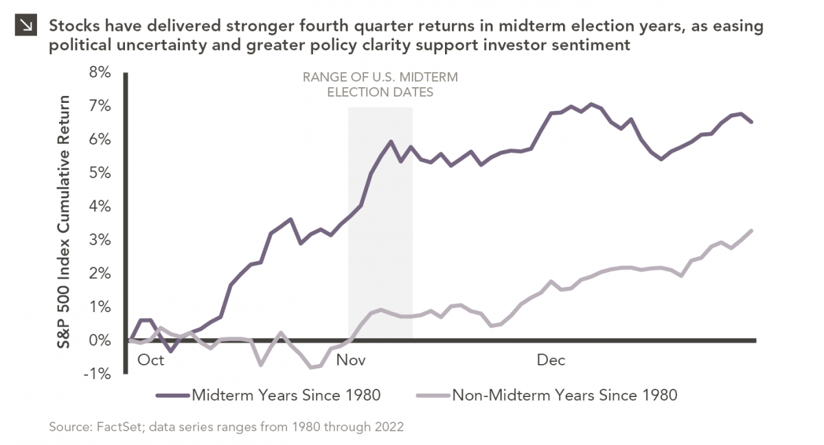
Since 1980, the S&P 500 Index has generally performed well in the weeks surrounding U.S. midterm elections. Specifically, the index…

10.12.2026
This week’s chart highlights the accelerating growth of electricity demand in the U.S., which has been driven primarily by the…

10.05.2026
For investors, the spookiest thing about October might not be the ghosts and monsters that are bound to show up…

09.28.2026
The phrase “expectations of higher inflation” has become a staple in financial news to explain the increase in nominal U.S….

09.21.2026
For much of the past several years, the conventional view has been that higher interest rates and stretched valuations would…

09.14.2026
There are many great things about working at Marquette Associates, but “Free Lunch Tuesday” is right at the top of…
Research alerts keep you updated on our latest research publications. Simply enter your contact information, choose the research alerts you would like to receive and click Subscribe. Alerts will be sent as research is published.
We respect your privacy. We will never share or sell your information.
If you have questions or need further information, please contact us directly and we will respond to your inquiry within 24 hours.
Contact Us >