07.07.2026
2026 Halftime Market Insights Webinar
JULY 23 — 1:00pm CT Please join Marquette’s research team for our 2026 Halftime Market Insights Webinar…
Recent events have raised investors’ concerns about how much runway we have left for a risk-on fixed income portfolio. First, the ECB made an unprecedented move towards negative deposit rates for banks to deposit funds with the central bank, thereby incentivizing more lending with the aim of further stimulating Europe’s economy and containing the risk of deflation. Second, while the Fed maintains its dovish stance, swaps indicate that the market anticipates Yellen to raise rates by July 2015. Third, the TXU bankruptcy’s $20 billion in defaulted loans increased the bank loan default rate to 4.64%, but it is expected to drop back to the 1% to 2% average next quarter. Lastly, as of May 2014, 2nd lien bank loans were 4.58% of all bank loans outstanding, which for the first time since the housing bubble is above the long-term average (since January 2004) of 4.51%.
This week’s chart explores high yield bond issuance ratings and use of proceeds as indicators of where we are in the credit cycle.
The lowest quality bonds, CCC-rated, reached a peak of 32.9% as a percentage of all high yield issues in 2007, just before the housing bubble burst. For the first quarter of 2014, this figure was only 15.2%, roughly at 2004 levels. This segment of the capital-raising pipeline is very telling because it shows whether there is an atypical amount of the most speculative rated companies accessing capital to meet the demand of investors reaching for yield, which was the case in 2007. Based on the current data, this trend does not appear to be resurfacing.
Another key insight can be gleaned from how the proceeds of newly issued high yield bonds are used. More specifically, the greater the amount of proceeds used for LBOs (as opposed to less risky actions such as refinancing debt or repurchasing equity), the more heated the market. LBOs as a percentage of new high yield issues reached a peak of 33.7% in 2007, just before the housing bubble burst. However, the same data point was only 2.6% for the first quarter of 2014, which equates to 2003 levels.
Collectively, these two metrics peaked before spreads blew out during the 2008 credit crisis and deserve careful observation as the credit rally continues. Fortunately, based on current levels, they indicate that we have perhaps another few years to go before another major market correction.
The opinions expressed herein are those of Marquette Associates, Inc. (“Marquette”), and are subject to change without notice. This material is not financial advice or an offer to purchase or sell any product. Marquette reserves the right to modify its current investment strategies and techniques based on changing market dynamics or client needs.

07.07.2026
JULY 23 — 1:00pm CT Please join Marquette’s research team for our 2026 Halftime Market Insights Webinar…

07.06.2026
Since traditional exit routes have remained constrained in recent years due to higher interest rates, valuation gaps, and a subdued…

06.29.2026
This week’s chart highlights the varying return profiles across key infrastructure sectors by illustrating the split between income and capital…

06.22.2026
When Benchmark, one of Silicon Valley’s most renowned early-stage venture capital firms, closed $2 billion across two new funds this…

06.15.2026
The rapid buildout of artificial intelligence infrastructure is reshaping the U.S. investment landscape. According to recent Census Bureau data, spending…
06.08.2026
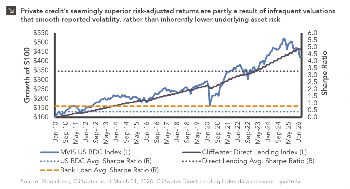
Hi, James Torgerson here! Volatility can be an unsightly blemish on portfolios and lead to inferior risk-adjusted returns. Private credit…
Research alerts keep you updated on our latest research publications. Simply enter your contact information, choose the research alerts you would like to receive and click Subscribe. Alerts will be sent as research is published.
We respect your privacy. We will never share or sell your information.
If you have questions or need further information, please contact us directly and we will respond to your inquiry within 24 hours.
Contact Us >