10.08.2026
3Q 2026 Market Insights
This video is a recording of a live webinar held October 22 by Marquette’s research team analyzing the third quarter…


As bond yields are much higher today than they were only three years ago due to nine Federal Reserve rate hikes since the Great Recession, fixed income investors are encouraged by the higher yields that are expected to produce higher returns in the future. The Fed’s nine rate hikes, having raised the fed funds rate from the range of 0.00%–0.25% only three years ago to 2.25%–2.50% today, are expected to provide a general boost to annualized bond returns over the next five years.
Our chart of the week looks at the relationship between current yields in the bond markets and the expected future annualized returns for the next five years. We focus on the Bloomberg Barclays Aggregate Index (“Agg”) as that is the most common bond benchmark used by investors. The chart plots the starting yield of the Agg over the last five decades, from the 1970s to today, on the x-axis. The y-axis then shows the corresponding annualized returns of the Agg over the next five years.
We can see that there is a very linear relationship: the higher the yields at each starting point, the higher the returns for the next five years. As rates declined from the 1980s through the 1990s and 2000s to today in the 2010s, this relationship held true. There are a few outliers in the 1970s, however, as the Federal Reserve under Volcker at the time hiked rates to counter stagflation. But excluding some of these outliers in the 1970s, the chart shows a very strong linear association that higher returns over the next five years are a direct result of higher rates today.
There are secular forces at play, particularly the rising retirement trend across the world’s most powerful economies (Japan, China, U.S., and Europe) that may keep our current low-rate “new neutral” phenomenon a persistent reality for some time. However, the countering forces are new technologies that provide for more productivity. On the balance, fixed income investors are expected to benefit from generally stronger annualized returns over the next five years versus the last 10 years since the Great Recession.
Print PDF > Higher Yields, Higher Returns
The opinions expressed herein are those of Marquette Associates, Inc. (“Marquette”), and are subject to change without notice. This material is not financial advice or an offer to purchase or sell any product. Marquette reserves the right to modify its current investment strategies and techniques based on changing market dynamics or client needs.
The opinions expressed herein are those of Marquette Associates, Inc. (“Marquette”), and are subject to change without notice. This material is not financial advice or an offer to purchase or sell any product. Marquette reserves the right to modify its current investment strategies and techniques based on changing market dynamics or client needs.

10.08.2026
This video is a recording of a live webinar held October 22 by Marquette’s research team analyzing the third quarter…

10.22.2026
Anyone who has run a marathon knows the last six miles are brutal — no matter how well the first…
10.19.2026
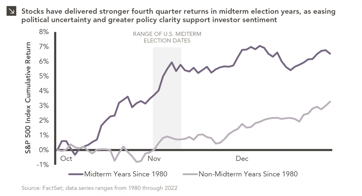
Since 1980, the S&P 500 Index has generally performed well in the weeks surrounding U.S. midterm elections. Specifically, the index…

10.12.2026
This week’s chart highlights the accelerating growth of electricity demand in the U.S., which has been driven primarily by the…

10.05.2026
For investors, the spookiest thing about October might not be the ghosts and monsters that are bound to show up…

09.28.2026
The phrase “expectations of higher inflation” has become a staple in financial news to explain the increase in nominal U.S….
Research alerts keep you updated on our latest research publications. Simply enter your contact information, choose the research alerts you would like to receive and click Subscribe. Alerts will be sent as research is published.
We respect your privacy. We will never share or sell your information.
If you have questions or need further information, please contact us directly and we will respond to your inquiry within 24 hours.
Contact Us >