Nat Kellogg, CFA
President
This week’s chart of the week looks at the growth in mid-west farmland prices. Our chart shows the increase in farmland prices in Illinois, Indiana, Iowa and the Federal Reserve 7th District, which includes all three of these states. While this may surprise many investors, mid-west farmland has been one of the best performing investments over the last decade, up 12.3% annually. Higher crop prices and a shrinking supply of available high quality farmland drove this increase in farmland prices. Since both of these trends seem likely to persist into the future, institutional investors have begun to invest in farmland to take advantage of these trends. However, as our chart shows, the other driver of higher prices has been the persistent fall in interest rates which lowers the carrying costs (i.e. interest payments) of owning farmland for both farmers and investors. Given the recent rise in interest rates over the last few months it seems reasonable to question if farmland prices can continue their upward trajectory without the benefit of further reductions in interest rates.

The opinions expressed herein are those of Marquette Associates, Inc. (“Marquette”), and are subject to change without notice. This material is not financial advice or an offer to purchase or sell any product. Marquette reserves the right to modify its current investment strategies and techniques based on changing market dynamics or client needs.

07.06.2026
Since traditional exit routes have remained constrained in recent years due to higher interest rates, valuation gaps, and a subdued…

06.29.2026
This week’s chart highlights the varying return profiles across key infrastructure sectors by illustrating the split between income and capital…
06.25.2026
Commodities represent a unique asset class within global financial markets. Like equities and bonds, commodity prices are influenced by the…

06.22.2026
When Benchmark, one of Silicon Valley’s most renowned early-stage venture capital firms, closed $2 billion across two new funds this…

06.15.2026
The rapid buildout of artificial intelligence infrastructure is reshaping the U.S. investment landscape. According to recent Census Bureau data, spending…
06.08.2026
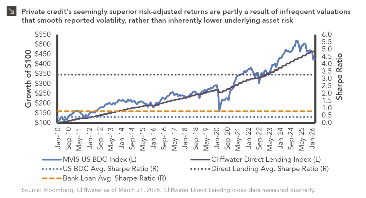
Hi, James Torgerson here! Volatility can be an unsightly blemish on portfolios and lead to inferior risk-adjusted returns. Private credit…
Research alerts keep you updated on our latest research publications. Simply enter your contact information, choose the research alerts you would like to receive and click Subscribe. Alerts will be sent as research is published.
We respect your privacy. We will never share or sell your information.
If you have questions or need further information, please contact us directly and we will respond to your inquiry within 24 hours.
Contact Us >