04.23.2026
We’ve Seen This Before
Diversify. Rebalance. Stay invested. Every one of these letters has concluded with that same advice in some shape or form….


Wage growth continues to be one of the most disappointing parts of the recovery as increases in pay are relatively low despite record levels of employment. However, the growth individuals see can vary significantly. This week’s chart shows how $1000 five years ago would have grown under the different quartiles of wage growth, as well as how costs have increased under inflation. Given the low levels of inflation in recent years, it is of little surprise that costs have not changed much, rising just over 6.5% during this time frame. Workers whose raises were consistent with median wage growth gained an extra $150 for every $1000 earned in 2012, which was enough to beat inflation and increase their purchasing power.
What is most notable though, is that those who received the 75th percentile for wage growth nearly doubled their pay, while individuals at the 25th percentile lost more than 10% before inflation. It is important to consider that many workers will not consistently be at one end or another of the spectrum; a promotion one year could put an individual in the top quartile, while the loss of an important customer could move them to the bottom the next. Still, this shines some light on the different scenarios workers are facing as a quarter of the population lost about 2% or more of their income this past year, while another gained over 14%.
Although it seems like this gives some credence to the complaints about rising inequality, it should be noted that the biggest determinant of wage growth is age. Younger workers just starting out their careers saw the largest raises with those age 16–24 gaining almost 8% this year on average, compared to just 2% for those 55 and older. Not surprisingly, those with higher skills and better education also fared better on average. The industry in which a person works is less important than one might expect, with most sectors having a growth rate between 3–4%. Ultimately, given the wide range of wage growth rates this could affect increases in consumer spending with those on the lower end of the spectrum not able to increase their spending habits. Spending growth is more dependent on those who experience larger gains and if they choose to start saving more, economic growth could suffer.
The opinions expressed herein are those of Marquette Associates, Inc. (“Marquette”), and are subject to change without notice. This material is not financial advice or an offer to purchase or sell any product. Marquette reserves the right to modify its current investment strategies and techniques based on changing market dynamics or client needs.
04.23.2026
Diversify. Rebalance. Stay invested. Every one of these letters has concluded with that same advice in some shape or form….

04.20.2026
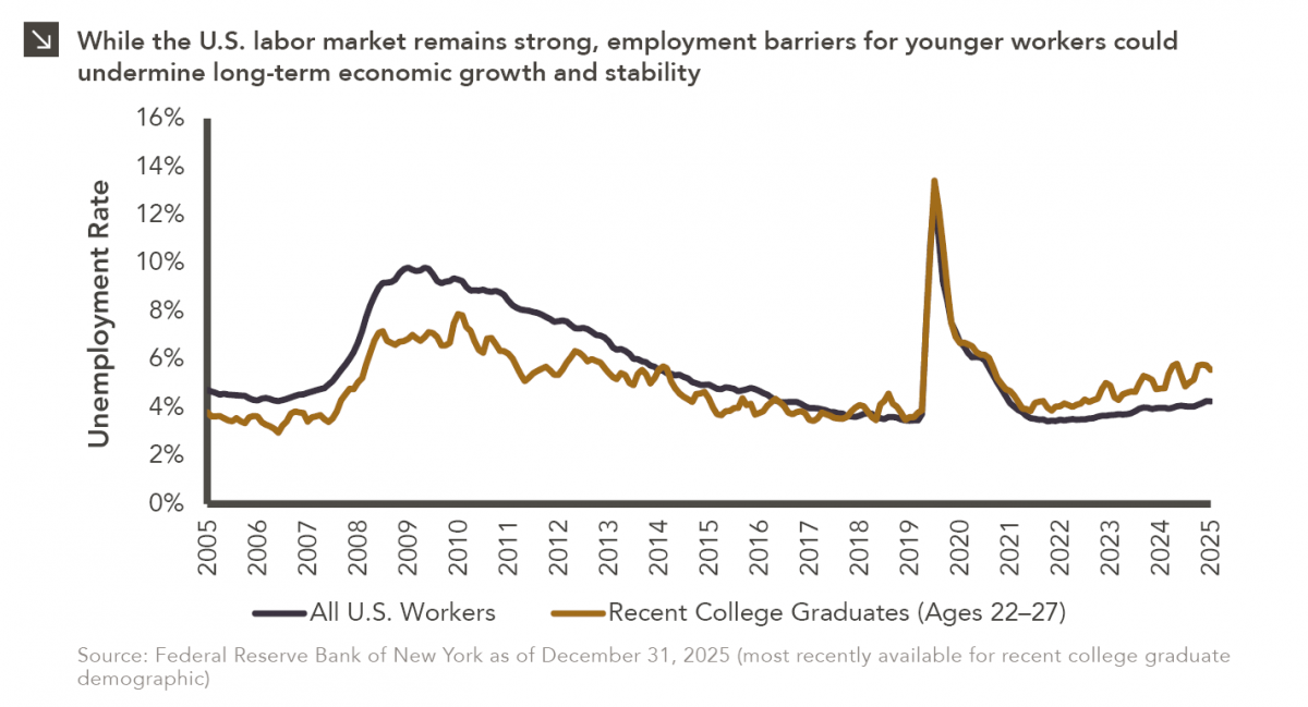
Entry-level jobs have traditionally served as the primary bridge between education and stable employment, offering young workers a foothold from…

04.13.2026
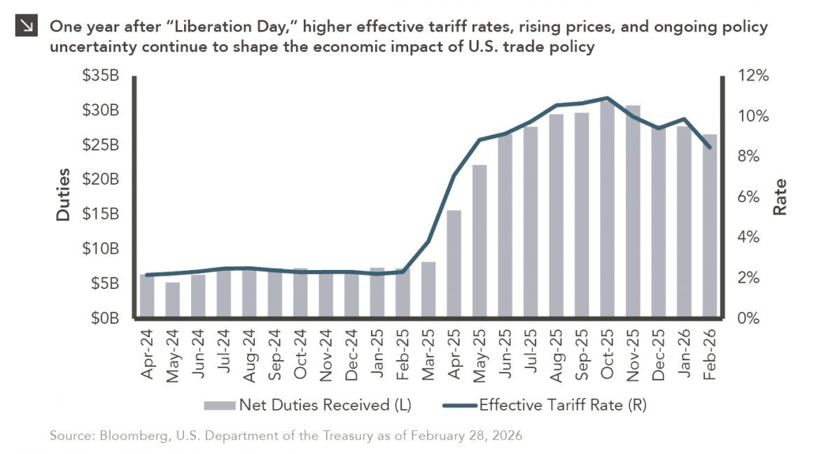
On April 2, 2025, President Donald Trump announced a sweeping set of tariffs on imports into the United States. Dubbed…
04.07.2026
On March 30, 2026, the Department of Labor (DOL) issued its proposed regulation: Fiduciary Duties in Selecting Designated Investment Alternatives….

04.06.2026
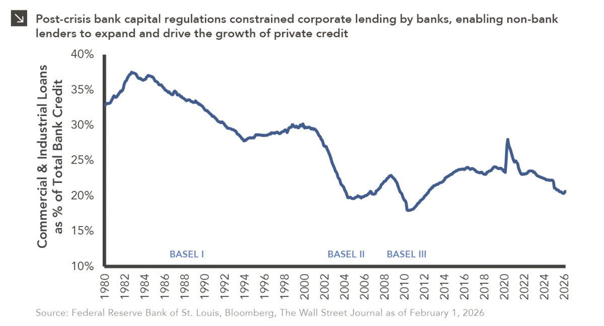
The Basel capital framework was created to ensure that banks maintain sufficient capital to absorb losses and reduce the risk…

04.02.2026
This video is a recording of a live webinar held April 16 by Marquette’s research team analyzing the first quarter…
Research alerts keep you updated on our latest research publications. Simply enter your contact information, choose the research alerts you would like to receive and click Subscribe. Alerts will be sent as research is published.
We respect your privacy. We will never share or sell your information.
If you have questions or need further information, please contact us directly and we will respond to your inquiry within 24 hours.
Contact Us >