05.07.2026
The Fed Tackles Succession Planning
The leadership structure of the Federal Reserve is intentionally designed to promote continuity, independence, and institutional stability across political cycles….

The total amount of student loans outstanding has grown from approximately $500 billion in 2006 to $1.3 trillion at the end of 2014. Of the $1.3 trillion in student loans outstanding, approximately $1.1 trillion are either direct loans from the U.S. Department of Education or outstanding loans from the now terminated Federal Family Education Loans Program (FFEL). The remaining $190 billion can be attributed to private loans.
There are several reasons that have contributed to the rise in the amount of student loans outstanding: overall college/advanced degree enrollment has increased over the past decade, cost of higher education has increased, graduates pre-recession have had a difficult time repaying their obligations, and as a result of the recession, students are relying on financial aid more heavily.
This week’s chart illustrates the portfolio of direct and FFEL loans by their loan status at the end of 2014. We focus on the categories described as Deferment, Forbearance, Default, and Other (see glossary below). These categories represent over 30% of the loan portfolio and are considered the highest risk categories because payments have been postponed, suspended, or ceased completely.
The pace of the economic recovery has been muted for a multitude of reasons; however, the overwhelming student debt load that has accumulated over the past decade has only exacerbated the problem. Studies have shown that people with student loans are less likely to start businesses of their own, which leads to less job creation and investment. Young Americans are delaying marriage and household formation which leads to a decrease in consumption. Additionally, holders of student debt are delaying the purchase of their first home.
It’s difficult to say if the recession and increase in student loans is a cause and effect relationship or vice versa, but most Americans can agree that some reform is necessary with regard to the cost of tuition or the cost of debt. If neither is addressed, we may continue to see the high risk categories discussed earlier increase as a percentage of debt outstanding, thus further depressing economic growth.
Glossary:
In-School – Includes loans that have never entered repayment as a result of the borrower’s enrollment in school.
Grace – Includes loans that have entered a six-month grace period after the borrower is no longer enrolled in school at least half-time. Borrowers are not expected to make payments during grace.
Repayment – Includes loans that are in an active repayment status.
Deferment – Includes loans in which payments have been postponed as a result of certain circumstances such as returning to school, military service, or economic hardship.
Forbearance – Includes loans in which payments have been temporarily suspended or reduced as a result of certain types of financial hardships.
Default – Includes loans that are more than 360 days delinquent.
Other – Includes loans that are in non-defaulted bankruptcy and in a disability status.
The opinions expressed herein are those of Marquette Associates, Inc. (“Marquette”), and are subject to change without notice. This material is not financial advice or an offer to purchase or sell any product. Marquette reserves the right to modify its current investment strategies and techniques based on changing market dynamics or client needs.
05.07.2026
The leadership structure of the Federal Reserve is intentionally designed to promote continuity, independence, and institutional stability across political cycles….

05.04.2026
Rooted in medieval Persian Sufi thought, the adage “this too shall pass” speaks to the fleeting and impermanent nature of…

04.27.2026
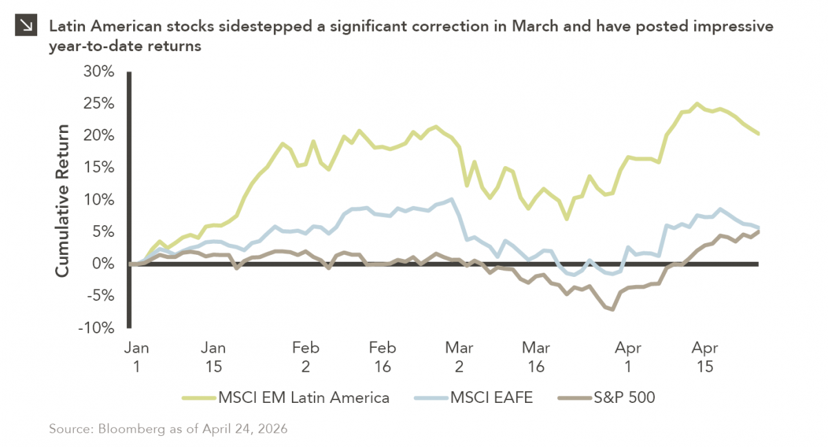
Latin American equity markets have shown remarkable strength in 2026. After a strong start to the year, the MSCI Emerging…
04.23.2026
Diversify. Rebalance. Stay invested. Every one of these letters has concluded with that same advice in some shape or form….

04.20.2026
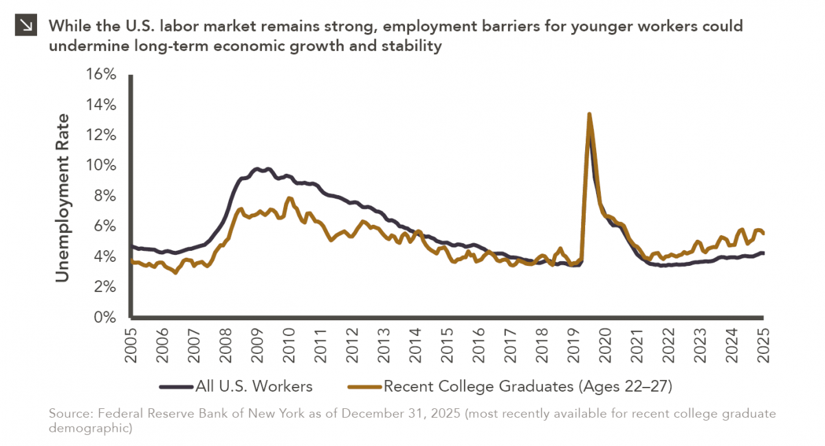
Entry-level jobs have traditionally served as the primary bridge between education and stable employment, offering young workers a foothold from…

04.13.2026
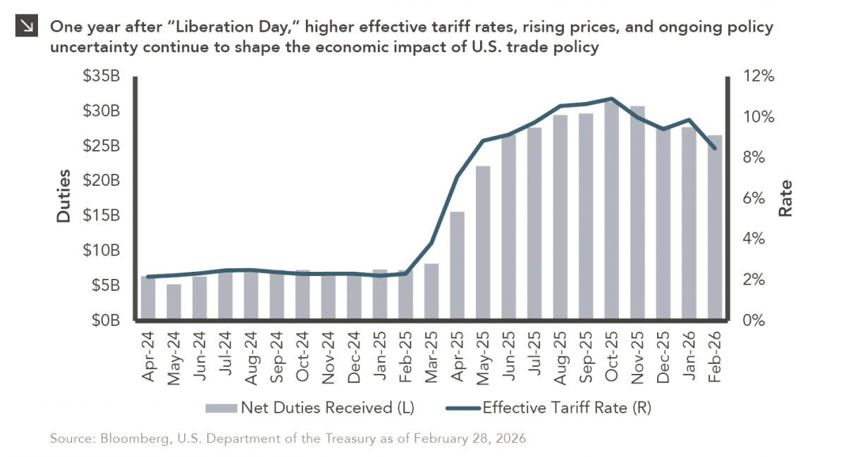
On April 2, 2025, President Donald Trump announced a sweeping set of tariffs on imports into the United States. Dubbed…
Research alerts keep you updated on our latest research publications. Simply enter your contact information, choose the research alerts you would like to receive and click Subscribe. Alerts will be sent as research is published.
We respect your privacy. We will never share or sell your information.
If you have questions or need further information, please contact us directly and we will respond to your inquiry within 24 hours.
Contact Us >