Mike Spychalski, CAIA
Vice President


This week’s chart of the week looks at the recent drop in South Korean exports, which fell by 14.7% in the 12 months ending August 31. South Korean exports have historically been a reliable and early indicator of the state of global trade, so much so that they have earned the nickname, the “canary in the coal mine” of the global economy. This is largely due to the fact that South Korean exports are a diversified mix of raw materials (such as oil, iron, and steel), intermediate goods (such as semiconductors and machine parts), and finished goods (such as cars, ships, and consumer electronics), as well as the fact that South Korea exports goods to both developed and emerging markets.
The fact that exports dropped by 14.7% in August (the largest drop since August 2009) is notable, especially considering that the consensus forecast was for a decrease of 5.9%. Even more concerning, this was the eighth consecutive month in which exports contracted. Since 1970, every prolonged drop in South Korean exports (defined as at least six consecutive monthly declines) has coincided with a material slowdown in the global economy. This was witnessed during the oil crisis of the mid-1970s, the Asian financial crisis of the late-1990s, the bursting of the tech bubble in the early-2000s, as well as the financial crisis of 2008.
While it is too soon to tell if the canary in the coal mine is accurately predicting trouble on the horizon, this prolonged drop in exports is clearly concerning. However, there are a few factors that could be causing this signal to be a false alarm this time around. For one, exports to China (currently representing about 25% of all South Korean exports) are a greater share of exports than they have been historically, so the slowdown in China is having a larger impact on exports than in the past. In addition, the steep plunge in commodity prices over the past year has had a major impact on South Korea’s exports of oil products, petrochemicals, as well as iron and steel. These three export sectors, which represent 6.4%, 7.3%, and 6.1% of all South Korean exports respectively, have seen the largest declines of any major sector, declining 40.3%, 25.7%, and 17.4% respectively.
The opinions expressed herein are those of Marquette Associates, Inc. (“Marquette”), and are subject to change without notice. This material is not financial advice or an offer to purchase or sell any product. Marquette reserves the right to modify its current investment strategies and techniques based on changing market dynamics or client needs.

04.27.2026
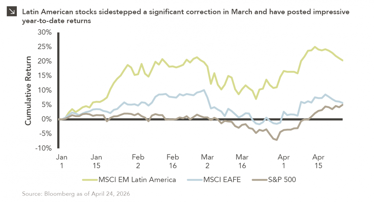
Latin American equity markets have shown remarkable strength in 2026. After a strong start to the year, the MSCI Emerging…
04.23.2026
Diversify. Rebalance. Stay invested. Every one of these letters has concluded with that same advice in some shape or form….

04.20.2026
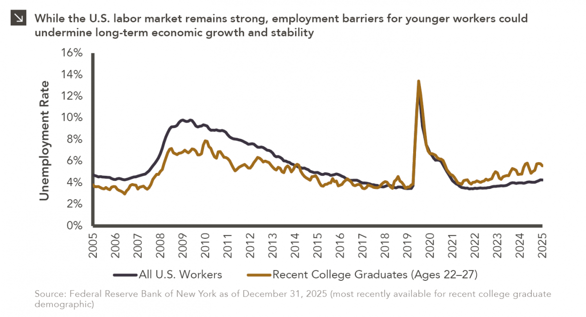
Entry-level jobs have traditionally served as the primary bridge between education and stable employment, offering young workers a foothold from…

04.13.2026
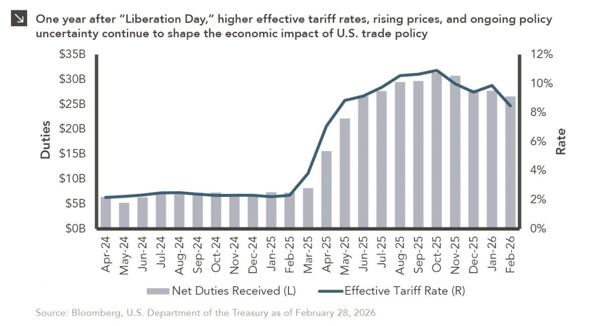
On April 2, 2025, President Donald Trump announced a sweeping set of tariffs on imports into the United States. Dubbed…

04.06.2026
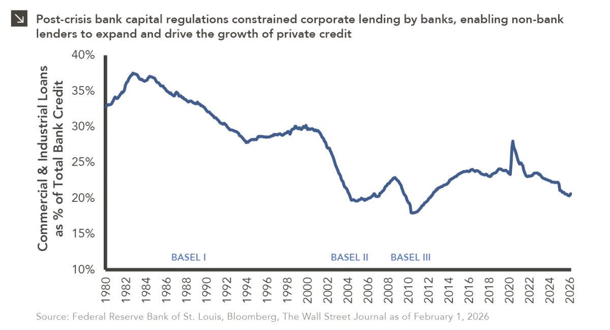
The Basel capital framework was created to ensure that banks maintain sufficient capital to absorb losses and reduce the risk…

04.02.2026
This video is a recording of a live webinar held April 16 by Marquette’s research team analyzing the first quarter…
Research alerts keep you updated on our latest research publications. Simply enter your contact information, choose the research alerts you would like to receive and click Subscribe. Alerts will be sent as research is published.
We respect your privacy. We will never share or sell your information.
If you have questions or need further information, please contact us directly and we will respond to your inquiry within 24 hours.
Contact Us >