04.27.2026
Let’s Hear It for Latin America
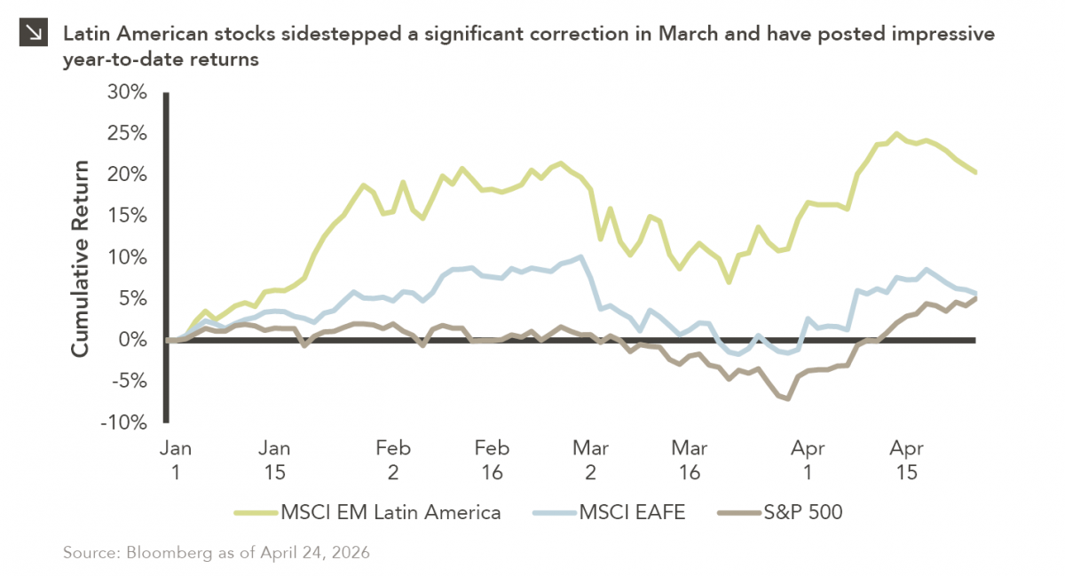
Latin American equity markets have shown remarkable strength in 2026. After a strong start to the year, the MSCI Emerging…


With the steady stream of negative economic data, record-shattering unemployment figures, and ballooning government deficits, it has been hard to reconcile whether there is light at the end of the COVID-19 tunnel. This is coupled with the markets’ shrug-off of these gloomy figures, thus far, as we see daily green-shoots. The general expectation that we have a tough slog ahead until a vaccine is widely available has led some investors to “wait it out” on the sidelines.
This week’s chart brings attention to a flickering bright spot for investors, society, and the planet at large: the resiliency and relative outperformance of clean energy during this pandemic. The energy sector has been rocked by limited demand (due to the broad economic shutdown) and an oversupply of crude oil (caused by OPEC and Russia locking horns on price). And as shown, the global energy sector has careened downward, posting a YTD return of -37.1% through May 12th. However, if we include only those companies that embrace alternative energy, one can see that they not only have outperformed their oil-dependent peers but have also outpaced the broader market, posting -5.1% YTD return. These renewable energy and infrastructure producers are benefitting from increased demand, technological innovation, lower cost of capital, and potential expansion of tax credits (for wind and solar power), while not having their chief input dictated by oil price fluctuations.
While it would be irrational to believe that the world will unanimously cut oil consumption and usage immediately post pandemic, there are compelling arguments that our “new normal” will be more accepting of electric grid expansion and increased usage of renewable energy sources. In the U.S., we are likely still in the early innings of a multi-decade energy disruption, while developed countries within Europe and Canada are approaching the seventh inning stretch. The clean energy sector, which has been touted by the environmentally conscious crowd for years, is showing a level of resiliency that all investors should take note of.
Print PDF > It’s Not Bad News for All Energy Stocks
The opinions expressed herein are those of Marquette Associates, Inc. (“Marquette”), and are subject to change without notice. This material is not financial advice or an offer to purchase or sell any product. Marquette reserves the right to modify its current investment strategies and techniques based on changing market dynamics or client needs.

04.27.2026
Latin American equity markets have shown remarkable strength in 2026. After a strong start to the year, the MSCI Emerging…
04.23.2026
Diversify. Rebalance. Stay invested. Every one of these letters has concluded with that same advice in some shape or form….

04.20.2026
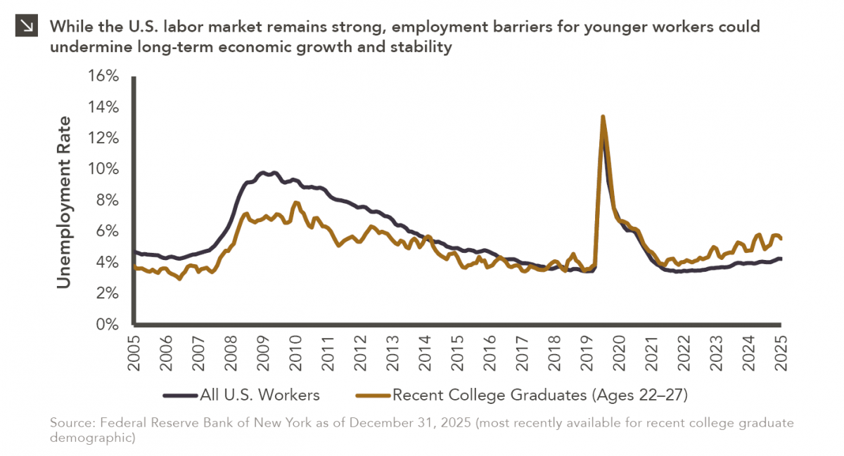
Entry-level jobs have traditionally served as the primary bridge between education and stable employment, offering young workers a foothold from…

04.13.2026
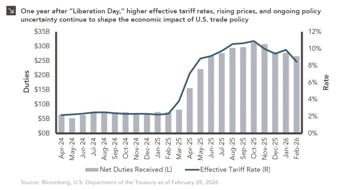
On April 2, 2025, President Donald Trump announced a sweeping set of tariffs on imports into the United States. Dubbed…
04.07.2026
On March 30, 2026, the Department of Labor (DOL) issued its proposed regulation: Fiduciary Duties in Selecting Designated Investment Alternatives….

04.06.2026
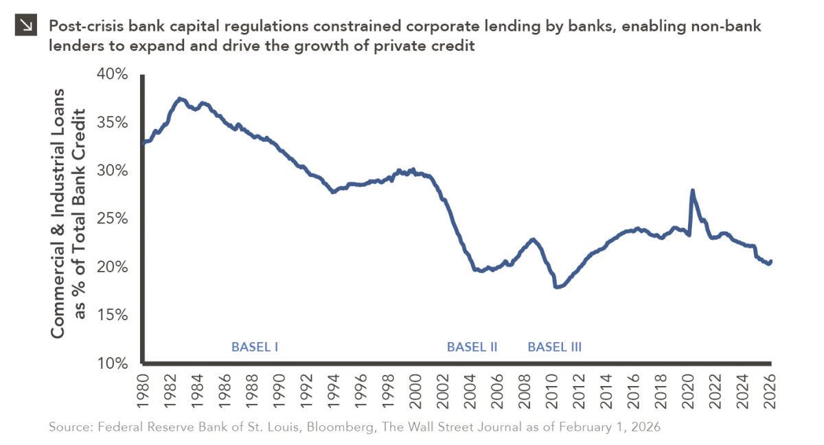
The Basel capital framework was created to ensure that banks maintain sufficient capital to absorb losses and reduce the risk…
Research alerts keep you updated on our latest research publications. Simply enter your contact information, choose the research alerts you would like to receive and click Subscribe. Alerts will be sent as research is published.
We respect your privacy. We will never share or sell your information.
If you have questions or need further information, please contact us directly and we will respond to your inquiry within 24 hours.
Contact Us >