Evan Frazier, CFA, CAIA
Senior Research Analyst


While overall fundamentals for U.S. equity benchmarks have remained mostly resilient this year amid a painful repricing of risk assets, earnings growth has actually been concentrated in just a few areas of the market. The blended year-over-year earnings growth rate for the S&P 500 index during the third quarter of 2022 is 2.2% (with roughly half of companies reporting at the time of this writing), though only four sectors of the index have reported growth in earnings for the period. The Energy space stands out especially among these sectors, with its earnings up a massive 134% year-over-year amid strong demand for natural resources and continued commodity price inflation. Were the sector to be excluded from the S&P 500 index, earnings for the benchmark would be down 5.1% on a year-over-year basis, despite the fact that Energy accounts for less than 6.0% of the index. This trend is expected to continue into the fourth quarter, during which total earnings growth for the index is expected to be roughly 0.5%, with a decline of 3.5% excluding the Energy sector. For the full calendar year, S&P 500 index earnings are expected to grow 6.1% and decline 0.6% without Energy stocks.
Examining data below the index level is always important when assessing the health of equity markets and company fundamentals. To that point, simply looking at earnings figures for the S&P 500 index in aggregate obscures the fact that growth-oriented spaces of the benchmark like Communication Services and Information Technology, which are expected to post year-over-year earnings declines of 22.2% and 2.1% in the third quarter, respectively, are experiencing significant headwinds amid ongoing interest rate and inflationary pressures. These trends, however, are expected to reverse beginning in the second quarter of next year when, against tough compares, the Energy space is projected to become a detractor to overall earnings growth for the S&P 500 index while the rest of the benchmark grows earnings at a positive rate. With all of this in mind, investors should continue to employ a prudent approach to diversification across asset classes, geographies, and economic sectors, which will help position portfolios for success as market leadership rotates.
Print PDF > Keeping the Lights On
The opinions expressed herein are those of Marquette Associates, Inc. (“Marquette”), and are subject to change without notice. This material is not financial advice or an offer to purchase or sell any product. Marquette reserves the right to modify its current investment strategies and techniques based on changing market dynamics or client needs.
05.04.2026
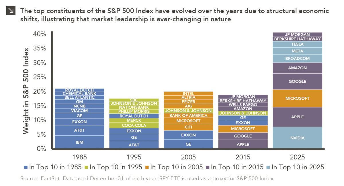
Rooted in medieval Persian Sufi thought, the adage “this too shall pass” speaks to the fleeting and impermanent nature of…
04.27.2026
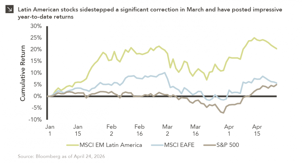
Latin American equity markets have shown remarkable strength in 2026. After a strong start to the year, the MSCI Emerging…
04.23.2026
Diversify. Rebalance. Stay invested. Every one of these letters has concluded with that same advice in some shape or form….
04.20.2026
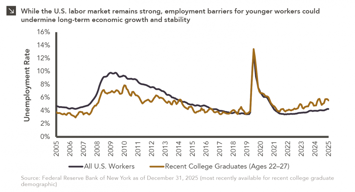
Entry-level jobs have traditionally served as the primary bridge between education and stable employment, offering young workers a foothold from…
04.13.2026
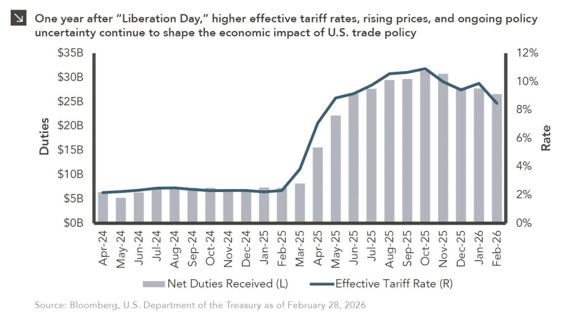
On April 2, 2025, President Donald Trump announced a sweeping set of tariffs on imports into the United States. Dubbed…
04.06.2026
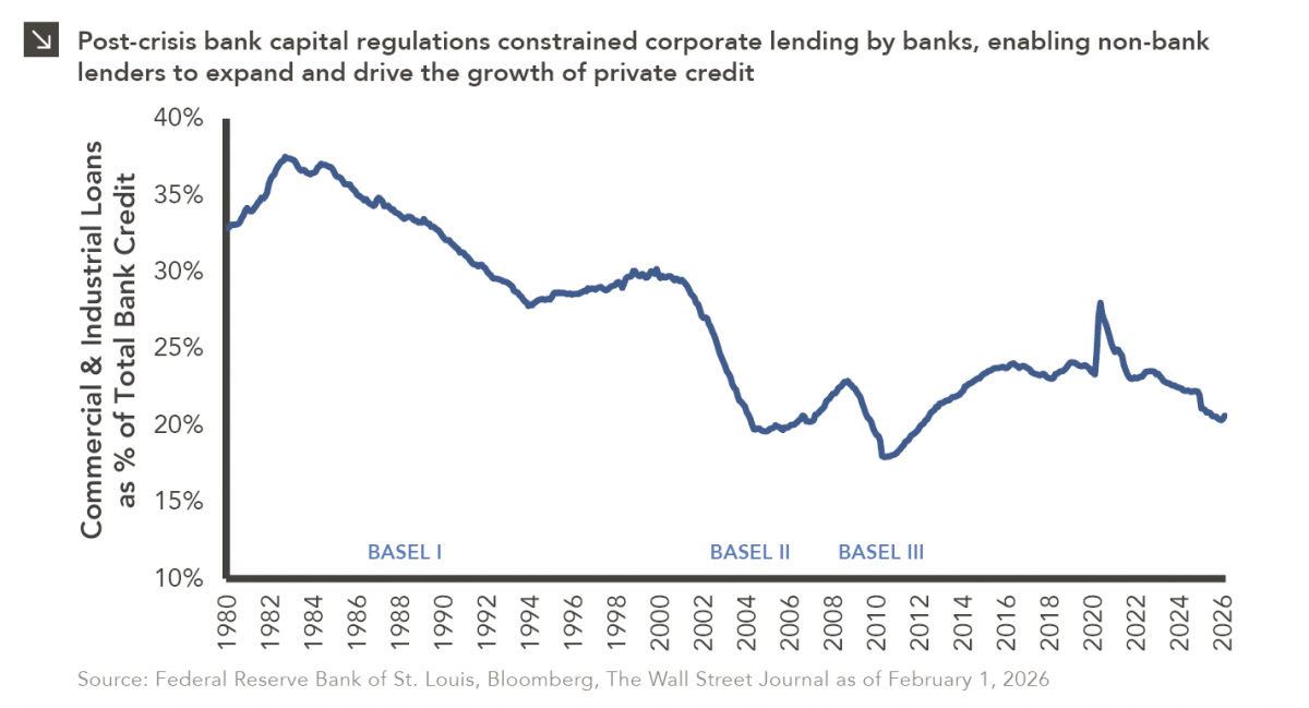
The Basel capital framework was created to ensure that banks maintain sufficient capital to absorb losses and reduce the risk…
Research alerts keep you updated on our latest research publications. Simply enter your contact information, choose the research alerts you would like to receive and click Subscribe. Alerts will be sent as research is published.
We respect your privacy. We will never share or sell your information.
If you have questions or need further information, please contact us directly and we will respond to your inquiry within 24 hours.
Contact Us >