07.27.2026
Liquidity Isn’t Free
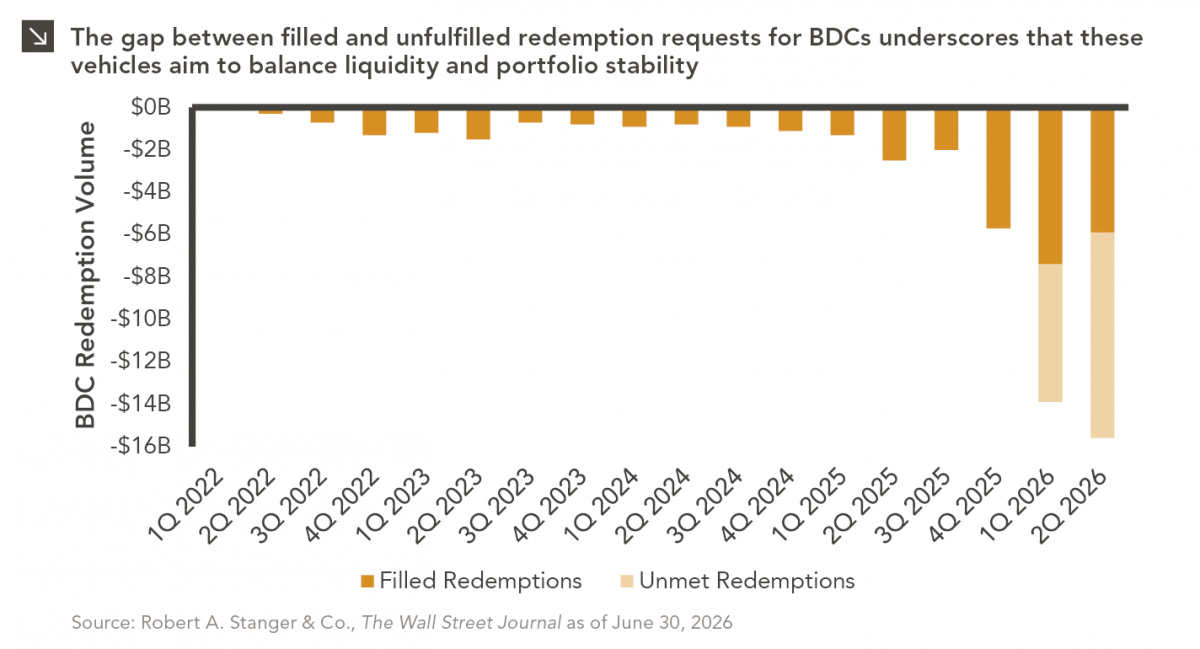
The rapid growth of non-traded business development companies (BDCs), which are investment vehicles that pool investor capital to make loans…

In late March, one of the busiest waterways in the world came to a standstill after the Ever Given, a 1,300-foot container ship, became lodged in the Suez Canal. Nearly 30% of the world’s daily shipping container freight passes through the Suez Canal, and with supply chains already disrupted amid the COVID pandemic, the timing could not have been worse. While only a one-week stoppage, with approximately 7% of the world’s oil and 12% of global goods trade flowing through the canal, it is estimated that each day lost delayed more than $9 billion worth of goods.¹
In this Chart of the Week, we analyze the impact that the Suez Canal closure had on maritime shipping costs and the contribution to inflation. The chart above shows the daily price movement of the Shanghai Containerized Freight Index (SCFI). As one of many proxies for global trade and ocean freight health, the SCFI reflects the weekly shipping spot rates of Shanghai container exports along 15 major trade routes, including Shanghai to the United States (east and west coasts), Europe, South Africa, and South America. In contrast to the highly-cited China Containerized Freight Index (CCFI), the SCFI focuses solely on exports in these 15 individual trade routes, rather than nationwide import and export container transport, which would include more contractual and futures rates. Rates surged throughout 2020 amid increasing demand for goods over services and tighter supply. The blockage, which may take months to fully recover from, combined with pent-up demand and economic re-openings has exacerbated the imbalance and sent SCFI spot shipping costs up another 20% over the last month. Rising inflation has been an increasing concern for investors this year and, given current dynamics, we do not expect the contribution from higher global shipping rates to abate anytime soon.
Print PDF > The Lasting Effects of a Temporary Trade Stoppage
¹Lloyd’s List Intelligence
The opinions expressed herein are those of Marquette Associates, Inc. (“Marquette”), and are subject to change without notice. This material is not financial advice or an offer to purchase or sell any product. Marquette reserves the right to modify its current investment strategies and techniques based on changing market dynamics or client needs.
07.27.2026
The rapid growth of non-traded business development companies (BDCs), which are investment vehicles that pool investor capital to make loans…

07.24.2026
This video is a recording of a live webinar held July 23 by Marquette’s research team analyzing the first half…
07.22.2026
The usual midyear version of these letters has touched on year-to-date performance as well as the most influential macroeconomic and…

07.20.2026
Our most recent Chart of the Week publication discussed how the AI investment opportunity has expanded beyond…

07.13.2026
One of the enduring lessons of the California Gold Rush is that the greatest fortunes were often made not by…

07.06.2026
Since traditional exit routes have remained constrained in recent years due to higher interest rates, valuation gaps, and a subdued…
Research alerts keep you updated on our latest research publications. Simply enter your contact information, choose the research alerts you would like to receive and click Subscribe. Alerts will be sent as research is published.
We respect your privacy. We will never share or sell your information.
If you have questions or need further information, please contact us directly and we will respond to your inquiry within 24 hours.
Contact Us >