07.27.2026
Liquidity Isn’t Free
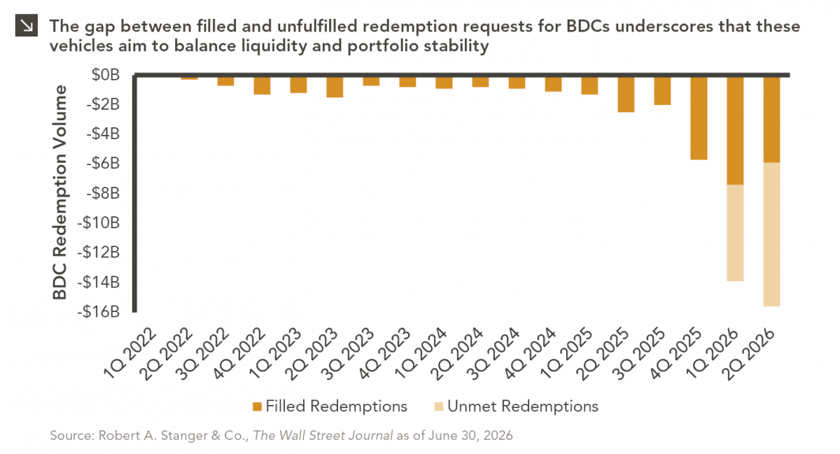
The rapid growth of non-traded business development companies (BDCs), which are investment vehicles that pool investor capital to make loans…

The month of November is often a positive one for equity markets, with the S&P 500 Index posting positive returns 62% of the time, and November 2020 was surely one for the record books. The Dow Jones Index, designed to serve as a proxy for the health of the broader U.S. economy, posted its best monthly return since 1987. Smaller companies also rallied in November as the Russell 2000 Index, which tracks U.S. small-capitalization stocks, set its first record high since 2018 and posted its strongest monthly return ever. That said, a stark contrast emerges when these milestones are viewed beside other economic indicators, particularly unemployment.
Down 54.4% from the April 2020 peak, U.S. national unemployment came in at 6.7% for November. This is exceptionally positive news considering the recent figure is only 0.6% above its 15-year average. However, this aggregated unemployment measure does not highlight the significant disparity plaguing the broader employment landscape.
According to the Bureau of Labor Statistics, the labor market can be divided into 22 unique occupation groups, many of which have been hit harder by the COVID-19-induced recession than others. For example — and perhaps not surprisingly — the four groups most affected by the pandemic include those on the frontlines of human interaction, such as Personal Care & Service, Food Preparation & Serving, Transport & Material Moving, and Building Grounds & Cleaning. While it is clear from the chart that these occupations tend to have a slightly higher rate of unemployment than the national figure, the average November unemployment rate for these groups was a significant 10.7%, coming in 4% higher than the current national level and 2.9% higher than the long-term average of the same groups. Conversely, occupation groups including Healthcare Practitioners, Legal, Computer & Mathematical, and Architecture & Engineering have escaped COVID-19 largely unscathed. These groups posted an average rate of 2.4% unemployment in November, which is 4.4% below the current national level and, in fact, 0.2% lower than their own long-term average. The gravity of this disparity takes on new meaning when viewed through the lens of workforce concentration and wealth generation. The least affected occupation groups employ 11.6% of the workforce, while the most affected groups have nearly double the employee base, at 23.0%. To make matters worse, this larger workforce earns substantially less than their COVID-sheltered peers. According to 2019 data, the most affected groups earned a median annual income of $27,800, which is just over the poverty line for a family of four and $12,000 less than the median income for all occupation groups. On the other hand, for those occupation groups nearing full employment, the median worker earned an annual income of $79,900 in 2019, more than two times the national median.
Ultimately, no two recessions are the same, but perspective can be gleaned by looking to the past. Since 1950, the average U.S. unemployment rate has been a low 5.8%, despite 10 unique bear market corrections during that time. However, the subsequent decline from a spike in unemployment can be slow and long. Looking back to the Global Financial Crisis, U.S. unemployment peaked at 10% in October 2009 and took just over six years to recover back to pre-crisis levels. However, unlike other recessions we have seen in recent memory, this one seems to have a discernible cure: a COVID-19 vaccine. With national distribution beginning before the end of the year, many analysts are expecting the economy to return to ‘normal’ by mid-2021. An unprecedented level of stimulus has already been injected into the economy and an additional highly anticipated package expected to arrive early next year are added reasons for optimism. Taken together, there is hope that current unemployment figures will revert to typical levels at a pace not seen in history.
Print PDF > Main Street Won’t Look Like Wall Street for a While
The opinions expressed herein are those of Marquette Associates, Inc. (“Marquette”), and are subject to change without notice. This material is not financial advice or an offer to purchase or sell any product. Marquette reserves the right to modify its current investment strategies and techniques based on changing market dynamics or client needs.
07.27.2026
The rapid growth of non-traded business development companies (BDCs), which are investment vehicles that pool investor capital to make loans…

07.24.2026
This video is a recording of a live webinar held July 23 by Marquette’s research team analyzing the first half…
07.22.2026
The usual midyear version of these letters has touched on year-to-date performance as well as the most influential macroeconomic and…

07.20.2026
Our most recent Chart of the Week publication discussed how the AI investment opportunity has expanded beyond…

07.13.2026
One of the enduring lessons of the California Gold Rush is that the greatest fortunes were often made not by…

07.06.2026
Since traditional exit routes have remained constrained in recent years due to higher interest rates, valuation gaps, and a subdued…
Research alerts keep you updated on our latest research publications. Simply enter your contact information, choose the research alerts you would like to receive and click Subscribe. Alerts will be sent as research is published.
We respect your privacy. We will never share or sell your information.
If you have questions or need further information, please contact us directly and we will respond to your inquiry within 24 hours.
Contact Us >