What Is the Most Attractive Segment of the Private Equity Market?

February 24, 2021 | ,

Column chart showing Net IRR Performance by Fund Size within private equity. Chart subtitle: Smaller buyout funds carry attractive return potential while also having the greatest performance variability in the private equity ecosystem Chart description: Y-axis shows Net IRR Performance, ranging from -15 to 45%. X-axis shows Fund Size by categories: Small ($6B). Each category has the full first through fourth quartile range in dark gray, then the 25th-75th percentile range overlaid in a lighter transparent gray, then a circle point marking the Median fund's net IRR performance. The Small Buyout category shows the greatest performance dispersion (median Net IRR of 13%, a 1st quartile range of 21–37%, and a 4th quartile range of -10–6%) but also the highest net IRR performance shown. Each consecutive category has slightly smaller bars for the full quartile range. Chart sources: Burgiss as of March 31, 2020, Pitchbook, Private iQ, and Morningstar. Performance shown reflects North American buyout funds with vintages between 2002–2016; funds with more recent vintages are not included as their performance is not yet meaningful.

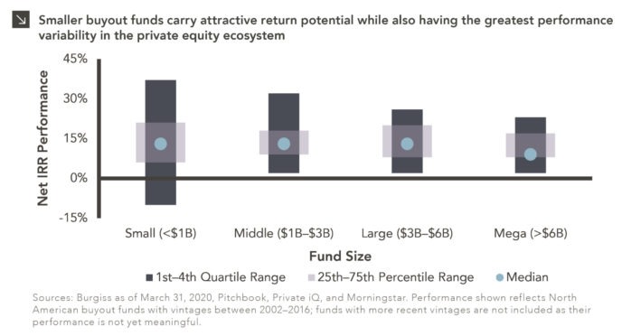
As private equity matures further as an asset class, median private equity returns will continue to move closer to the public markets. Nevertheless, as a result of active management and private market inefficiencies, the top quartile to median spread for private equity is still more than 2x greater than it is for public market-oriented managers. When we take a closer look at fund performance within private equity, there is significantly more upside as well as performance variability for smaller buyout funds as compared to larger buyout funds. As seen in this week’s chart, funds that are less than $1B in size had a median Net IRR of 13%, a 1st quartile range of 21–37%, and a 4th quartile range of -10–6% whereas funds greater than $6B in size had a median Net IRR of 9%, a 1st quartile range of 17–23%, and a 4th quartile range of 2–8%.

This performance dispersion is largely driven by smaller funds sourcing opportunities outside of intermediated processes, leveraging a repeatable and focused operational playbook to professionalize and grow portfolio companies quickly, and a growing list of paths to liquidity, including larger funds with an increasing amount of dry powder that are sourcing investments out of smaller managers’ funds. With that said, larger funds buy companies that are typically more mature, have built-out teams, and are capable of weathering business shocks with greater success, which accounts for the tighter band of outcomes at the larger end of the market.

Due to COVID and an inability to meet with potential investors in person, first-time funds and emerging managers which typically fall in the “small” fund size had difficulty raising capital in 2020. This dynamic is expected to have two significant effects on the 2021 private equity ecosystem: 1) first-time funds and emerging managers fundraising is likely to be more active in 2021 and 2) dry powder has been further concentrated in larger funds, which should create an increasingly attractive exit environment for smaller funds.

Given the compelling upside opportunity of investing in smaller funds and an expected increase in the number of these funds raising capital in 2021, these managers represent an attractive area of the private equity market to be allocating capital towards. Given the greater performance variability of smaller funds, allocations to funds at this size should be focused within a program that allows for a number of high-quality commitments, such as those provided by fund-of-funds.

Print PDF > What Is the Most Attractive Segment of the Private Equity Market


The opinions expressed herein are those of Marquette Associates, Inc. (“Marquette”), and are subject to change without notice. This material is not financial advice or an offer to purchase or sell any product. Marquette reserves the right to modify its current investment strategies and techniques based on changing market dynamics or client needs. Opinions, estimates, projections, and comments on financial market trends constitute our judgment and are subject to change without notice. Past performance does not guarantee future results. 

Related Content

This chart description is for illustrative purposes only and its accuracy cannot be guaranteed. Please see full disclosures at end of PDF document in the web post. General description: Table describing categories and criteria of MSCI indices. Chart subtitle: Despite its rapid ascendancy in recent decades, China is categorized as an emerging country by MSCI due to the market classification framework utilized by the index provider. Chart source: Source: MSCI as of June 30, 2023. ATVR: Annualized Traded Value Ratio, which is a liquidity measure used to assess liquidity of securities in the MSCI Global Investable Market Indices. The ATVR corresponds to the Annualized Traded Value of a security relative to its Free Float‐Adjusted Market Capitalization. Chart description: First column is Criteria, second is Frontier, third is Emerging, and fourth is Developed. First row section is Economic Development, detailed with “Sustainability of economic development.” Frontier: No requirement. Emerging: No requirement. Developed: Country GNI per capita 25% above the World Bank high income threshold for 3 consecutive years. Second section is Size and Liability Requirements, with four sub-rows. First: Number of companies meeting the following Standard Index criteria: Frontier: 2 Emerging: 3. Developed: 5. Second: Company size (full market cap, USD): Frontier: $1,033M. Emerging: $2,066M. Developed: $4,133M. Third: Security size (float market cap, USD): Frontier: $73M. Emerging: $1,033M. Developed: $2,066M. Fourth: Security liquidity: Frontier: 2.5% ATVR. Emerging: 15% ATVR. Developed: 20% ATVR. Third section is Market Accessibility, with five sub-rows. First: Openness to foreign ownership: Frontier: At least some. Emerging: Significant. Developed: Very high. Second: Ease of capital inflows / outflows: Frontier: At least partial. Emerging: Significant. Developed: Very high. Third: Efficiency of operational framework: Frontier: Modest. Emerging: Good and tested. Developed: Very high. Fourth: Availability of investment instruments: Frontier: High. Emerging: High. Developed: Unrestricted. Fifth: Stability of the institutional framework: Frontier: Modest. Emerging: Modest. Developed: Very high. End chart description. See disclosures at end of document.

12.04.2023

Is China Guilty of Category Fraud?

With movie awards season around the corner, some entertainment pundits may use the term “category fraud” to describe races in…

This chart description is for illustrative purposes only and its accuracy cannot be guaranteed. Please see full disclosures at end of PDF document in the web post. General description: Combination column and line chart comparing recent holiday spending by U.S. consumers. Chart subtitle: Spending is on track to reach record levels this holiday season, despite mounting economic pressures faced by American consumers. Chart source: Adobe Analytics and CNN Business as of October 31, 2023. Chart description: Left Y-axis is labeled “Spending” and ranges from $0B to $250B. Right Y-axis is labeled “YoY Growth” and ranges from 0% to 50%. X-axis labels each column: 2019, 2020, 2021, 2022, and 2023 (Projected). Holiday Spending by U.S. Consumers is plotted in dark teal columns. Holiday Spending Growth is plotted with light purple line and markers. 2019 saw $143B in spending and 13.1% YoY growth; 2020 $188B, 32.1%; 2021 $205B, 8.7%; 2022 $212B, 3.5%, and 2023 is projected at $222B and 4.8%. End chart description. See disclosures at end of document.

11.30.2023

‘Tis the Season to Spend!

The holiday spending frenzy is well underway as some of the biggest shopping days of the year, including Black Friday…

11.16.2023

The Taming of the VIX

October proved tumultuous for investors as all major U.S. equity indices were negative and the CBOE VIX Index, which serves…

This chart description is for illustrative purposes only and its accuracy cannot be guaranteed. Please see full disclosures at end of PDF document in the web post. General description: Combination stacked column and line chart comparing unrealized gains/losses with effective federal funds rate. Chart subtitle: Unrealized losses across depository institutions have increased in recent quarters thanks to higher interest rates. Chart source: Federal Deposit Insurance Corporation and Federal Reserve Bank of St. Louis as of June 30, 2023. Chart description: Left Y-axis is labeled “Unrealized Gains/Losses” and ranges from -$800B to +$800B, corresponding to stacked columns. Right Y-axis is labeled “Rate” and ranges from -6% to +6%, corresponding to line. X-axis ranges from 1Q08 to 2Q23; labels are at 3-quarter increments to fit so last label is for 1Q23. Available-For-Sale Securities are plotted in dark green base of stacked columns; Held-To-Maturity Securities are plotted in lighter green as second half of column. Effect Federal Funds Rate line is plotted in light blue. Unrealized losses are at significant levels for chart losses; since the fed funds rate has increased since 1Q22, losses have totaled over $300B. Most recent datapoints, as of 2Q23 are as follows: Available-For-Sale Securities at -$248.9B, Held-To-Maturity Securities at -$309.6B, and Effective Federal Funds Rate at 5.3%. Please contact us for the full dataset. End chart description. See disclosures at end of document.

11.08.2023

Realizing the Impact of Unrealized Losses

Earlier this year, the regional banking crisis and eventual collapses of Silicon Valley Bank, Signature Bank, First Republic Bank, and…

This chart description is for illustrative purposes only and its accuracy cannot be guaranteed. Please see full disclosures at end of PDF document in the web post. General description: Three-line chart showing cumulative return for various U.S. equity indices. Chart subtitle: Domestic stock indices enter correction territory after recent slide. Chart source: Bloomberg as of October 31, 2023. Chart description: Y-axis is labeled “Cumulative Return” and ranges from -15% to +10%. X-axis is labeled in monthly increments, from Jun-23 to Oct-23. Data ranges 6/30/23 through 10/31/23. S&P 500 Index is plotted in orange line, Nasdaq-100 Index in light tan line, and Russell 2000 Index in dark purple line. Most recent data points, respectively, -5.31%, -4.84%, -11.61%. Please contact us for the full dataset. End chart description. See disclosures at end of document.

11.01.2023

The Chart for Red October

U.S. equities declined for the third consecutive month in October amid an environment of higher yields and underwhelming earnings reports…

10.13.2023

3Q 2023 Market Insights Video

This video is a recording of a live webinar held on October 26 by Marquette’s research team, featuring in-depth analysis…

More articles

Subscribe to Research Email Alerts

Research Email Alert Subscription

Research alerts keep you updated on our latest research publications. Simply enter your contact information, choose the research alerts you would like to receive and click Subscribe. Alerts will be sent as research is published.

We respect your privacy. We will never share or sell your information.

Thank You

We appreciate your interest in Marquette Associates.

If you have questions or need further information, please contact us directly and we will respond to your inquiry within 24 hours.

Contact Us >