Greg Leonberger, FSA, EA, MAAA, FCA
Partner, Director of Research


Our Chart of the Week examines the migration of dollars from active to passive U.S. equity mutual funds over the last five years. During this time period, approximately $144 billion of investor money has flowed into passive funds (blue line) on a net basis, thus reflecting a growing frustration with the performance (and perhaps as importantly, fee level) of actively managed funds. Even more telling is the movement out of actively managed funds, as shown by the red line on the chart. From 1st quarter of 2007 through the 3rd quarter of 2012, over $460 billion has been moved out of actively managed funds and into other investment vehicles.
Why the dramatic movement, most especially out of actively managed funds? A few explanations come to mind. First, it is no secret that the equity markets have largely traded on macroeconomic factors the last four years, so it has been hard for fundamentally-based managers to consistently add value when the market has not traded on those very optics used to evaluate equities. In addition, the bond bull market has attracted capital as investors have moved to ride rates down, as well as preserve the principal value of their investments. Last, as investors become more cost conscious, the low fees of passively managed funds have helped to attract additional capital.
The cloudy economic outlook suggests that this trend may continue. Whether it is a short term uncertainty such as the fiscal cliff or a longer-term matter about the future of a regional currency (Europe), it is conceivable that the market will remain a risk on / risk off trade over the next few years. Therefore, we may see continued flows into passively managed funds in the equity markets.

The opinions expressed herein are those of Marquette Associates, Inc. (“Marquette”), and are subject to change without notice. This material is not financial advice or an offer to purchase or sell any product. Marquette reserves the right to modify its current investment strategies and techniques based on changing market dynamics or client needs.
10.19.2026
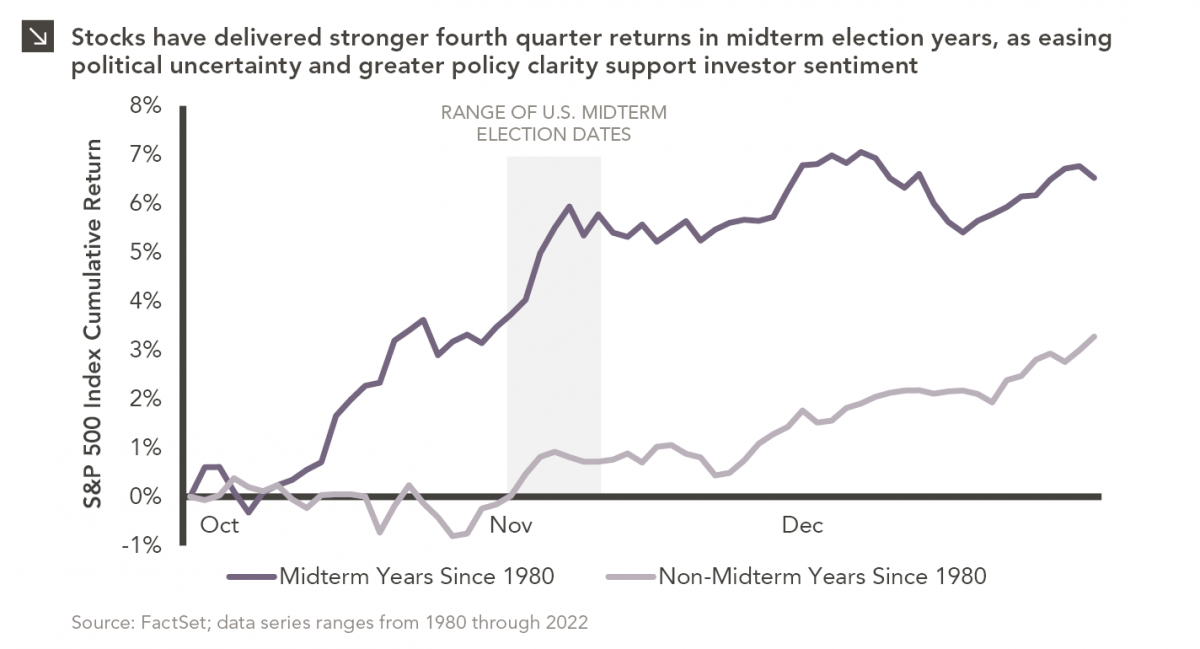
Since 1980, the S&P 500 Index has generally performed well in the weeks surrounding U.S. midterm elections. Specifically, the index…

10.12.2026
This week’s chart highlights the accelerating growth of electricity demand in the U.S., which has been driven primarily by the…

10.08.2026
LIVE WEBINAR — OCTOBER 22 Please join Marquette’s research team for our 3Q 2026 Market Insights Webinar…

10.05.2026
For investors, the spookiest thing about October might not be the ghosts and monsters that are bound to show up…

09.28.2026
The phrase “expectations of higher inflation” has become a staple in financial news to explain the increase in nominal U.S….

09.21.2026
For much of the past several years, the conventional view has been that higher interest rates and stretched valuations would…
Research alerts keep you updated on our latest research publications. Simply enter your contact information, choose the research alerts you would like to receive and click Subscribe. Alerts will be sent as research is published.
We respect your privacy. We will never share or sell your information.
If you have questions or need further information, please contact us directly and we will respond to your inquiry within 24 hours.
Contact Us >