07.27.2026
Liquidity Isn’t Free
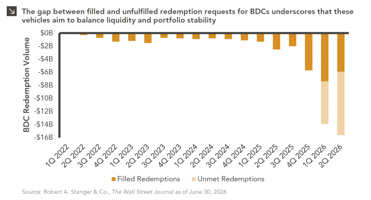
The rapid growth of non-traded business development companies (BDCs), which are investment vehicles that pool investor capital to make loans…

Add-on investments, a company acquired by a private equity firm to be added to one of its platform companies, have steadily increased in importance and popularity over the past two decades. In 2020, 71.7% of U.S. PE deals were add-ons, compared with 43.2% in 2002. After a dip in total deal count in 2020 amid the COVID-19 pandemic, we expect 2021 will see the highest number of add-on deals on record. These buy-and-build strategies can take different forms. Some involve large-scale roll-ups in which a platform company acquires a large number of smaller, often founder-owned companies. Others include more opportunistic M&A transactions that allow portfolio companies to pursue specific product or operational goals. The growth of add-ons across two decades of various market cycles can be attributed to a number of advantages: multiple arbitrage, giving larger firms access to out-of-reach market segments, helping portfolio companies enter new geographical markets, and doubling down on more profitable end markets.
The holding period for add-ons has also evolved. Historically, private equity has held platform investments that included add-ons longer than other portfolio companies. In recent years, the median exit times for portfolio companies with and without add-ons have converged to roughly five years. We attribute this to both private equity becoming more skilled at executing these buy-and-build strategies as well as buyers being increasingly willing to pay for the unrealized potential of recently-completed add-on acquisitions.
Print PDF > PE Pursues Buy-and-Build
The opinions expressed herein are those of Marquette Associates, Inc. (“Marquette”), and are subject to change without notice. This material is not financial advice or an offer to purchase or sell any product. Marquette reserves the right to modify its current investment strategies and techniques based on changing market dynamics or client needs.
07.27.2026
The rapid growth of non-traded business development companies (BDCs), which are investment vehicles that pool investor capital to make loans…

07.24.2026
This video is a recording of a live webinar held July 23 by Marquette’s research team analyzing the first half…

07.20.2026
Our most recent Chart of the Week publication discussed how the AI investment opportunity has expanded beyond…

07.13.2026
One of the enduring lessons of the California Gold Rush is that the greatest fortunes were often made not by…

07.06.2026
Since traditional exit routes have remained constrained in recent years due to higher interest rates, valuation gaps, and a subdued…

06.29.2026
This week’s chart highlights the varying return profiles across key infrastructure sectors by illustrating the split between income and capital…
Research alerts keep you updated on our latest research publications. Simply enter your contact information, choose the research alerts you would like to receive and click Subscribe. Alerts will be sent as research is published.
We respect your privacy. We will never share or sell your information.
If you have questions or need further information, please contact us directly and we will respond to your inquiry within 24 hours.
Contact Us >