04.27.2026
Let’s Hear It for Latin America
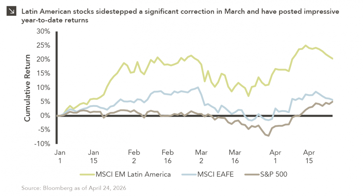
Latin American equity markets have shown remarkable strength in 2026. After a strong start to the year, the MSCI Emerging…


With market volatility already heightened due to the COVID-19 pandemic, the U.S. presidential election this year poses another layer of uncertainty that investors may view as added risk to their portfolios. In particular, there is inevitable speculation about how the market will react upon which candidate or political party wins the election. This week’s chart illustrates equity performance over the last nine presidents since 1969.
The question most asked is how the stock market will perform under Republican or Democratic leadership in the White House. Based on the data above,¹ the equity markets have averaged 14% annualized total returns when the president has been a Democrat and 8% when a Republican has been president. However, we caution that equity markets are subject to many market forces and most importantly, the sample size from this data set is not large enough to support these trends in a statistically significant manner. The good news is that regardless of political party, the stock market has averaged 10% a year over the time period shown in the chart.
As we look towards the November election, it is critical to understand the platforms of each candidate and how they can broadly impact the economy and by extension, equity markets. Understanding each candidate’s position on a variety of economic and social issues will inform the market’s likely reaction to the election results and help formulate expectations for investors. In the coming weeks, we will release a paper that examines these very topics in greater depth to establish baseline expectations of each candidate’s policies, market impact, and historical market performance of political party leadership in Washington across the White House, Senate, and House of Representatives. If nothing else, we know the election will be contentious and scrutinized, with market participants closely watching the ultimate result.
Print PDF > Do Presidents Play a Role in Equity Performance?
¹ For measuring equity performance, a total return index was used to account for shares that pay dividends and represent more accurate performance by reinvesting dividends back into the index.
The opinions expressed herein are those of Marquette Associates, Inc. (“Marquette”), and are subject to change without notice. This material is not financial advice or an offer to purchase or sell any product. Marquette reserves the right to modify its current investment strategies and techniques based on changing market dynamics or client needs.

04.27.2026
Latin American equity markets have shown remarkable strength in 2026. After a strong start to the year, the MSCI Emerging…
04.23.2026
Diversify. Rebalance. Stay invested. Every one of these letters has concluded with that same advice in some shape or form….

04.20.2026
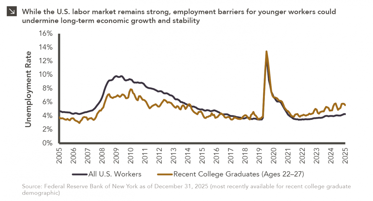
Entry-level jobs have traditionally served as the primary bridge between education and stable employment, offering young workers a foothold from…

04.13.2026
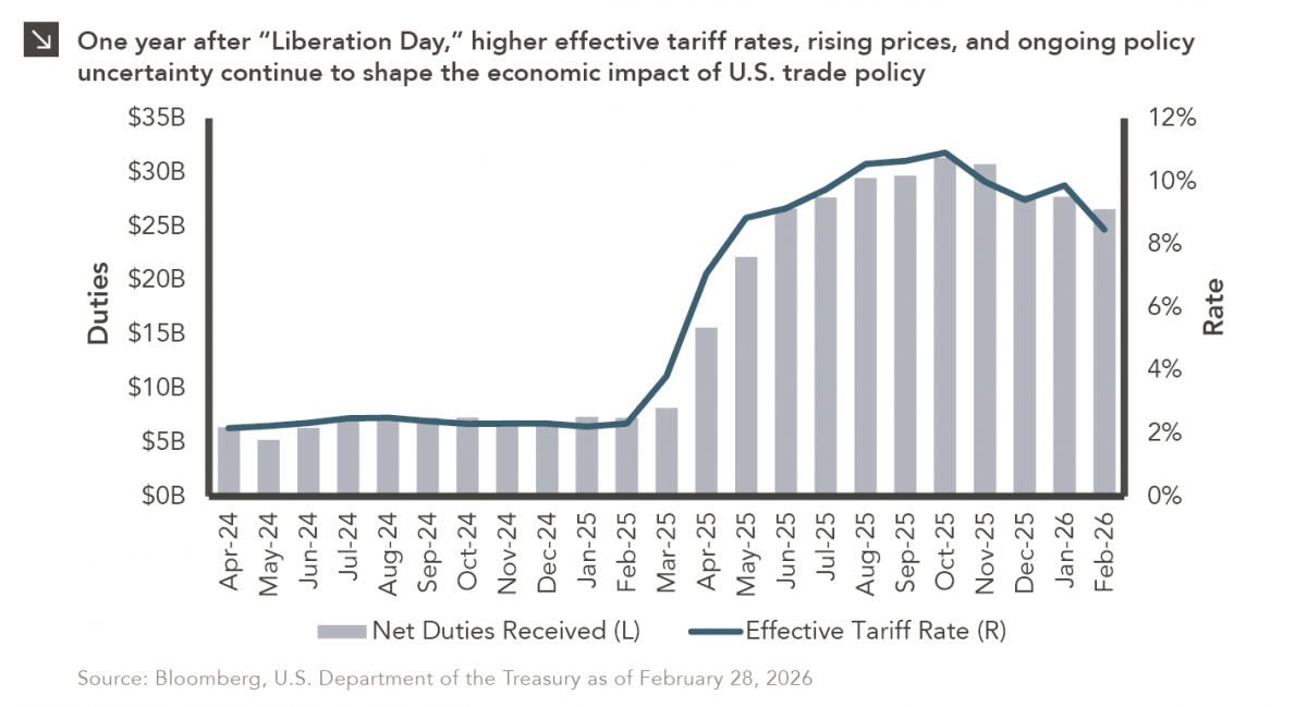
On April 2, 2025, President Donald Trump announced a sweeping set of tariffs on imports into the United States. Dubbed…
04.07.2026
On March 30, 2026, the Department of Labor (DOL) issued its proposed regulation: Fiduciary Duties in Selecting Designated Investment Alternatives….

04.06.2026
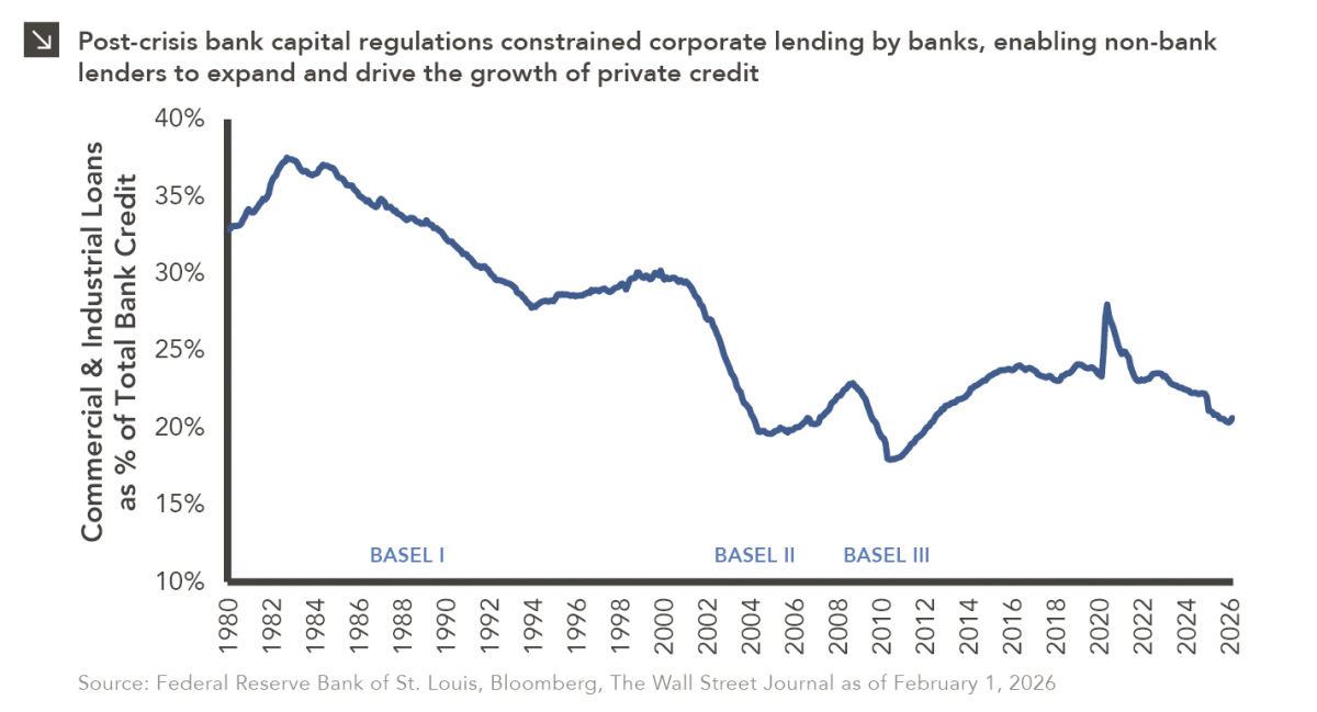
The Basel capital framework was created to ensure that banks maintain sufficient capital to absorb losses and reduce the risk…
Research alerts keep you updated on our latest research publications. Simply enter your contact information, choose the research alerts you would like to receive and click Subscribe. Alerts will be sent as research is published.
We respect your privacy. We will never share or sell your information.
If you have questions or need further information, please contact us directly and we will respond to your inquiry within 24 hours.
Contact Us >