07.27.2026
Liquidity Isn’t Free
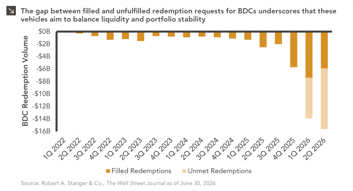
The rapid growth of non-traded business development companies (BDCs), which are investment vehicles that pool investor capital to make loans…

In 2011, venture capitalist Marc Andreessen wrote “software is eating the world,” and added that disruptors were “invading and overturning established industry structures.” Private equity firms were taking notes. Over the past decade, technology investments have steadily grown as a percentage of the global buyout market. In 2021, $284 billion in technology deals were closed, accounting for 25% of total buyout deal value and 31% of total buyout deal count — the largest share of any sector. Of that $284 billion, software deals comprised $256 billion. And while capital has flooded the sector, increasing competition for these businesses and driving up multiples, superior performance has continued, both in terms of lower loss rates and higher upside of outperforming deals.
Additionally, the value creation levers being pulled by private equity firms in the technology space appear sustainable. According to DealEdge, in fully realized global buyout deals between 2010 and 2021 with more than $50 million in invested capital, 71% of the value created in technology deals (excluding software) and 55% in software deals was driven by EBITDA growth, relative to 44% for all other sectors. These compelling return characteristics are due in large part to the operating models of these businesses — asset light, scalable, with high margins, and, in most cases, sticky, recurring revenue.
Despite the sector’s broad appeal, technology has proven to be a domain for specialists within the buyout market. The complexity of these business models, constant evolution in the technology landscape, and the need for expertise to lead these businesses at scale lends itself to investors who focus exclusively on the sector. LPs appear to share this sentiment, with more than $270 billion raised by technology-focused private equity firms in the past five years, equivalent to 13% of total global buyout capital raised during that time.
While technology and software stocks in the public arena have suffered over the last year-plus amid rising rates, private companies have not been subject to the same mark-to-market risk. The sector remains a driving force in innovation and economic value creation, and we expect exciting opportunities for private equity firms to persist.
Print PDF > Private Equity – Living in the 21st Century
The opinions expressed herein are those of Marquette Associates, Inc. (“Marquette”), and are subject to change without notice. This material is not financial advice or an offer to purchase or sell any product. Marquette reserves the right to modify its current investment strategies and techniques based on changing market dynamics or client needs.
07.27.2026
The rapid growth of non-traded business development companies (BDCs), which are investment vehicles that pool investor capital to make loans…

07.24.2026
This video is a recording of a live webinar held July 23 by Marquette’s research team analyzing the first half…
07.22.2026
The usual midyear version of these letters has touched on year-to-date performance as well as the most influential macroeconomic and…

07.20.2026
Our most recent Chart of the Week publication discussed how the AI investment opportunity has expanded beyond…

07.13.2026
One of the enduring lessons of the California Gold Rush is that the greatest fortunes were often made not by…

07.06.2026
Since traditional exit routes have remained constrained in recent years due to higher interest rates, valuation gaps, and a subdued…
Research alerts keep you updated on our latest research publications. Simply enter your contact information, choose the research alerts you would like to receive and click Subscribe. Alerts will be sent as research is published.
We respect your privacy. We will never share or sell your information.
If you have questions or need further information, please contact us directly and we will respond to your inquiry within 24 hours.
Contact Us >