04.27.2026
Let’s Hear It for Latin America
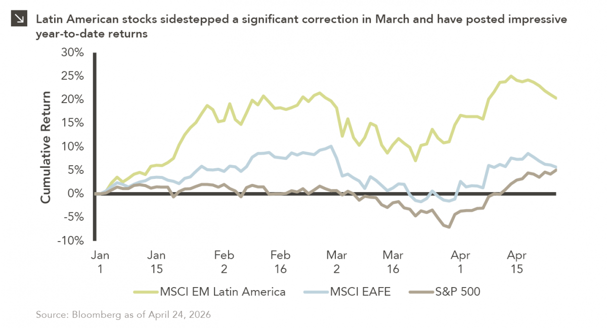
Latin American equity markets have shown remarkable strength in 2026. After a strong start to the year, the MSCI Emerging…


While there is still much uncertainty around the long-term economic ramifications of COVID-19, financial markets have been undergoing frequent massive swings as both investment managers and allocators evaluate the situation and what it might mean for their current and future investments. Given the illiquid and slow-moving nature of private equity investments, an outstanding question is: What will this mean for private market investors?
One principle which people took serious note of in the last crisis was something called the “denominator effect.” A decline in the value of one asset should result in other assets being sold to properly rebalance a portfolio, but many assets like venture capital (“VC”), private equity (“PE”), and others can be quite hard to sell in the short-to-medium term, leaving LPs overallocated to private markets. When the stock market falls dramatically, public market investments fall in value immediately; however, private market investments do not reflect the changing environment right away because they require a manual valuation process that is one to two quarters behind public markets.
In addition, LPs allocating to PE and VC can expect net cash flows to turn negative, a break from the norm of recent years when distributions outpaced contributions, which led to positive net cash flows. During a time of crisis, GPs dislike realizing investments at diminished valuations. Instead, they tend to further invest into existing portfolio companies, or at least hold those companies longer, which leads to reduced distributions. Furthermore, GPs also tend to call down capital more slowly during times of market crisis because deal-making slows substantially. It is forecasted that it will take months, possibly even until the end of the year for transaction volumes to rebound.
The exact repercussions the crisis will have on PE fund performance will remain unknown until we know how deeply the virus will affect global economies. However, we do believe private markets will fare well in the current market environment. Research indicates that while PE exhibits high correlation with public market performance over longer periods of time, in times of volatility it tends to drop less and subsequently outperform. Funds deploying cash through the crisis are in a favorable position to deliver elevated returns given the higher likelihood of finding a bargain in a crisis. Previous crisis funds, such as 2001 or 2009 vintages, posted top-tier metrics; the hope is that this pandemic is consistent with these previous patterns for private equity returns.
Print PDF > Private Equity in Times of Crisis
The opinions expressed herein are those of Marquette Associates, Inc. (“Marquette”), and are subject to change without notice. This material is not financial advice or an offer to purchase or sell any product. Marquette reserves the right to modify its current investment strategies and techniques based on changing market dynamics or client needs.

04.27.2026
Latin American equity markets have shown remarkable strength in 2026. After a strong start to the year, the MSCI Emerging…
04.23.2026
Diversify. Rebalance. Stay invested. Every one of these letters has concluded with that same advice in some shape or form….

04.20.2026
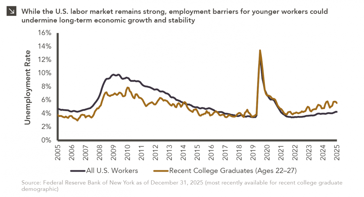
Entry-level jobs have traditionally served as the primary bridge between education and stable employment, offering young workers a foothold from…

04.13.2026
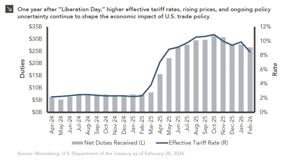
On April 2, 2025, President Donald Trump announced a sweeping set of tariffs on imports into the United States. Dubbed…
04.07.2026
On March 30, 2026, the Department of Labor (DOL) issued its proposed regulation: Fiduciary Duties in Selecting Designated Investment Alternatives….

04.06.2026
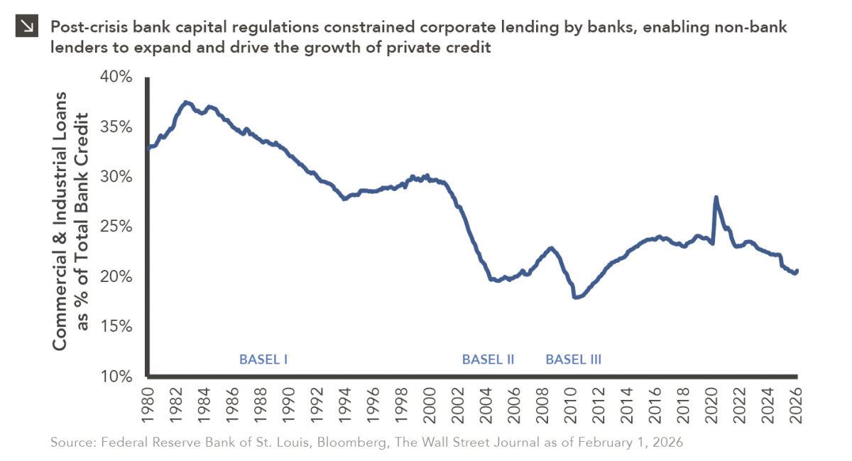
The Basel capital framework was created to ensure that banks maintain sufficient capital to absorb losses and reduce the risk…
Research alerts keep you updated on our latest research publications. Simply enter your contact information, choose the research alerts you would like to receive and click Subscribe. Alerts will be sent as research is published.
We respect your privacy. We will never share or sell your information.
If you have questions or need further information, please contact us directly and we will respond to your inquiry within 24 hours.
Contact Us >