04.23.2026
We’ve Seen This Before
Diversify. Rebalance. Stay invested. Every one of these letters has concluded with that same advice in some shape or form….


Bank loans provide investors with many advantages, chief among them a floating rate feature that resets on a quarterly basis, benefiting the investor as interest rates rise. They also offer a senior secured top-of-an-issuer’s-capital-structure positioning, meaning that the bank loan investor has first-in-line access to the issuer’s assets should something go wrong. However, recent market dynamics have produced a phenomenon that cuts into bank loans’ attractiveness: re-pricings. A re-pricing is a renegotiation performed by the bank loan issuer with its bank loan investors. Typically occurring in rising rate periods, the re-pricing lets the bank loan issuer reduce the spread that makes up the total coupon it has to pay under its bank loan agreement. An example representative of several recent re-pricings is shown in this week’s chart.
The chart shows two time periods: one year ago (before re-pricing), on the left, and today (after re-pricing), on the right. One year ago, LIBOR, the base rate, was at 1.0%. The spread was 4.0%, making the total coupon, or yield, 5.0%. After the re-pricing on the right, as LIBOR increased from 1.0% to 1.5%–a direct result of the Federal Reserve’s recent rate hikes–the issuer has successfully renegotiated the spread from 4.0% to 3.5%. The total yield then remains at 5.0%. Bank loan issuers get to re-price only if the price of their bank loan exceeds par value, typically 101, and they can initiate re-pricings only after the non-call period ends, which typically lasts six to twelve months after issuance. High yield bonds, on the other hand, have much longer non-call periods, typically five years.
Currently, we are seeing large amounts of bank loan re-pricings. This is because of strong demand for bank loans, including re-priced bank loans, and a lack of supply in the form of new issuance due to low mergers and acquisitions activity, as the issuance of new bank loans is typically how an acquirer finances a take-over. Investors currently have an appetite for re-priced bank loans that is keeping the total yield after the re-pricing approximately equal to the total yield before the re-pricing. This phenomenon explains why bank loan spreads have remained close to their long term averages, as investors have not completely rushed into bank loans, which would have made spreads much tighter. We continue to recommend bank loans as a short-term and long-term allocation due to their moderate spread level, relatively strong yield (currently averaging 5.0%), and the aforementioned floating rate and senior secured features. As M&A activity picks up, we expect more new bank loan issuance, which would reduce the proportion of re-priced loans in the market, thereby raising overall yields on bank loan investment portfolios.
The opinions expressed herein are those of Marquette Associates, Inc. (“Marquette”), and are subject to change without notice. This material is not financial advice or an offer to purchase or sell any product. Marquette reserves the right to modify its current investment strategies and techniques based on changing market dynamics or client needs.
04.23.2026
Diversify. Rebalance. Stay invested. Every one of these letters has concluded with that same advice in some shape or form….

04.20.2026
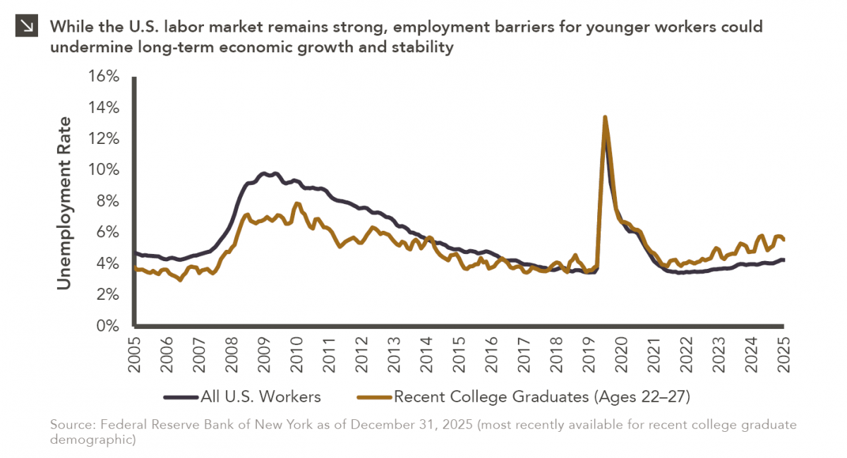
Entry-level jobs have traditionally served as the primary bridge between education and stable employment, offering young workers a foothold from…

04.13.2026
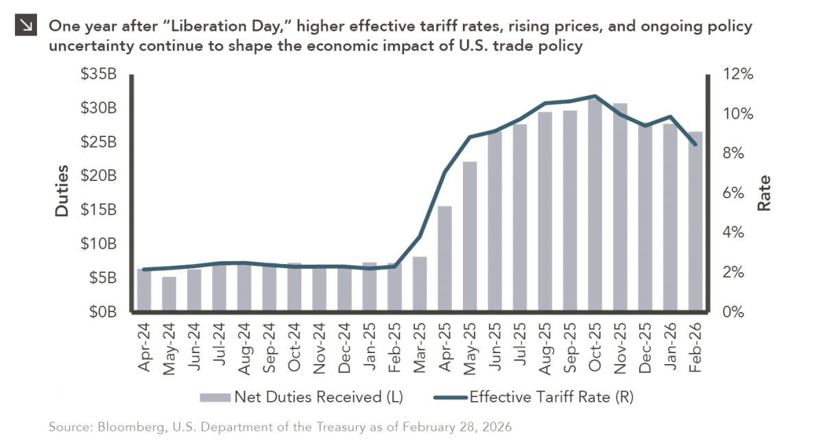
On April 2, 2025, President Donald Trump announced a sweeping set of tariffs on imports into the United States. Dubbed…

04.06.2026
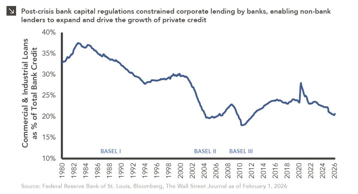
The Basel capital framework was created to ensure that banks maintain sufficient capital to absorb losses and reduce the risk…

04.02.2026
This video is a recording of a live webinar held April 16 by Marquette’s research team analyzing the first quarter…
04.01.2026
Fixed income is the largest global financial market and often one of the largest allocations within institutional investors’ portfolios. A…
Research alerts keep you updated on our latest research publications. Simply enter your contact information, choose the research alerts you would like to receive and click Subscribe. Alerts will be sent as research is published.
We respect your privacy. We will never share or sell your information.
If you have questions or need further information, please contact us directly and we will respond to your inquiry within 24 hours.
Contact Us >