06.22.2026
The VC Convergence Era
When Benchmark, one of Silicon Valley’s most renowned early-stage venture capital firms, closed $2 billion across two new funds this…

Escalating tensions between Russia and Ukraine have the world on edge. While the situation continues to evolve and the likelihood of a full-scale war remains unlikely, markets are attempting to price in the risk. This latest geopolitical clash builds on an already tumultuous start to the year for financial markets. In the U.S., the S&P 500 has fallen 8.1% from its all-time high on January 3rd amid concerns about rising inflation and consequential rate increases by the Fed. The latest year-over-year inflation figures for both the U.S. and Eurozone have reached alarming milestones, with the U.S. hitting a new 40-year high and the Eurozone setting a new record going back to 1991. Ballooning energy prices have been the greatest contributor to rising inflation, evident in the delta between consumer inflation and core inflation, which removes more volatile prices like energy- and food-related costs. The friction between Russia and Ukraine is only expected to worsen this dynamic, given Europe’s reliance on Russia for energy.
The European Union imports nearly 40% of its total natural gas consumption from Russia. While global oil prices tend to trade largely in tandem due to OPEC’s influence, natural gas prices are more sensitive to regional access and supply. The Dutch TTF Natural Gas price has historically hovered around $20/MMBtu but has surged more than 300% over the last 12 months, while U.S. Natural Gas is up just 36.9% over the same period. While geopolitical fears may continue to drive up the cost of crude as uncertainty builds, the more immediate impact is to the European energy markets via natural gas prices. In the most direct sense, the impact to global developed markets may be low, with the Energy sector comprising only 2.9% and 3.9% of the S&P 500 and MSCI EAFE indices, respectively, though knock-on effects may be broader, including economic sanctions and additional measures to combat inflation that could ultimately impact growth. Past geopolitical stress events provide little guidance with moving pieces always evolving. Tensions could deescalate and we could see little fallout, as was the case following the 2014 Crimean crisis, or pressures could mount with wide-reaching global implications. For now, we will continue to monitor and help our clients navigate the volatility.
Print PDF > Russia & Ukraine: All Eyes on Energy
The opinions expressed herein are those of Marquette Associates, Inc. (“Marquette”), and are subject to change without notice. This material is not financial advice or an offer to purchase or sell any product. Marquette reserves the right to modify its current investment strategies and techniques based on changing market dynamics or client needs.

06.22.2026
When Benchmark, one of Silicon Valley’s most renowned early-stage venture capital firms, closed $2 billion across two new funds this…

06.15.2026
The rapid buildout of artificial intelligence infrastructure is reshaping the U.S. investment landscape. According to recent Census Bureau data, spending…
06.08.2026
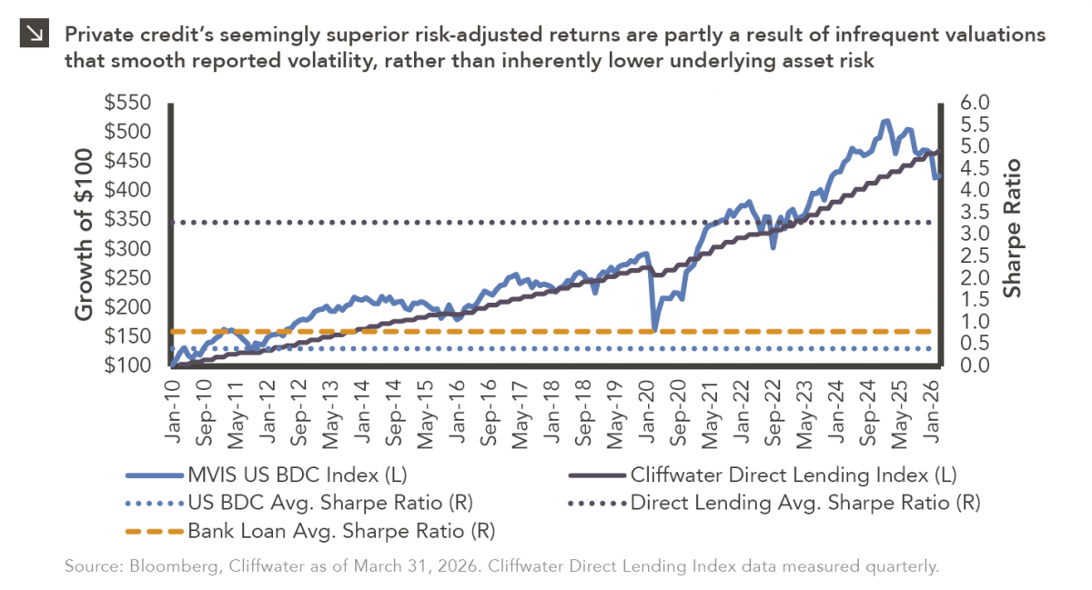
Hi, James Torgerson here! Volatility can be an unsightly blemish on portfolios and lead to inferior risk-adjusted returns. Private credit…
06.01.2026
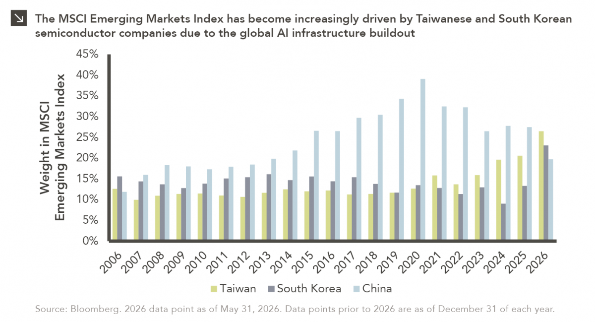
The MSCI Emerging Markets Index has undergone a significant structural transformation in recent years. For much of the past decade,…
05.26.2026
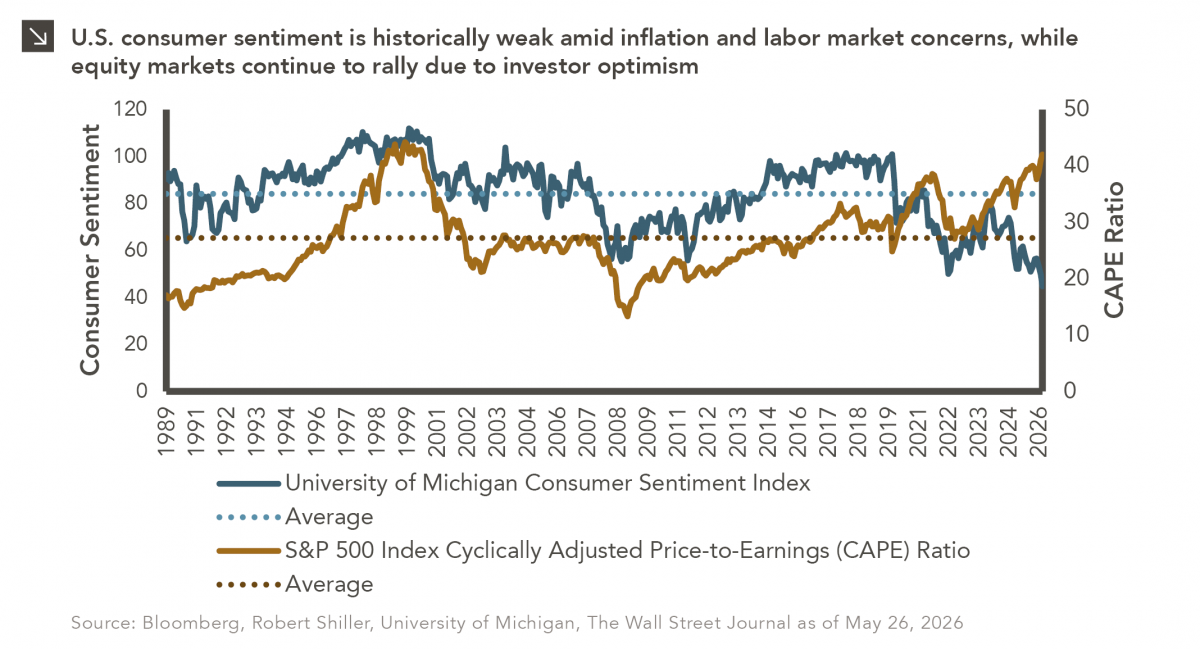
The classic novel A Tale of Two Cities by Charles Dickens begins with the line “It was the best of…
05.18.2026
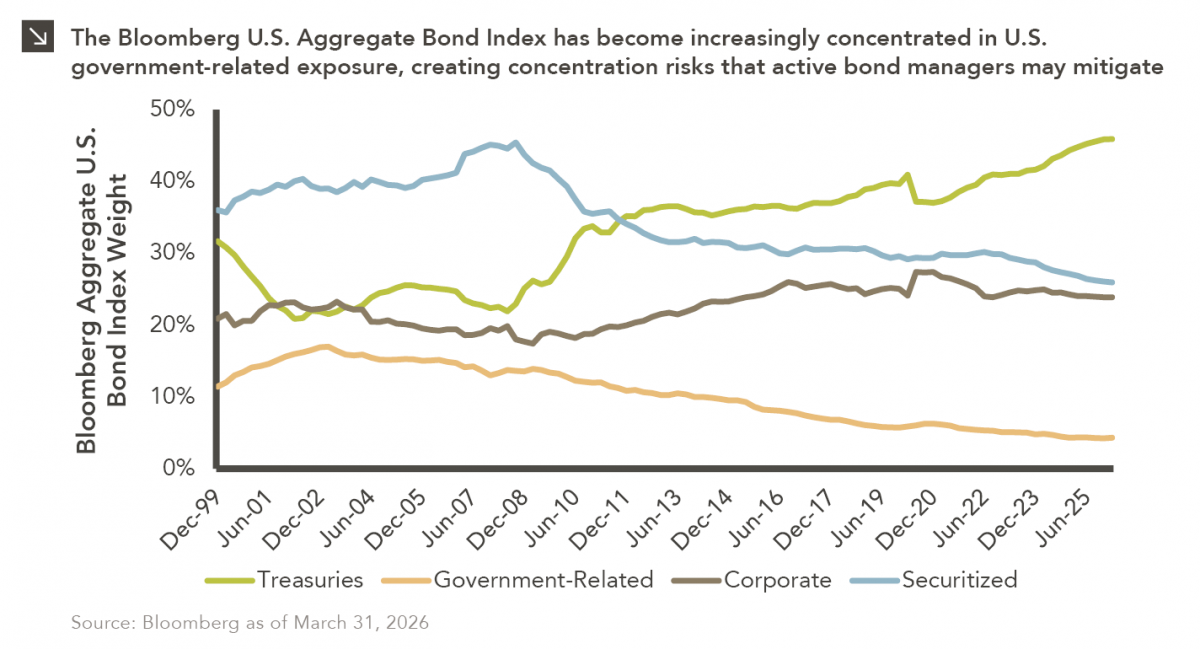
Over the last few years, equity markets have been defined by a group of stocks often referred to as the…
Research alerts keep you updated on our latest research publications. Simply enter your contact information, choose the research alerts you would like to receive and click Subscribe. Alerts will be sent as research is published.
We respect your privacy. We will never share or sell your information.
If you have questions or need further information, please contact us directly and we will respond to your inquiry within 24 hours.
Contact Us >