The Big Squeeze

February 02, 2021 | Jessica Noviskis, CFA, Associate Director

Line chart showing short interest as a percent of float for several single stocks. Chart subtitle: Hedge funds under pressure as shorts rally. Chart description: Y-axis shows Short Interest as a % of Float ranging from 0-150%. X-axis shows years spanning 2016-2021. Stocks displayed include GameStop Corp, AMC Entertainment Holdings, Bed Bath & Beyond Inc, BlackBerry Ltd, and Express Inc. GameStop's line shows the highest increase, from 43% in 2016 to 122% as of January 15, 2021. AMC and Bed Bath & Beyond also show marked increases over the years, from 5% to 28% and 12% to 66%, respectively. Both BlackBerry and Express have hovered relatively low and are currently at 9% and 12% respectively. Chart source: Bloomberg.

A group of small-cap stocks made big waves last week as retail day traders collaborated online to drive up certain stock prices in order to “squeeze” hedge funds with short positions. The influence of the retail investor has been building for over a year, facilitated by reduced trading fees, new brokerage platforms, and the time and money freed up by COVID lockdowns, but the Reddit-documented campaigns to manipulate GameStop and others brought forth entirely new dynamics.

Hedge funds take short positions when they expect stock prices to fall, generally for fundamental reasons. Short positions are inherently more risky than long positions — the downside is theoretically unlimited and short positions will increase in size as the stock moves against you, but prudent long/short managers understand these risks and typically run short portfolios that are more diversified, with smaller position sizes and tighter risk management parameters. Market sentiment and positioning is a key part of their analysis, especially on the short side. Stocks with high short interest have been red flags for many managers well before the term “Gamestonk” existed.

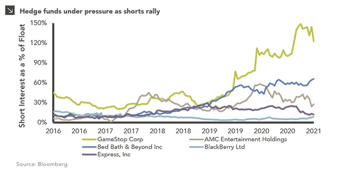
GameStop, AMC, Bed Bath & Beyond, and other stocks being irrationally bid up have fundamentally struggled for years. Outdated business models have led to earnings declines and multiple compression, and the impact of COVID has pulled forward bankruptcy concerns. At the same time, short interest has increased, and profitably — for the three years ending June 30th, 2020, the five stocks in the chart above lost on average 59% of their value. Over the last seven months, through the end of January, the worst performer of the group has almost tripled, and GameStop is up more than 7,000%, despite a largely unchanged fundamental outlook.

A number of hedge funds holding these higher short interest stocks were significantly impacted. At the center of the drama, Melvin Capital was reportedly down more than 50% for the month. While many hedge funds did not have direct exposure, the broader issue for the group and investors is the related de-grossing — long selling and short covering — as managers look to reduce exposure to the volatility. While de-grossing is not unusual (seen most recently in March 2020, September 2019, the fourth quarter of 2018), it has been especially rapid over the last week with hedge funds coming into the year with above average levels of gross and net leverage. While this has a created a tough backdrop for hedge fund alpha, especially coming off a record year in 2020, year to date losses have been modest. Through January, the average U.S. long/short fund was down just 2.3%,¹ relative to the S&P 500 -1.0%.

While Melvin Capital and others have publicly stated that they have fully closed out short positions on GameStop, the damage has been done, and these funds will likely face ongoing investor scrutiny over their risk management processes. But the majority of long/short funds should be able to make up any early year losses, with 2021 set up to be a good year for stock pickers. Prudent managers are re-underwriting their short positions, reducing exposure to potential targets and names with higher short interest, and many are patiently planning for the inevitable next leg. Stocks do not typically remain this severely disconnected from fundamentals for long, and at these valuations could present strong short opportunities.

Print PDF > The Big Squeeze

¹ Morgan Stanley Prime Brokerage


The opinions expressed herein are those of Marquette Associates, Inc. (“Marquette”), and are subject to change without notice. This material is not financial advice or an offer to purchase or sell any product. Marquette reserves the right to modify its current investment strategies and techniques based on changing market dynamics or client needs.

Jessica Noviskis, CFA
Associate Director

Get to Know Jessica

Related Content

This chart description is for illustrative purposes only and its accuracy cannot be guaranteed. Please see full disclosures at end of PDF document in the web post. General description: Table describing categories and criteria of MSCI indices. Chart subtitle: Despite its rapid ascendancy in recent decades, China is categorized as an emerging country by MSCI due to the market classification framework utilized by the index provider. Chart source: Source: MSCI as of June 30, 2023. ATVR: Annualized Traded Value Ratio, which is a liquidity measure used to assess liquidity of securities in the MSCI Global Investable Market Indices. The ATVR corresponds to the Annualized Traded Value of a security relative to its Free Float‐Adjusted Market Capitalization. Chart description: First column is Criteria, second is Frontier, third is Emerging, and fourth is Developed. First row section is Economic Development, detailed with “Sustainability of economic development.” Frontier: No requirement. Emerging: No requirement. Developed: Country GNI per capita 25% above the World Bank high income threshold for 3 consecutive years. Second section is Size and Liability Requirements, with four sub-rows. First: Number of companies meeting the following Standard Index criteria: Frontier: 2 Emerging: 3. Developed: 5. Second: Company size (full market cap, USD): Frontier: $1,033M. Emerging: $2,066M. Developed: $4,133M. Third: Security size (float market cap, USD): Frontier: $73M. Emerging: $1,033M. Developed: $2,066M. Fourth: Security liquidity: Frontier: 2.5% ATVR. Emerging: 15% ATVR. Developed: 20% ATVR. Third section is Market Accessibility, with five sub-rows. First: Openness to foreign ownership: Frontier: At least some. Emerging: Significant. Developed: Very high. Second: Ease of capital inflows / outflows: Frontier: At least partial. Emerging: Significant. Developed: Very high. Third: Efficiency of operational framework: Frontier: Modest. Emerging: Good and tested. Developed: Very high. Fourth: Availability of investment instruments: Frontier: High. Emerging: High. Developed: Unrestricted. Fifth: Stability of the institutional framework: Frontier: Modest. Emerging: Modest. Developed: Very high. End chart description. See disclosures at end of document.

12.04.2023

Is China Guilty of Category Fraud?

With movie awards season around the corner, some entertainment pundits may use the term “category fraud” to describe races in…

This chart description is for illustrative purposes only and its accuracy cannot be guaranteed. Please see full disclosures at end of PDF document in the web post. General description: Combination column and line chart comparing recent holiday spending by U.S. consumers. Chart subtitle: Spending is on track to reach record levels this holiday season, despite mounting economic pressures faced by American consumers. Chart source: Adobe Analytics and CNN Business as of October 31, 2023. Chart description: Left Y-axis is labeled “Spending” and ranges from $0B to $250B. Right Y-axis is labeled “YoY Growth” and ranges from 0% to 50%. X-axis labels each column: 2019, 2020, 2021, 2022, and 2023 (Projected). Holiday Spending by U.S. Consumers is plotted in dark teal columns. Holiday Spending Growth is plotted with light purple line and markers. 2019 saw $143B in spending and 13.1% YoY growth; 2020 $188B, 32.1%; 2021 $205B, 8.7%; 2022 $212B, 3.5%, and 2023 is projected at $222B and 4.8%. End chart description. See disclosures at end of document.

11.30.2023

‘Tis the Season to Spend!

The holiday spending frenzy is well underway as some of the biggest shopping days of the year, including Black Friday…

11.16.2023

The Taming of the VIX

October proved tumultuous for investors as all major U.S. equity indices were negative and the CBOE VIX Index, which serves…

This chart description is for illustrative purposes only and its accuracy cannot be guaranteed. Please see full disclosures at end of PDF document in the web post. General description: Combination stacked column and line chart comparing unrealized gains/losses with effective federal funds rate. Chart subtitle: Unrealized losses across depository institutions have increased in recent quarters thanks to higher interest rates. Chart source: Federal Deposit Insurance Corporation and Federal Reserve Bank of St. Louis as of June 30, 2023. Chart description: Left Y-axis is labeled “Unrealized Gains/Losses” and ranges from -$800B to +$800B, corresponding to stacked columns. Right Y-axis is labeled “Rate” and ranges from -6% to +6%, corresponding to line. X-axis ranges from 1Q08 to 2Q23; labels are at 3-quarter increments to fit so last label is for 1Q23. Available-For-Sale Securities are plotted in dark green base of stacked columns; Held-To-Maturity Securities are plotted in lighter green as second half of column. Effect Federal Funds Rate line is plotted in light blue. Unrealized losses are at significant levels for chart losses; since the fed funds rate has increased since 1Q22, losses have totaled over $300B. Most recent datapoints, as of 2Q23 are as follows: Available-For-Sale Securities at -$248.9B, Held-To-Maturity Securities at -$309.6B, and Effective Federal Funds Rate at 5.3%. Please contact us for the full dataset. End chart description. See disclosures at end of document.

11.08.2023

Realizing the Impact of Unrealized Losses

Earlier this year, the regional banking crisis and eventual collapses of Silicon Valley Bank, Signature Bank, First Republic Bank, and…

This chart description is for illustrative purposes only and its accuracy cannot be guaranteed. Please see full disclosures at end of PDF document in the web post. General description: Three-line chart showing cumulative return for various U.S. equity indices. Chart subtitle: Domestic stock indices enter correction territory after recent slide. Chart source: Bloomberg as of October 31, 2023. Chart description: Y-axis is labeled “Cumulative Return” and ranges from -15% to +10%. X-axis is labeled in monthly increments, from Jun-23 to Oct-23. Data ranges 6/30/23 through 10/31/23. S&P 500 Index is plotted in orange line, Nasdaq-100 Index in light tan line, and Russell 2000 Index in dark purple line. Most recent data points, respectively, -5.31%, -4.84%, -11.61%. Please contact us for the full dataset. End chart description. See disclosures at end of document.

11.01.2023

The Chart for Red October

U.S. equities declined for the third consecutive month in October amid an environment of higher yields and underwhelming earnings reports…

10.13.2023

3Q 2023 Market Insights Video

This video is a recording of a live webinar held on October 26 by Marquette’s research team, featuring in-depth analysis…

More articles

Subscribe to Research Email Alerts

Research Email Alert Subscription

Research alerts keep you updated on our latest research publications. Simply enter your contact information, choose the research alerts you would like to receive and click Subscribe. Alerts will be sent as research is published.

We respect your privacy. We will never share or sell your information.

Thank You

We appreciate your interest in Marquette Associates.

If you have questions or need further information, please contact us directly and we will respond to your inquiry within 24 hours.

Contact Us >