Eric Gaylord, CFA
Partner


A repurchase agreement (“repo”) is a transaction in which a dealer sells securities to an investor and agrees to repurchase the securities at a future date. Typically, the dealer sells the securities at a discount to the repurchase price. Effectively, the arrangement is akin to a collateralized loan with the difference between the sales price and repurchase price equating to an interest payment and the securities serving as collateral in the event of default (i.e., failure to repurchase).
The repo market is relevant because it is a critical mechanism for the U.S. financial system to facilitate short-term lending between major financial institutions, money market vehicles, and the Federal Reserve. The credit crisis in 2008 was preceded by heightened leverage in the repo market. When the fragile state of banking institutions’ balance sheets became apparent, money market funds and private lenders collectively barred access to capital for borrowers perceived to be weak. Due to a general lack of transparency as well as market fear, access to capital from the repo market dried up and sealed the fate of the likes of Lehman Brothers and Bear, Stearns & Co. who depended on it as a source of borrowing. Since then, the Federal Reserve has been aware of the need for reforms to reduce reliance on private banks and money market funds for liquidity in the repo market during times of stress.
This week’s chart shows evidence of the Fed’s intervention in the U.S. repo market to manage liquidity in lending markets and promote the stability of the financial system. In 2008, the Fed acted as a lender of cash, increasing its position in repurchase agreements, attempting to supply much needed capital to the banking system. More recently, the Fed has done the opposite. On September 23, 2013, the Fed began testing its reverse repurchase agreement program. As part of the new program, the Fed has been increasing its position in reverse repurchase agreements which means it absorbs cash from private institutions, thus acting as a borrower. While some believe this is simply a measure of monetary tightening, a more compelling argument is that the Fed is maintaining its role as a provider of liquidity despite taking the other side of the trade. In the face of high demand for U.S. Treasury securities as collateral for private institutions and money market funds, the Fed is using reverse repos to increase the availability of those securities in the market by drawing them from its own balance sheet. Meanwhile, the New York Fed is monitoring the weighted average maturity of banks’ borrowings in the repo market to identify vulnerable institutions with an overreliance on borrowing. Though the program has not yet been permanently instituted, it seems probable that the Fed hopes to use this new tool to stabilize bond markets ad infinitum.
The opinions expressed herein are those of Marquette Associates, Inc. (“Marquette”), and are subject to change without notice. This material is not financial advice or an offer to purchase or sell any product. Marquette reserves the right to modify its current investment strategies and techniques based on changing market dynamics or client needs.

04.27.2026
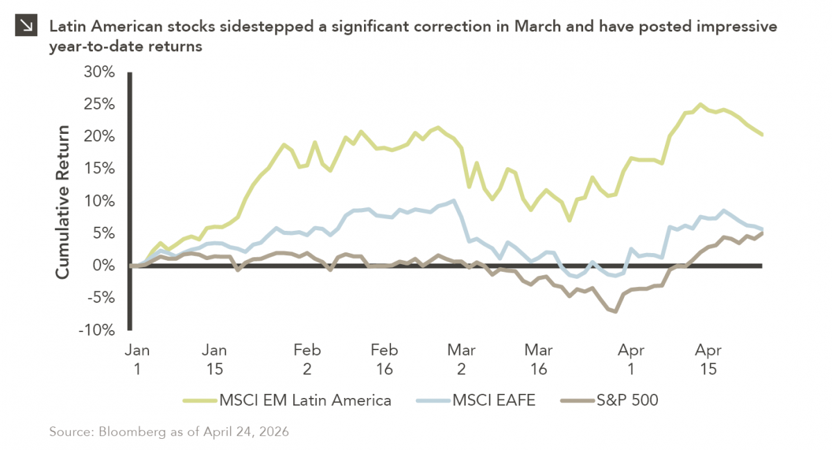
Latin American equity markets have shown remarkable strength in 2026. After a strong start to the year, the MSCI Emerging…
04.23.2026
Diversify. Rebalance. Stay invested. Every one of these letters has concluded with that same advice in some shape or form….

04.20.2026
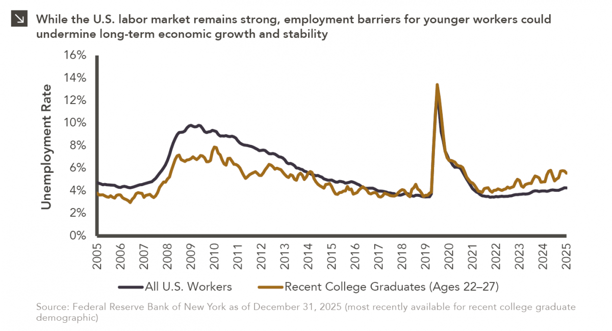
Entry-level jobs have traditionally served as the primary bridge between education and stable employment, offering young workers a foothold from…

04.13.2026
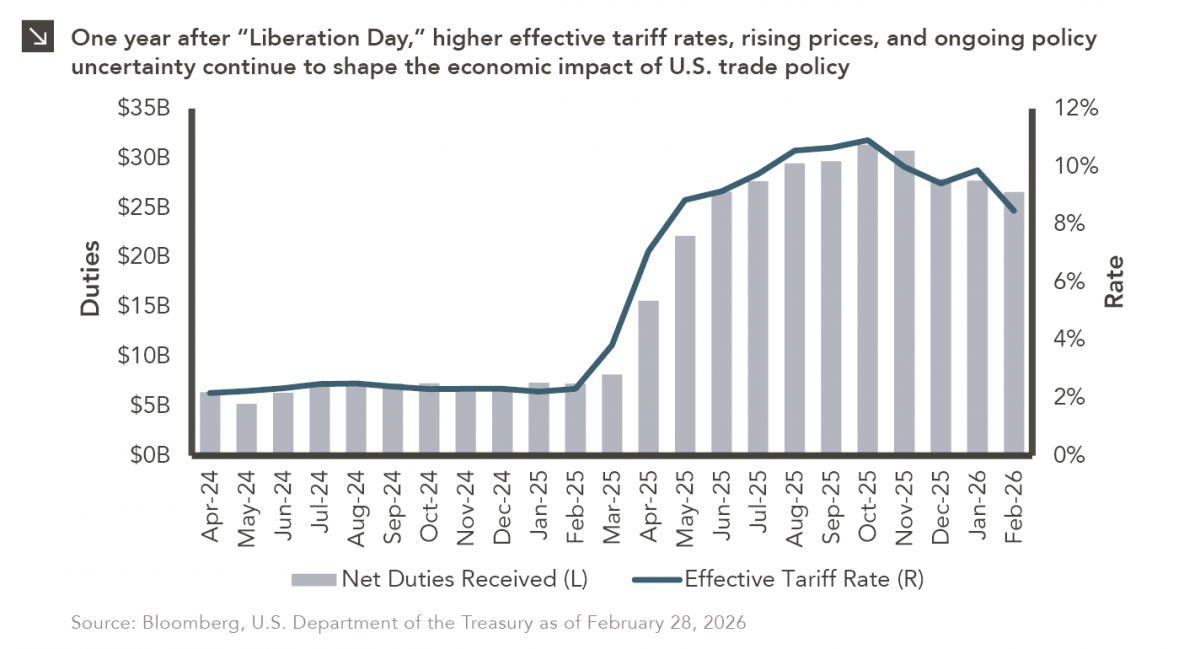
On April 2, 2025, President Donald Trump announced a sweeping set of tariffs on imports into the United States. Dubbed…
04.07.2026
On March 30, 2026, the Department of Labor (DOL) issued its proposed regulation: Fiduciary Duties in Selecting Designated Investment Alternatives….

04.06.2026
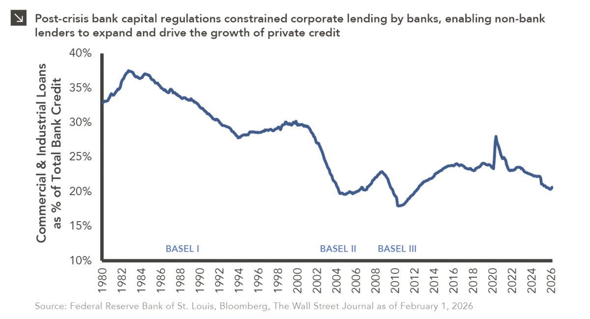
The Basel capital framework was created to ensure that banks maintain sufficient capital to absorb losses and reduce the risk…
Research alerts keep you updated on our latest research publications. Simply enter your contact information, choose the research alerts you would like to receive and click Subscribe. Alerts will be sent as research is published.
We respect your privacy. We will never share or sell your information.
If you have questions or need further information, please contact us directly and we will respond to your inquiry within 24 hours.
Contact Us >