04.23.2026
We’ve Seen This Before
Diversify. Rebalance. Stay invested. Every one of these letters has concluded with that same advice in some shape or form….


Index choice plays a pivotal role in investment management. Passive investors utilize indices to gain exposure to a specific segment of the market or asset class, while active managers look to them as a benchmark of success or failure. For small-cap investors, the choice rests between two options: the S&P 600 Index and the Russell 2000 Index. While 93% of the eVestment Small Cap Core strategies utilize the Russell 2000 as a benchmark, the S&P 600 has been a superior investment over the long-term. The S&P has outperformed its more heavily-utilized peer by more than 1.8% on average across rolling three-year periods. On a cumulative basis, the S&P has generated more than 140% outperformance to the Russell since the turn of the century. This week’s chart seeks to understand the nuances of each index and share insights on why the “quality”-focused S&P index has begun to lag the Russell 2000 in the current market environment.
Launched in 1984, the Russell 2000 measures the performance of the smallest stocks in the United States. FTSE Russell ranks the entirety of the U.S. equities market by market capitalization in descending order. Stocks with a rank of 1,001st to 3,000th are included in the Russell 2000 Index. This approach effectively captures the breadth of the small cap market in its totality with objective, predictable, and transparent construction. On the other hand, the S&P 600 Index takes a committee-determined more concentrated approach, investing in just 600 stocks in the small cap universe. In addition, S&P utilizes an earnings screen for new constituents. For a company to be included, the sum of the most recent four consecutive quarters of GAAP earnings must be positive, as should the most recent quarter. We view this requirement as a proxy for quality. Without this screen, non-earning stocks have risen to more than 40% of the Russell 2000 Index.¹ Relative to large-cap peers, small-cap companies tend to be rife with debt, unproven business models, and inexperienced management teams. While this lends itself to market inefficiencies and opportunities for active management, it is important to view the asset class through a quality lens.
These indices utilize vastly different construction processes and yet both are tasked with measuring the performance of U.S. small-cap equities. The driving force behind the S&P 600’s outperformance lies in the earnings screen. Over the long-term, small-cap companies with higher return on equity (ROE) have historically outperformed their low or negative ROE peers.² In other words, companies that make profits have outperformed those that do not. However, history shows us that markets are cyclical. In the latter stages of a bull market, earnings tend to take a back seat to momentum and speculation. At such a point, investors are risk seeking – as shown in the lead up to the early 2000’s Dot.com bubble – crowding into popular “high-tech” offerings despite deteriorating fundamentals. This echoes today’s environment and while every economic downturn is unique, themes tend to persist. Today we have an abundance of capital injected into the economy by the Federal Reserve, allowing small-cap companies to fund operations in the face of falling demand and narrowing margins. Market dynamics have been dictated by winners and losers of the pandemic, allowing the S&P 500 to reach new daily highs as the top-heavy index continues to soar regardless of record high unemployment and cratering corporate earnings. Eventually, investing in quality will reign supreme as it has – on average – over the last two decades. As the cycle continues its course, remaining invested in companies with positive earnings will pay off in the long run.
Print PDF > The Quality of Index Construction
¹ Strategas
² Factset; The top quintile of the IWM ETF outperforms the bottom quintile of cumulative return by ROE by 7.4% over a 7 year period ending July 31, 2020.
The opinions expressed herein are those of Marquette Associates, Inc. (“Marquette”), and are subject to change without notice. This material is not financial advice or an offer to purchase or sell any product. Marquette reserves the right to modify its current investment strategies and techniques based on changing market dynamics or client needs.
04.23.2026
Diversify. Rebalance. Stay invested. Every one of these letters has concluded with that same advice in some shape or form….

04.20.2026
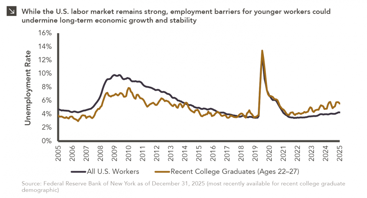
Entry-level jobs have traditionally served as the primary bridge between education and stable employment, offering young workers a foothold from…

04.13.2026
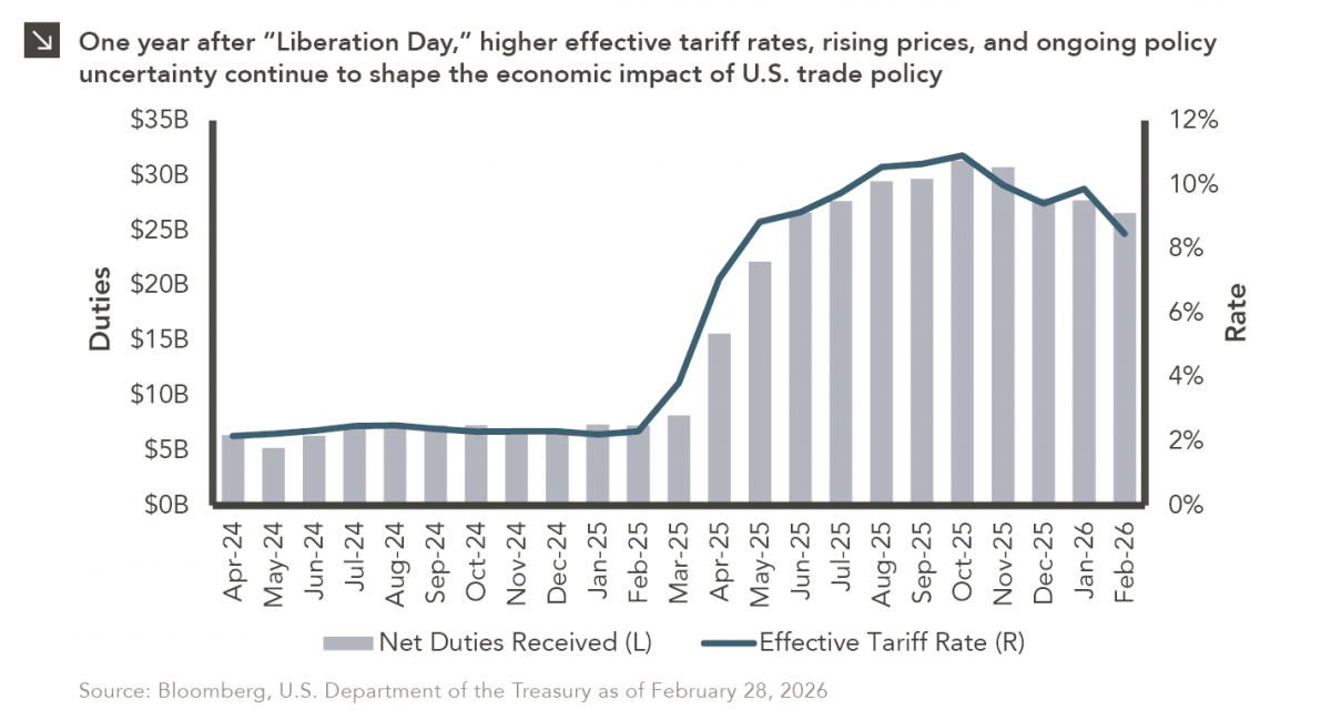
On April 2, 2025, President Donald Trump announced a sweeping set of tariffs on imports into the United States. Dubbed…
04.07.2026
On March 30, 2026, the Department of Labor (DOL) issued its proposed regulation: Fiduciary Duties in Selecting Designated Investment Alternatives….

04.06.2026
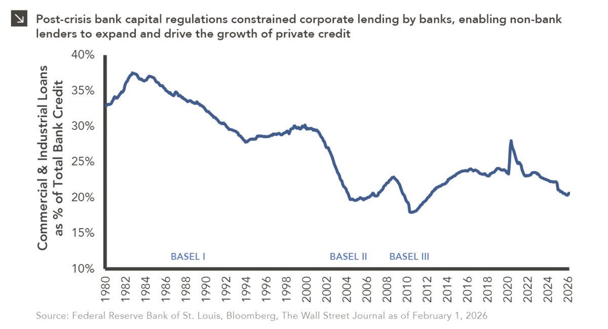
The Basel capital framework was created to ensure that banks maintain sufficient capital to absorb losses and reduce the risk…

04.02.2026
This video is a recording of a live webinar held April 16 by Marquette’s research team analyzing the first quarter…
Research alerts keep you updated on our latest research publications. Simply enter your contact information, choose the research alerts you would like to receive and click Subscribe. Alerts will be sent as research is published.
We respect your privacy. We will never share or sell your information.
If you have questions or need further information, please contact us directly and we will respond to your inquiry within 24 hours.
Contact Us >