07.27.2026
Liquidity Isn’t Free
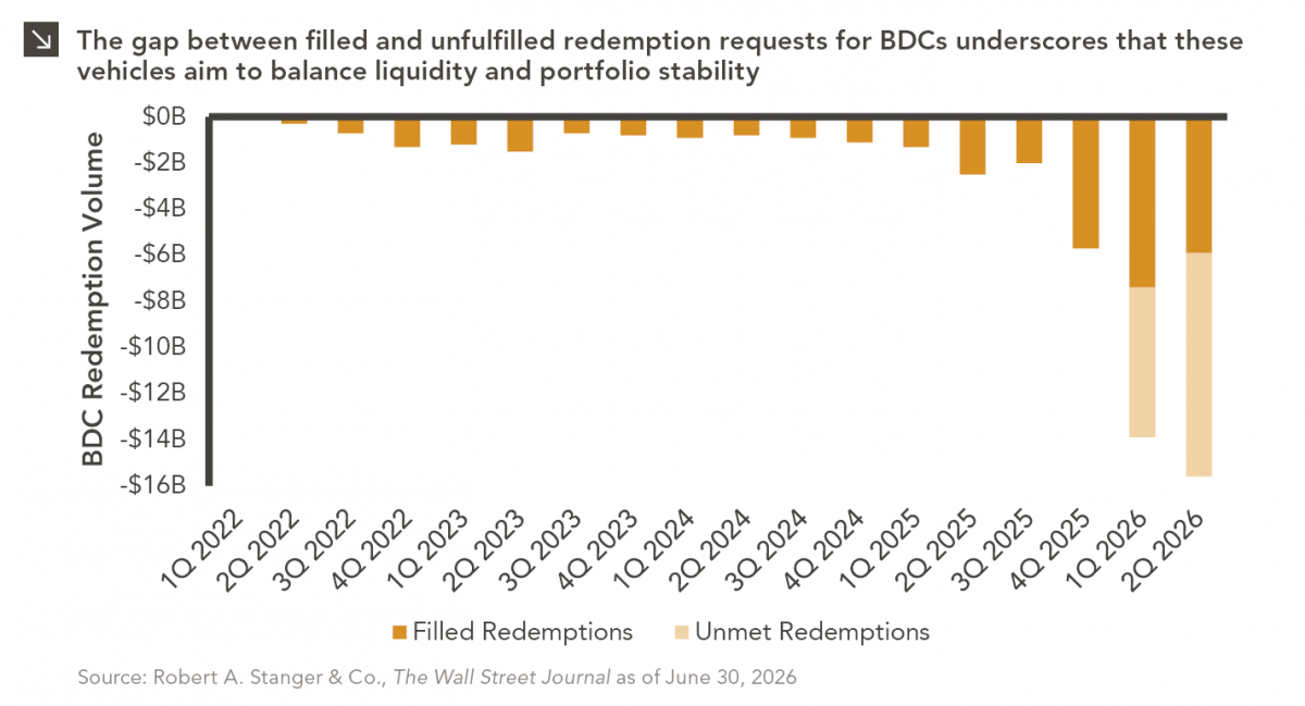
The rapid growth of non-traded business development companies (BDCs), which are investment vehicles that pool investor capital to make loans…

The Federal Reserve is arguably the most influential financial institution in the world. Their eight meetings a year are highly anticipated, their policy decisions are highly scrutinized, and their economic projections and commentary can move markets. Last month the Nasdaq sold off nearly 9% on concerns of heightened inflation and expected rate hikes by the central bank. The market reversed sharply after the January FOMC meeting on Chair Jerome Powell’s comments about rising inflation and monetary tightening. There are even trading strategies built on predicting market movements after the Fed’s comments and monetary policy surprises. While the monetary policy decisions made by the Fed have a material impact on the economy, their projections are not always accurate, especially when it comes to rate hikes.
Our chart of the week examines the summary of economic projections of GDP, unemployment, inflation, and the number of 25 basis point rate hikes projected for the year over the last eight years. Prior to the COVID pandemic in 2020, the Fed had fairly accurately predicted GDP, inflation, and unemployment, more often than not coming within 0.2% of actual full-year numbers. Ironically, when it comes to interest rate changes — the metric most directly controlled by the Federal Reserve — predictions worsen. While the Fed accurately foresaw no movement in 2014 and 2021 and were on the mark with three rate hikes in 2017, they greatly overestimated hikes in 2015 and 2016 and underestimated rate cuts in 2019 and 2020. Following four rate hikes in 2018, after starting the year predicting three, the Fed quickly reversed course in 2019, cutting rates three times, a sharp contrast to initial expectations for one additional rate increase.
This year the members of the FOMC are predicting three rate hikes, though history has shown us actual results could differ greatly. Monetary policy and economics are never an exact science, and the continually evolving supply and demand dynamics behind inflation make this year all the more challenging. There are simply variables that cannot be predicted. In other words, there is no crystal ball. As the year unfolds, we will continue to keep our clients abreast of policy updates out of the Fed as well as any other developments that could impact the course of rates.
Print PDF > There Is No Crystal Ball
The opinions expressed herein are those of Marquette Associates, Inc. (“Marquette”), and are subject to change without notice. This material is not financial advice or an offer to purchase or sell any product. Marquette reserves the right to modify its current investment strategies and techniques based on changing market dynamics or client needs.
07.27.2026
The rapid growth of non-traded business development companies (BDCs), which are investment vehicles that pool investor capital to make loans…

07.20.2026
Our most recent Chart of the Week publication discussed how the AI investment opportunity has expanded beyond…

07.13.2026
One of the enduring lessons of the California Gold Rush is that the greatest fortunes were often made not by…

07.06.2026
Since traditional exit routes have remained constrained in recent years due to higher interest rates, valuation gaps, and a subdued…

06.29.2026
This week’s chart highlights the varying return profiles across key infrastructure sectors by illustrating the split between income and capital…

06.22.2026
When Benchmark, one of Silicon Valley’s most renowned early-stage venture capital firms, closed $2 billion across two new funds this…
Research alerts keep you updated on our latest research publications. Simply enter your contact information, choose the research alerts you would like to receive and click Subscribe. Alerts will be sent as research is published.
We respect your privacy. We will never share or sell your information.
If you have questions or need further information, please contact us directly and we will respond to your inquiry within 24 hours.
Contact Us >