04.27.2026
Let’s Hear It for Latin America
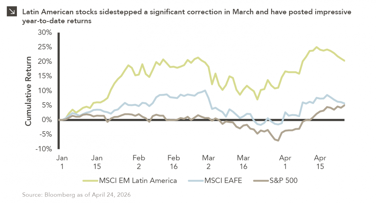
Latin American equity markets have shown remarkable strength in 2026. After a strong start to the year, the MSCI Emerging…


As a growing number of participants have entered the private markets, the amount of total dry powder has increased. Venture capital funds, however, do not appear to be driving this significant increase in fundraising. Rather, U.S. venture capital fundraising appears to have remained rational, roughly in-line with the market’s long-term average of $30 billion raised annually, which differs from the more dramatic increases in fundraising within private equity, growth equity, real estate, and private credit.
Dry powder within U.S. venture capital has risen, but remains at a consistent ratio relative to the annual investment level in the industry, currently implying 1.5 years of investment¹ to work through the current levels of dry powder. A key reason for this statistic is the notable level of investments made in the market; in 2017, close to $70 billion was invested, which represents the highest amount since the tech bubble in 2000. Over the last 18 years U.S. venture capital investments have exceeded U.S. fundraising as additional capital has been invested by sovereign wealth funds, corporate venture groups, and family offices.
This increasingly competitive investment environment is forcing managers to work harder to differentiate their capital by providing more strategic value to underlying managers and companies. Market valuations have been high for 4-5 years now, but the early stage venture space hasn’t experienced as much valuation expansion given the inherent business risk. What has changed is a decline in the number of financing rounds, as fewer companies are raising larger amounts of capital and instead are seeking investors who can provide strategic value as many businesses remain private for longer.
We believe it is important to remain disciplined in manager selection as established high-quality managers with broader platforms are positioned to perform well in this environment as they have differentiated capital pursued by many businesses. We believe these managers are more likely to find attractive investment opportunities without overpaying in this competitive environment.
¹ The ratio of dry powder to annual investment provides an indication of how many years of investment are needed to work through the current level of dry powder. A ratio over 1 implies there is more than a full year’s worth of dry powder based on the most recent annual deployment for the industry. It is important to pay attention to the directional change of this ratio. An increasing ratio is an indicator the investment landscape is becoming more competitive to deploy capital as dry powder is growing faster than investment opportunities.
The opinions expressed herein are those of Marquette Associates, Inc. (“Marquette”), and are subject to change without notice. This material is not financial advice or an offer to purchase or sell any product. Marquette reserves the right to modify its current investment strategies and techniques based on changing market dynamics or client needs.
The opinions expressed herein are those of Marquette Associates, Inc. (“Marquette”), and are subject to change without notice. This material is not financial advice or an offer to purchase or sell any product. Marquette reserves the right to modify its current investment strategies and techniques based on changing market dynamics or client needs.

04.27.2026
Latin American equity markets have shown remarkable strength in 2026. After a strong start to the year, the MSCI Emerging…
04.23.2026
Diversify. Rebalance. Stay invested. Every one of these letters has concluded with that same advice in some shape or form….

04.20.2026
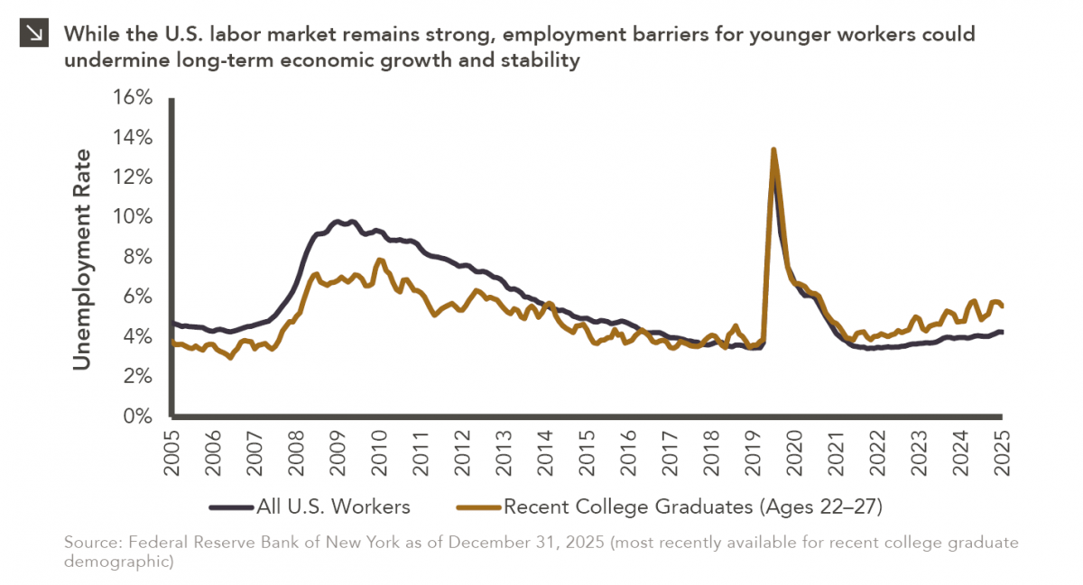
Entry-level jobs have traditionally served as the primary bridge between education and stable employment, offering young workers a foothold from…

04.13.2026
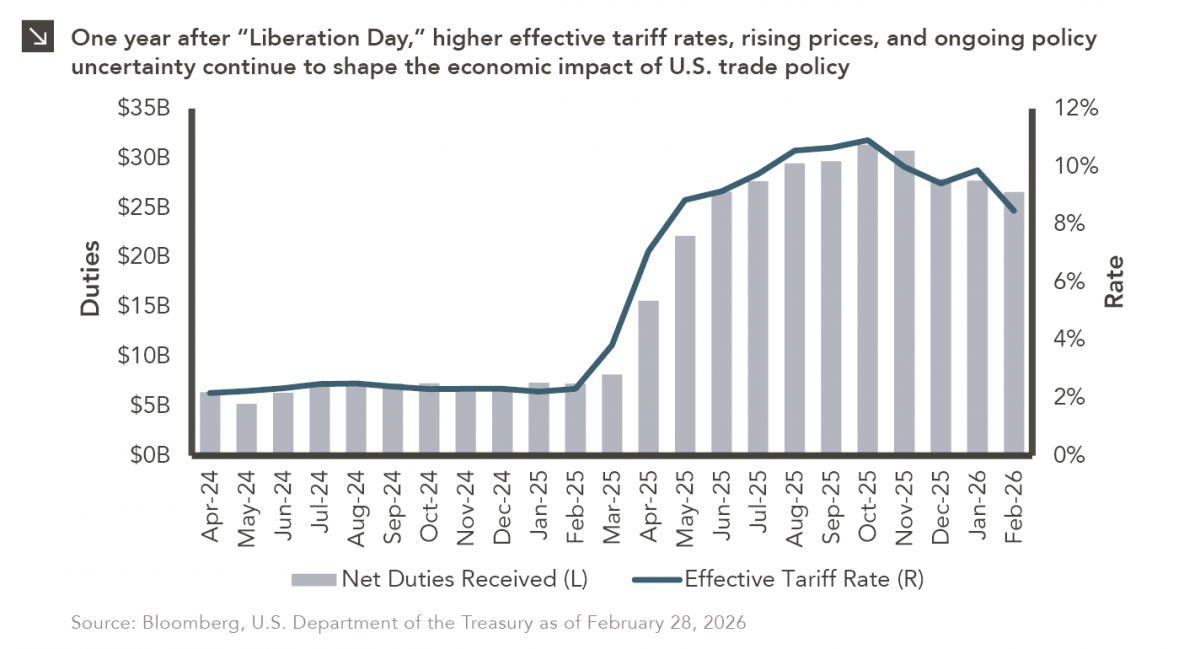
On April 2, 2025, President Donald Trump announced a sweeping set of tariffs on imports into the United States. Dubbed…
04.07.2026
On March 30, 2026, the Department of Labor (DOL) issued its proposed regulation: Fiduciary Duties in Selecting Designated Investment Alternatives….

04.06.2026
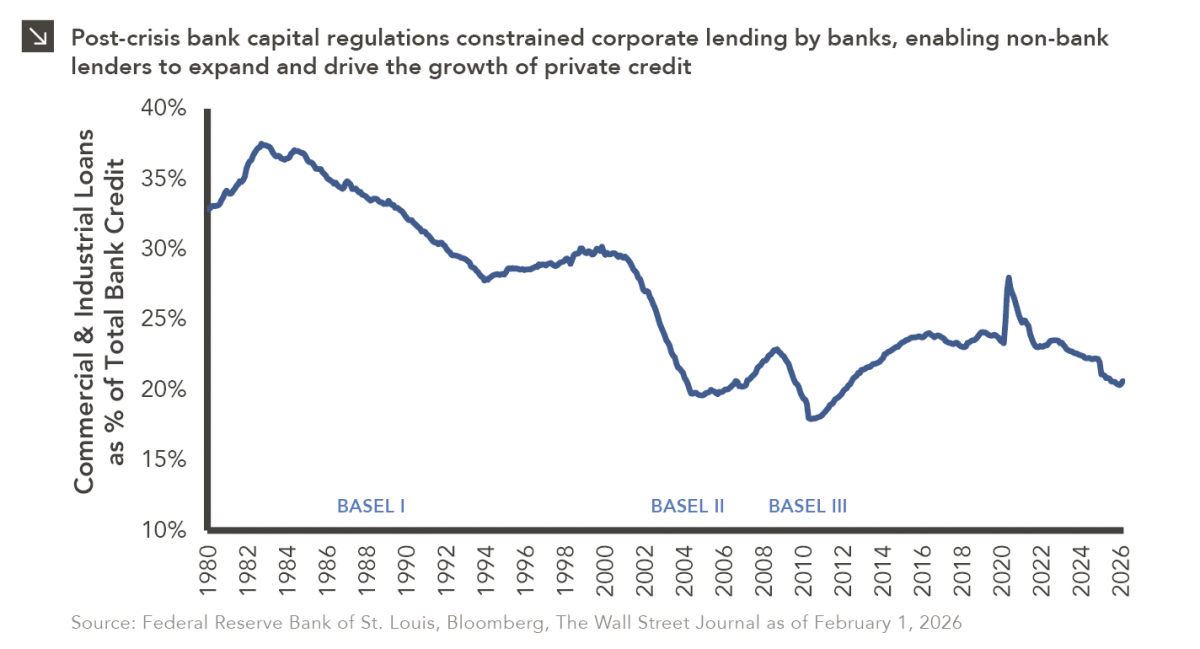
The Basel capital framework was created to ensure that banks maintain sufficient capital to absorb losses and reduce the risk…
Research alerts keep you updated on our latest research publications. Simply enter your contact information, choose the research alerts you would like to receive and click Subscribe. Alerts will be sent as research is published.
We respect your privacy. We will never share or sell your information.
If you have questions or need further information, please contact us directly and we will respond to your inquiry within 24 hours.
Contact Us >