07.07.2026
2026 Halftime Market Insights Webinar
JULY 23 — 1:00pm CT Please join Marquette’s research team for our 2026 Halftime Market Insights Webinar…
Flash talk by Olu Rosanwo, CAIA, at Marquette’s 2015 Investment Symposium on making sense of oil and energy prices.
The opinions expressed herein are those of Marquette Associates, Inc. (“Marquette”), and are subject to change without notice. This material is not financial advice or an offer to purchase or sell any product. Marquette reserves the right to modify its current investment strategies and techniques based on changing market dynamics or client needs.

07.07.2026
JULY 23 — 1:00pm CT Please join Marquette’s research team for our 2026 Halftime Market Insights Webinar…
06.25.2026
Commodities represent a unique asset class within global financial markets. Like equities and bonds, commodity prices are influenced by the…
05.11.2026
In addition to the humanitarian toll of the conflict in Iran, the world is currently confronting the impact that trade…
04.23.2026
Diversify. Rebalance. Stay invested. Every one of these letters has concluded with that same advice in some shape or form….
04.02.2026
This video is a recording of a live webinar held April 16 by Marquette’s research team analyzing the first quarter…

03.23.2026
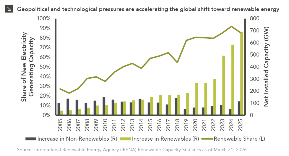
Global energy costs have risen sharply this month due to a convergence of geopolitical shocks, as critical infrastructure and transport…
Research alerts keep you updated on our latest research publications. Simply enter your contact information, choose the research alerts you would like to receive and click Subscribe. Alerts will be sent as research is published.
We respect your privacy. We will never share or sell your information.
If you have questions or need further information, please contact us directly and we will respond to your inquiry within 24 hours.
Contact Us >