07.24.2026
2026 Halftime Market Insights
This video is a recording of a live webinar held July 23 by Marquette’s research team analyzing the first half…
On December 14, 2016, the FOMC announced its unanimous decision to raise interest rates by 25 basis points, bringing the target fed funds rate to between 0.50% and 0.75%. This was the first increase since last December’s, with the hike prior to that occurring in 2006 before the Great Recession.
This move was widely anticipated and well-communicated to the markets. As such, fed funds futures carried a 100% implied probability of a hike going into it, and most – if not all – of the hike was already priced into global markets. Markets over the past one and a half days since the hike have remained relatively calm. The 10-year Treasury yield rose by only 12bp to end at 2.6%, while the one-year Treasury yield rose by just 3bp to end at 0.9% and the 30-year Treasury yield rose by 2bp to end at 3.1%. The Core Aggregate bond index and the Intermediate Government/Credit index were down only 0.5%, while the 1-3 Yr Government/Credit index fell 0.2%; the Long Government/Credit index also decreased 0.2%. The Credit Suisse Leveraged Loan index was up 0.1%, the Credit Suisse High Yield index was down 0.3%, and the JPMorgan emerging markets debt EMBI Global Diversified index decreased by less than 0.1%. The dollar rose while gold declined, as expected. The S&P 500 declined less than 0.1%.
The opinions expressed herein are those of Marquette Associates, Inc. (“Marquette”), and are subject to change without notice. This material is not financial advice or an offer to purchase or sell any product. Marquette reserves the right to modify its current investment strategies and techniques based on changing market dynamics or client needs.

07.24.2026
This video is a recording of a live webinar held July 23 by Marquette’s research team analyzing the first half…
07.22.2026
The usual midyear version of these letters has touched on year-to-date performance as well as the most influential macroeconomic and…
06.25.2026
Commodities represent a unique asset class within global financial markets. Like equities and bonds, commodity prices are influenced by the…
06.08.2026
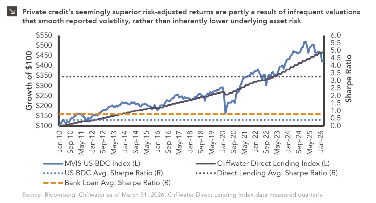
Hi, James Torgerson here! Volatility can be an unsightly blemish on portfolios and lead to inferior risk-adjusted returns. Private credit…
05.18.2026
Over the last few years, equity markets have been defined by a group of stocks often referred to as the…
05.07.2026
The leadership structure of the Federal Reserve is intentionally designed to promote continuity, independence, and institutional stability across political cycles….
Research alerts keep you updated on our latest research publications. Simply enter your contact information, choose the research alerts you would like to receive and click Subscribe. Alerts will be sent as research is published.
We respect your privacy. We will never share or sell your information.
If you have questions or need further information, please contact us directly and we will respond to your inquiry within 24 hours.
Contact Us >