Amy Miller
Associate Director of Private Equity

One of the oft-touted advantages of investing in private equity is the opportunity to buy in at a discount to public markets. This valuation discount, as measured by EV/EBITDA multiples, has persisted since 2012, widening to nearly 60% in 2020.¹ Since that peak, the discount has narrowed significantly as public market equities have sold off. While this may give some cause to pause, it is interesting to consider what transpired for investors between 2009 and 2012, on the heels of a near-meltdown of the financial system. With equities down sharply into 2009, the denominator effect boosted percentage allocations to private equity within investor portfolios. The instinctive reaction (and in some cases, forced action) may have been to abstain from new private equity investments beginning in 2009 so as not to exacerbate the over-allocation. This may sound familiar to private equity investors in 2022.
With hindsight being 20/20, these corrections to annual capital commitments ultimately resulted in an under-allocation to private equity, and thus underperforming portfolios over the next decade, as public markets and public market allocations snapped back. Furthermore, while private equity will likely not see the type of drawdown that public markets have seen, we do expect valuations to pull back, creating attractive entry points for managers with dry powder to deploy capital. While investors should be mindful of any liquidity constraints and maximum allocations to private markets, those that are able to remain steadfast in their annual commitment pacing schedules may find themselves in a better position once the public markets settle. Marquette believes that a successful private equity program is one that is consistently diversified by vintage year over time and highly selective in terms of manager partnerships.
¹Pitchbook, as of June 30, 2022

The opinions expressed herein are those of Marquette Associates, Inc. (“Marquette”), and are subject to change without notice. This material is not financial advice or an offer to purchase or sell any product. Marquette reserves the right to modify its current investment strategies and techniques based on changing market dynamics or client needs.

07.07.2026
JULY 23 — 1:00pm CT Please join Marquette’s research team for our 2026 Halftime Market Insights Webinar…

07.06.2026
Since traditional exit routes have remained constrained in recent years due to higher interest rates, valuation gaps, and a subdued…

06.29.2026
This week’s chart highlights the varying return profiles across key infrastructure sectors by illustrating the split between income and capital…

06.22.2026
When Benchmark, one of Silicon Valley’s most renowned early-stage venture capital firms, closed $2 billion across two new funds this…

06.15.2026
The rapid buildout of artificial intelligence infrastructure is reshaping the U.S. investment landscape. According to recent Census Bureau data, spending…
06.08.2026
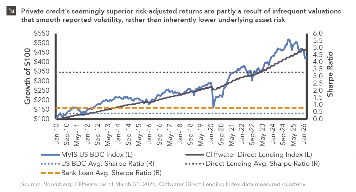
Hi, James Torgerson here! Volatility can be an unsightly blemish on portfolios and lead to inferior risk-adjusted returns. Private credit…
Research alerts keep you updated on our latest research publications. Simply enter your contact information, choose the research alerts you would like to receive and click Subscribe. Alerts will be sent as research is published.
We respect your privacy. We will never share or sell your information.
If you have questions or need further information, please contact us directly and we will respond to your inquiry within 24 hours.
Contact Us >