07.27.2026
Liquidity Isn’t Free
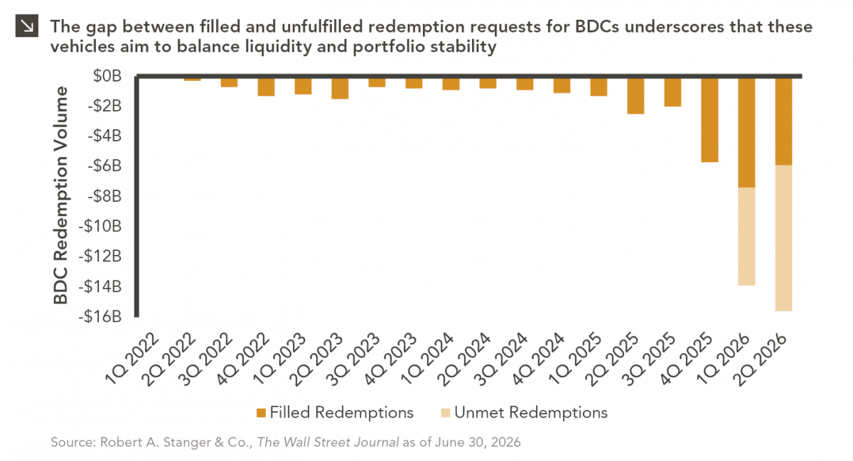
The rapid growth of non-traded business development companies (BDCs), which are investment vehicles that pool investor capital to make loans…

Despite a number of commodity prices, including lumber, corn, and pork, retreating from recent highs, inflation remains a key focus for investors, especially as the Delta variant rages on and vaccination rates slow. Our chart this week looks at what the data can tell us about where inflation is headed.
Actual inflation, as measured by year-over-year growth in the headline Consumer Price Index (CPI), is shown in green in the chart above. CPI ran hot in 2008 just before the Global Financial Crisis (GFC), fell into negative territory in 2009, and then peaked twice before turning a corner, declining in 2011 and normalizing from 2012 to 2014.
The market’s expectations for average annual inflation are shown above in purple and teal, over the next two and five years, respectively. The breakeven inflation rate measures the difference in yield between U.S. Treasury bonds and Treasury Inflation-Protected Securities (TIPS) of the same maturity. This difference is the return that the TIPS provide to protect from inflation, or the inflation rate where an investor would be indifferent between owning the two instruments.
What do these three lines tell us? First, actual CPI does loosely follow, on a lag, the two-year and five-year breakeven rates. Both breakeven rates fell and recovered ahead of CPI in 2008 and 2009. The difference between the two-year breakeven and five-year breakeven also provides critical information. In the post-2008 GFC recovery, the five-year breakeven remained higher than the two-year breakeven from 2009 to 2011, with the market expecting inflation to rise and be higher on average over the next five years than over the next two years as the global economy continued to recover. In 2011, the five-year breakeven fell below the two-year breakeven, showing that the market began to forecast that average inflation over the next five years would be lower than average inflation over the next two years. Actual CPI peaked not long after that, declining and normalizing from 2011 to 2014.
What could these indicators mean for inflation going forward? Actual CPI is again running hot at 5.4% in both June and July. However, the two-year breakeven, despite characteristically falling faster than the five-year breakeven at the height of the COVID panic in 1Q20, is already higher than the five-year breakeven, a leading indicator of CPI peaking and something that didn’t happen after the GFC until 2011. Additionally, both the two-year and five-year breakeven appear to be plateauing. Both breakeven rates have been fluctuating around 2.5%, meaning the market believes annual inflation will settle around an average 2.5% over both the next two and five years, supporting the idea that heightened near-term inflation is more transitory. While this market-based data does have its limitations, it is a helpful input as we look to help our clients prepare for the future.
Print PDF > Where is Inflation Headed?
The opinions expressed herein are those of Marquette Associates, Inc. (“Marquette”), and are subject to change without notice. This material is not financial advice or an offer to purchase or sell any product. Marquette reserves the right to modify its current investment strategies and techniques based on changing market dynamics or client needs.
07.27.2026
The rapid growth of non-traded business development companies (BDCs), which are investment vehicles that pool investor capital to make loans…

07.24.2026
This video is a recording of a live webinar held July 23 by Marquette’s research team analyzing the first half…
07.22.2026
The usual midyear version of these letters has touched on year-to-date performance as well as the most influential macroeconomic and…

07.20.2026
Our most recent Chart of the Week publication discussed how the AI investment opportunity has expanded beyond…

07.13.2026
One of the enduring lessons of the California Gold Rush is that the greatest fortunes were often made not by…

07.06.2026
Since traditional exit routes have remained constrained in recent years due to higher interest rates, valuation gaps, and a subdued…
Research alerts keep you updated on our latest research publications. Simply enter your contact information, choose the research alerts you would like to receive and click Subscribe. Alerts will be sent as research is published.
We respect your privacy. We will never share or sell your information.
If you have questions or need further information, please contact us directly and we will respond to your inquiry within 24 hours.
Contact Us >