Frank Valle, CFA, CAIA
Associate Director of Fixed Income


Readers who have recently shopped for Labor Day barbeque supplies may lament the fact that beef prices have climbed to extreme levels. This sharp increase in the cost of beef is in part thanks to an elevated price of corn, which, as the primary feed source for cattle, is a key input in the beef manufacturing process. Due to this relationship, the two prices have moved in a highly correlated matter over the last few decades, albeit with a lag. For instance, corn prices rose from roughly $2 per bushel in 2000 to over $8 per bushel in 2012 as ethanol usage became more prevalent during that time. Live cattle futures increased by roughly 70% over that same interval and kept climbing to nearly $1.70 per pound before tapering off in 2014.
The lagged nature of this relationship is attributable to beef market dynamics. Specifically, when corn prices increase, beef producers first try to pass these higher input costs on to consumers. However, this can only be accomplished to a limited extent before the margins of producers begin to come under pressure. At that point, farmers are forced to cull their herds to reduce the supply of beef, raise prices, and protect margins. Since it takes an extended period of time to rebuild herds, beef prices often moderate over several years after the initial reversion of input prices back to normal levels.
After the onset of the COVID-19 pandemic, corn prices skyrocketed due to various shocks, including a spike in demand from ethanol producers and a fertilizer shortage that increased production costs. The invasion of Ukraine further boosted the price of the commodity given the nation’s status as the fourth-largest corn exporter in the world, accounting for roughly 15% of the global corn trade. After increasing by more than 110% since the start of 2020, corn prices peaked in July of last year at roughly $8.20 per bushel. Perhaps unsurprisingly, these dynamics have led to a commensurate rise in the cost of beef in recent years, with prices rising from less than $1 per pound at the beginning of the pandemic to an all-time high of over $1.80 per pound today.
The good news is that it does appear that corn prices have started to moderate, falling by roughly 42% since last summer. That said, it will likely take a few years for beef prices to fully reverse course due to the factors detailed above. Until that time, grillmasters everywhere may need to find more cost-effective ingredients to use during their cookouts.
Print PDF > Where’s the (Affordable) Beef?

The opinions expressed herein are those of Marquette Associates, Inc. (“Marquette”), and are subject to change without notice. This material is not financial advice or an offer to purchase or sell any product. Marquette reserves the right to modify its current investment strategies and techniques based on changing market dynamics or client needs.
10.19.2026
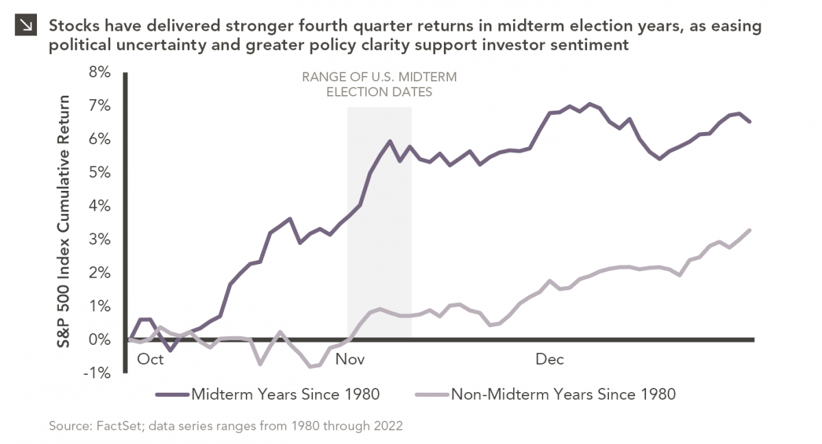
Since 1980, the S&P 500 Index has generally performed well in the weeks surrounding U.S. midterm elections. Specifically, the index…

10.12.2026
This week’s chart highlights the accelerating growth of electricity demand in the U.S., which has been driven primarily by the…

10.08.2026
LIVE WEBINAR — OCTOBER 22 Please join Marquette’s research team for our 3Q 2026 Market Insights Webinar…

10.05.2026
For investors, the spookiest thing about October might not be the ghosts and monsters that are bound to show up…

09.28.2026
The phrase “expectations of higher inflation” has become a staple in financial news to explain the increase in nominal U.S….

09.21.2026
For much of the past several years, the conventional view has been that higher interest rates and stretched valuations would…
Research alerts keep you updated on our latest research publications. Simply enter your contact information, choose the research alerts you would like to receive and click Subscribe. Alerts will be sent as research is published.
We respect your privacy. We will never share or sell your information.
If you have questions or need further information, please contact us directly and we will respond to your inquiry within 24 hours.
Contact Us >