04.27.2026
Let’s Hear It for Latin America
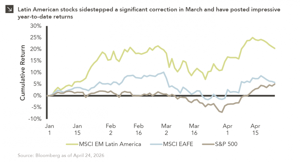
Latin American equity markets have shown remarkable strength in 2026. After a strong start to the year, the MSCI Emerging…


Driven by the rising price of oil, the unknown ultimate impact of the tax cuts, strong global economic growth and potential infrastructure spending, investors are asking whether inflation might finally rise. This week’s chart examines market-implied inflation versus actual realized inflation. The orange line shows the market-implied core personal consumption expenditures (“PCE”). The blue line shows the actual realized core PCE. PCE is based on surveys of what businesses are selling, while CPI, or consumer price index, is based on surveys of what households are buying. For this analysis, core excludes the more volatile food and energy components.
The orange line — market-implied inflation — is calculated by subtracting 50bp from the 10-year breakeven inflation rate. The 10-year breakeven inflation rate is the 10-year nominal Treasury yield minus the 10-year TIPS yield, which shows the inflation that would equilibrate the two securities. The 10-year breakeven inflation rate is then the market’s expectation for CPI based on how the market prices Treasuries and TIPS. To convert this CPI to PCE, we subtract 50bp, which is the historical average difference between CPI and PCE.
The market-implied core PCE was low in late 2015 and into 2016 because of the shale crisis, Third Avenue’s high yield hedge fund meltdown, and a general sentiment that inflation would not rise. Actual inflation was higher than market-implied during this time. In the first half of 2017, the unwinding of the “Trump trade,” the health care bill’s initial failure and North Korean missiles over Japan drove both market-implied and actual inflation lower. As the tax cut gained momentum in the second half of 2017, both market-implied and actual inflation rose in unison and have continued to rise so far in 2018. Because we are now at full employment, further inflation will have to be wage-driven, not employment-driven.
The opinions expressed herein are those of Marquette Associates, Inc. (“Marquette”), and are subject to change without notice. This material is not financial advice or an offer to purchase or sell any product. Marquette reserves the right to modify its current investment strategies and techniques based on changing market dynamics or client needs.
The opinions expressed herein are those of Marquette Associates, Inc. (“Marquette”), and are subject to change without notice. This material is not financial advice or an offer to purchase or sell any product. Marquette reserves the right to modify its current investment strategies and techniques based on changing market dynamics or client needs.

04.27.2026
Latin American equity markets have shown remarkable strength in 2026. After a strong start to the year, the MSCI Emerging…
04.23.2026
Diversify. Rebalance. Stay invested. Every one of these letters has concluded with that same advice in some shape or form….

04.20.2026
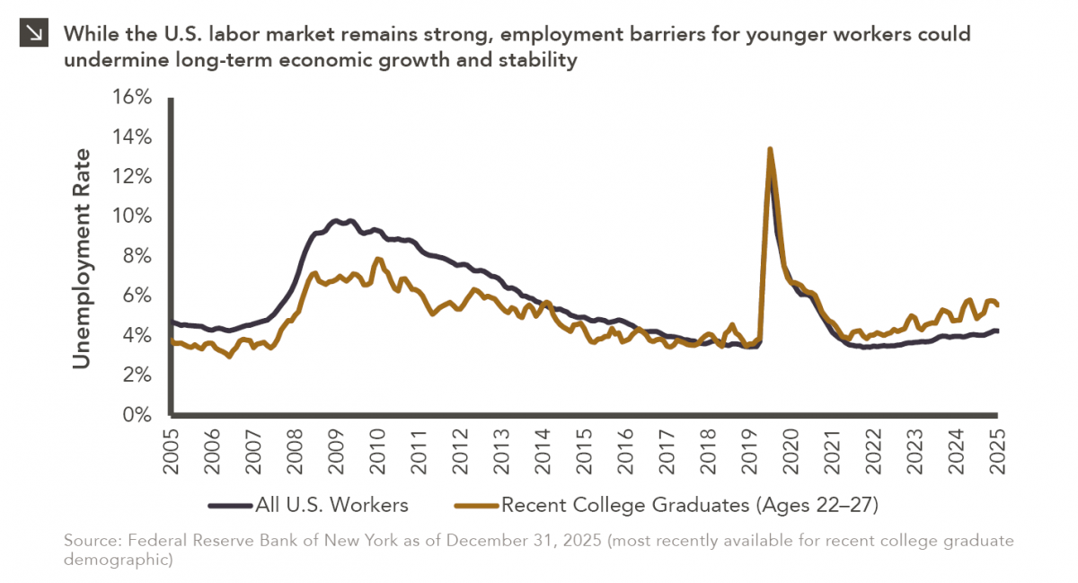
Entry-level jobs have traditionally served as the primary bridge between education and stable employment, offering young workers a foothold from…

04.13.2026
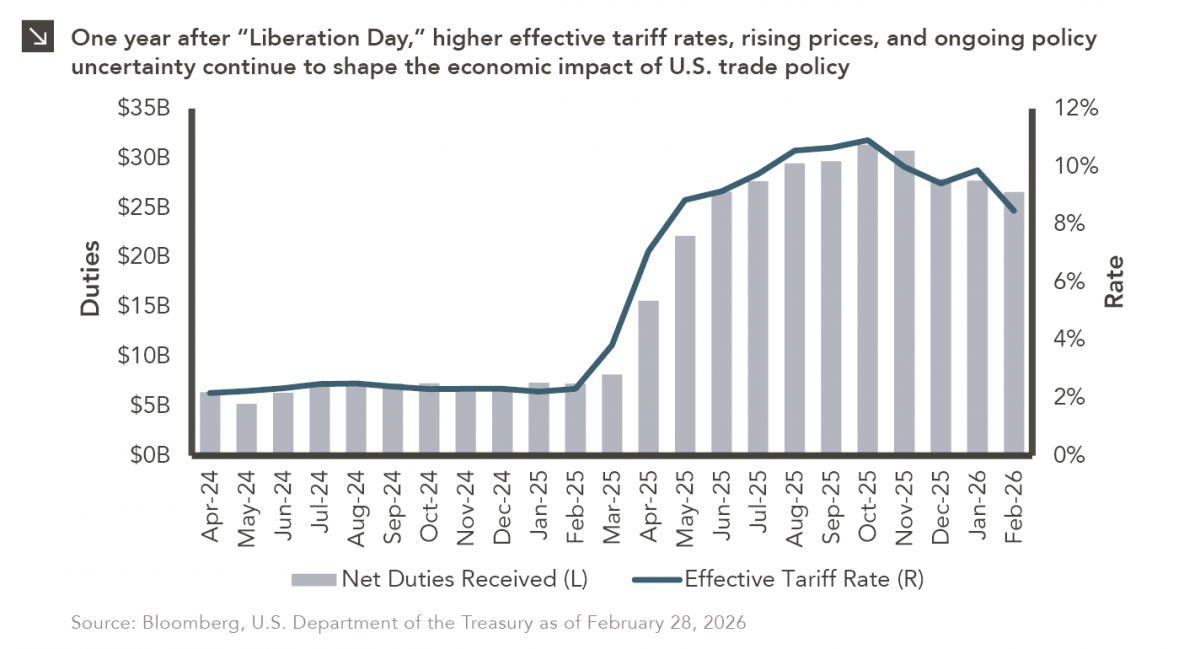
On April 2, 2025, President Donald Trump announced a sweeping set of tariffs on imports into the United States. Dubbed…
04.07.2026
On March 30, 2026, the Department of Labor (DOL) issued its proposed regulation: Fiduciary Duties in Selecting Designated Investment Alternatives….

04.06.2026
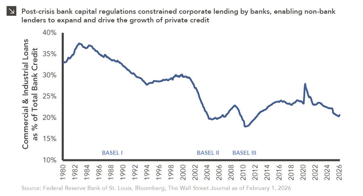
The Basel capital framework was created to ensure that banks maintain sufficient capital to absorb losses and reduce the risk…
Research alerts keep you updated on our latest research publications. Simply enter your contact information, choose the research alerts you would like to receive and click Subscribe. Alerts will be sent as research is published.
We respect your privacy. We will never share or sell your information.
If you have questions or need further information, please contact us directly and we will respond to your inquiry within 24 hours.
Contact Us >