10.22.2026
Will Higher Rates Cramp the Markets?
Anyone who has run a marathon knows the last six miles are brutal — no matter how well the first…


The Chinese yield curve inverted recently. Does this mean that the U.S. yield curve might invert soon? What does inversion mean for investors? Inverted yield curves have been precursors of bad news for the equity market. In the past 20 years, the U.S. yield curve inverted twice, once in 2000 and once in 2006 and the S&P 500 subsequently dropped 48% and 53% following each inversion, respectively. When the yield curve inverts, it usually means that the market is pessimistic about the economy and drives up long bond prices as safe havens, thereby reducing their yields relative to short bond yields, which typically have been driven up by rate hikes.
This week’s chart observes several signals that appear just before the yield curve inverts. First, there are several years of a downward trend in the spread between 10-Year and 2-Year Treasury yields (also known as steepness) and an upward trend in the equity market, as the orange and red arrows show in the chart. Since the last inversion in 2006, we have seen this signal for a while. Second, GDP growth reaches its peak. For the last five years, GDP growth has been stable and at a moderate level, and it is unclear if it has reached a peak or could grow further. Lastly, it takes time for the spread to become negative and the change is not abrupt. Before the inversion, the spread was around 30bps in 2000 and 15bps in 2006. The spread as of May 2017 was around 50bps and still has room to contract.
Overall, there are several signals that suggest that yield curve inversion is coming. However, inversion is unlikely to happen in the near future. The current yield curve is reasonably steep, the market has a positive sentiment about the economy and other economic boosts from the Trump administration may come into play, such as job creation initiatives and tax cuts for businesses and consumers. Yield curve inversion is not yet impending.
The opinions expressed herein are those of Marquette Associates, Inc. (“Marquette”), and are subject to change without notice. This material is not financial advice or an offer to purchase or sell any product. Marquette reserves the right to modify its current investment strategies and techniques based on changing market dynamics or client needs.

10.22.2026
Anyone who has run a marathon knows the last six miles are brutal — no matter how well the first…
10.19.2026
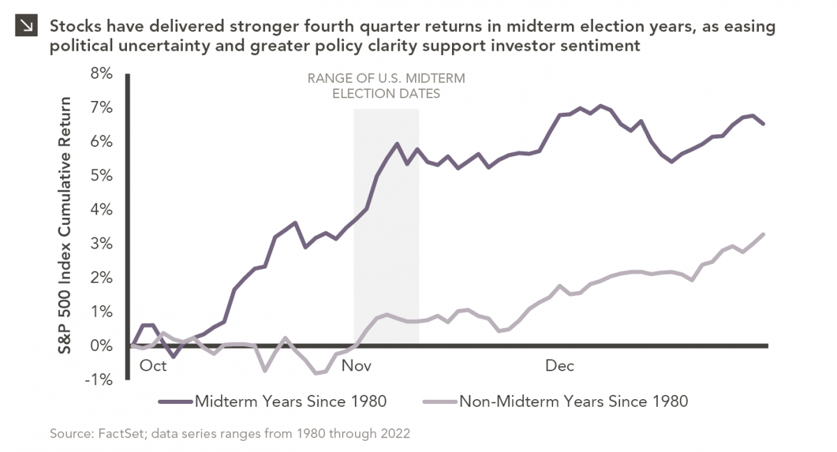
Since 1980, the S&P 500 Index has generally performed well in the weeks surrounding U.S. midterm elections. Specifically, the index…

10.12.2026
This week’s chart highlights the accelerating growth of electricity demand in the U.S., which has been driven primarily by the…

10.08.2026
LIVE WEBINAR — OCTOBER 22 Please join Marquette’s research team for our 3Q 2026 Market Insights Webinar…

10.05.2026
For investors, the spookiest thing about October might not be the ghosts and monsters that are bound to show up…

09.28.2026
The phrase “expectations of higher inflation” has become a staple in financial news to explain the increase in nominal U.S….
Research alerts keep you updated on our latest research publications. Simply enter your contact information, choose the research alerts you would like to receive and click Subscribe. Alerts will be sent as research is published.
We respect your privacy. We will never share or sell your information.
If you have questions or need further information, please contact us directly and we will respond to your inquiry within 24 hours.
Contact Us >