05.07.2026
The Fed Tackles Succession Planning
The leadership structure of the Federal Reserve is intentionally designed to promote continuity, independence, and institutional stability across political cycles….

In January, the European Central Bank (ECB) officially announced its much talked about Quantitative Easing (QE) program, which will purchase a total of about €1.1 trillion (€60 billion per month) of bonds through September 2016. As was the reasoning behind QE here in the U.S., the hope in Europe is that QE will lower borrowing costs, which in turn will spur economic growth and inflation. When the rumor mill started buzzing in November about a possible QE program, forward-looking investors began snapping up bonds, but what they didn’t count on was the large range of maturities the ECB would be purchasing.
On March 5th, Mario Draghi, President of the ECB, announced the details of the QE program and surprised markets by stating that purchases would include issues with maturities as far out as 30 years, causing a compression in yields (actual purchases by the ECB and various national banks began on March 9th). As the chart demonstrates, the largest yield compression has occurred in German bonds, where yields on 30-year maturities were 0.633% on Wednesday morning, down from 0.946% on March 5th. The spread between 2 and 30-year German bonds is currently 87 basis points. Yields for some of the riskiest longer-dated European debt (demonstrated here by Spanish and Italian bonds) have also seen compressions, though the spread between 2 and 30-year yields remains around 2%.
What does this mean for investors and the ECB bond buying program? Given the inverse relationship between bond yields and prices, the notable drop in yields has benefitted investors. However, reinvestment risk is a significant concern for investors should they sell their current holdings, as they would then have to purchase newer bonds that feature lower yields and coupons. Unless immediate cash is needed, bond investors will be loath to give up their higher yielding bonds in exchange for lower yields. Some wiggle room will be available as the front runners of QE look to cash in their profits, but others may hold out for a time since the ECB is a large, price indifferent buyer. Eventually, supply will normalize, possibly through a combination of profit taking and the ECB “nudging” those stubborn bondholders to sell.
The opinions expressed herein are those of Marquette Associates, Inc. (“Marquette”), and are subject to change without notice. This material is not financial advice or an offer to purchase or sell any product. Marquette reserves the right to modify its current investment strategies and techniques based on changing market dynamics or client needs.
05.07.2026
The leadership structure of the Federal Reserve is intentionally designed to promote continuity, independence, and institutional stability across political cycles….

05.04.2026
Rooted in medieval Persian Sufi thought, the adage “this too shall pass” speaks to the fleeting and impermanent nature of…

04.27.2026
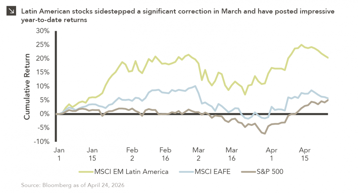
Latin American equity markets have shown remarkable strength in 2026. After a strong start to the year, the MSCI Emerging…
04.23.2026
Diversify. Rebalance. Stay invested. Every one of these letters has concluded with that same advice in some shape or form….

04.20.2026
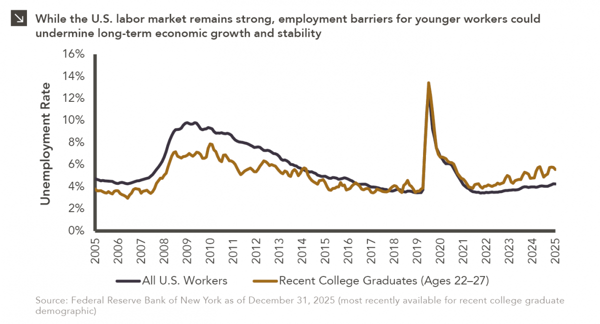
Entry-level jobs have traditionally served as the primary bridge between education and stable employment, offering young workers a foothold from…

04.13.2026
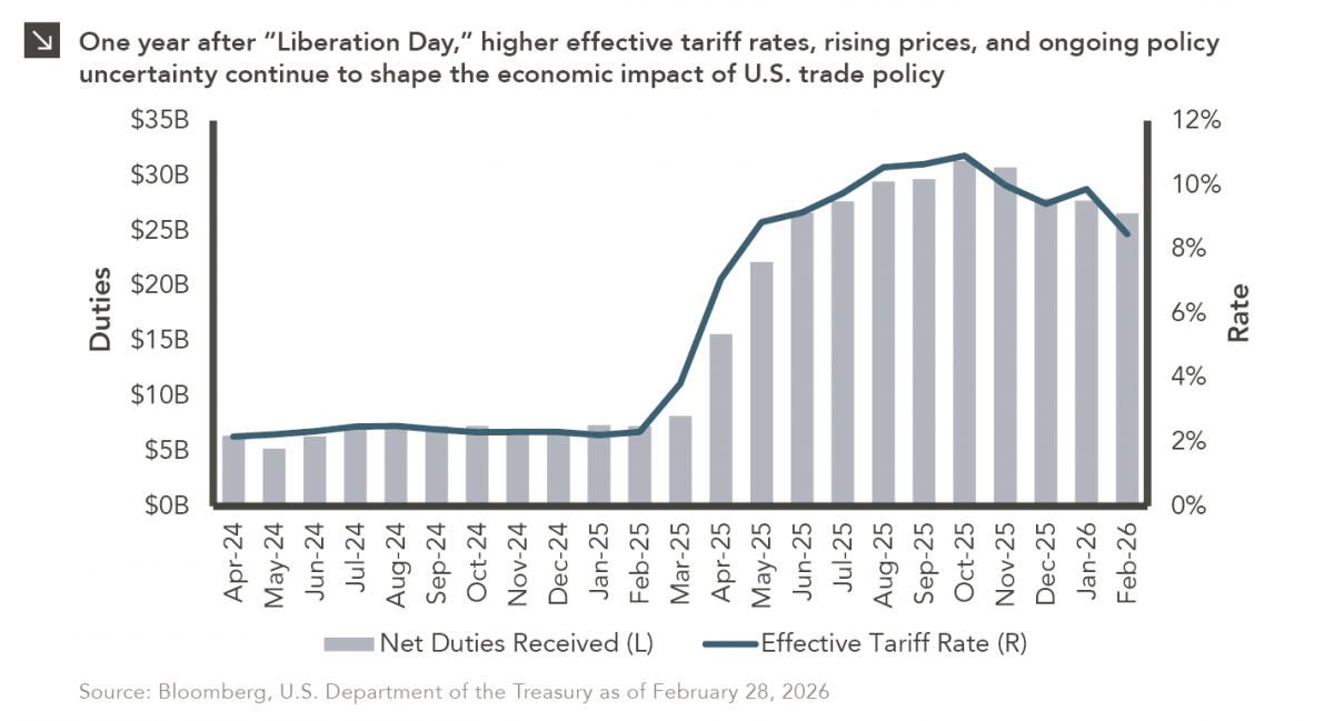
On April 2, 2025, President Donald Trump announced a sweeping set of tariffs on imports into the United States. Dubbed…
Research alerts keep you updated on our latest research publications. Simply enter your contact information, choose the research alerts you would like to receive and click Subscribe. Alerts will be sent as research is published.
We respect your privacy. We will never share or sell your information.
If you have questions or need further information, please contact us directly and we will respond to your inquiry within 24 hours.
Contact Us >