06.22.2026
The VC Convergence Era
When Benchmark, one of Silicon Valley’s most renowned early-stage venture capital firms, closed $2 billion across two new funds this…
Since March 2009, the S&P 500 has returned 130% through September. Unemployment rates in the United States have improved as well, though more sluggishly. With the unemployment rate in the headlines, it may be insightful to look under the hood and see how the numbers have changed on a more detailed level. Today’s chart of the week looks at the improvement in unemployment rates on a state by state basis since March of 2009. Changes are normalized by the unemployment rate ending in 2006 to show comparisons across states on a similar basis. The largest decreases in unemployment, or the “best” improvements, are shown in dark green. Mathematically, a state that falls into the dark green category of “less than -20%” means that unemployment since March of 2009 has fallen by at least 20% of the pre-crisis level in 2006. For example, unemployment in Alabama was 9.2% in March of 2009, and is 8.5% as of the most recent reading. This decline of 0.7% is about 20% of Alabama’s 2006 unemployment rate of 3.4%.
Looking at some of the individual states, a few stand out for assorted reasons. Utah, with one of the lowest unemployment rates in the country both pre- and post-crisis, has shown the greatest improvement since 2009 relative to pre-crisis levels. Michigan and Ohio, large rust belt states with some of the nation’s highest unemployment rates leading into the crisis, have also seen large improvements. Michigan currently has one of the higher unemployment rates in the country at 9.4%, but this is down from 12.6% in early 2009.
Housing bubble states Florida and Nevada both saw some of the largest increases in unemployment due to the crisis, with unemployment rates spiking north of 6% in both states. Since then however, Florida’s unemployment rate has experienced a strong improvement, while Nevada’s has continued to deteriorate. Nevada now has the worst unemployment rate in the nation at 12.1%, compared to 8.8% for Florida. States with a large amount of financial sector employees such as Connecticut, New York, and New Jersey are also among the states that have seen the largest declines in employment since 2009.
Other states of note include North Dakota, which with an unemployment rate of 3% is the only state with unemployment below 2006 levels, and Texas, which is in the same category as California on this chart but arrived there in a much different way. Though California had a large increase in unemployment during the crisis (5.6%) and relatively little improvement since then, Texas suffered a more modest deterioration in unemployment (2.3%) with a similarly weak rebound. On an absolute basis, California’s unemployment rate of 10.6% is one of the nation’s worst, while Texas’ rate of 7.1% is below the national average.
The opinions expressed herein are those of Marquette Associates, Inc. (“Marquette”), and are subject to change without notice. This material is not financial advice or an offer to purchase or sell any product. Marquette reserves the right to modify its current investment strategies and techniques based on changing market dynamics or client needs.

06.22.2026
When Benchmark, one of Silicon Valley’s most renowned early-stage venture capital firms, closed $2 billion across two new funds this…

06.15.2026
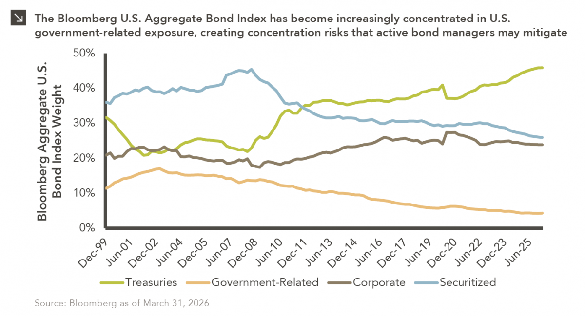
The rapid buildout of artificial intelligence infrastructure is reshaping the U.S. investment landscape. According to recent Census Bureau data, spending…
06.08.2026
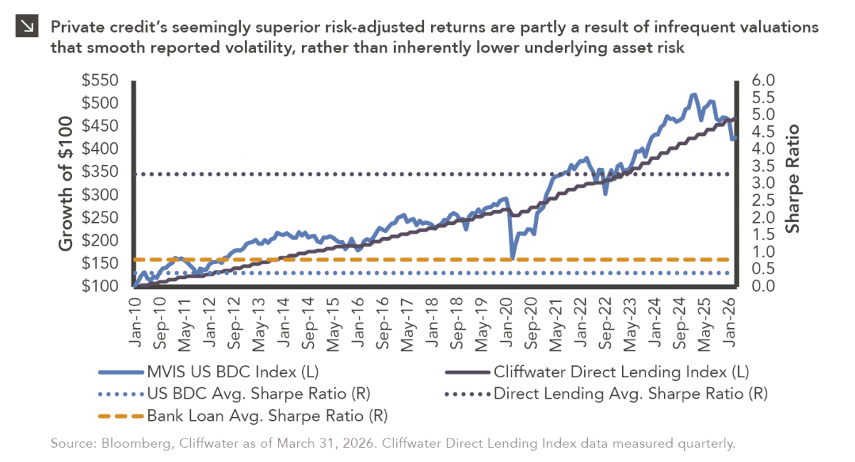
Hi, James Torgerson here! Volatility can be an unsightly blemish on portfolios and lead to inferior risk-adjusted returns. Private credit…
06.01.2026
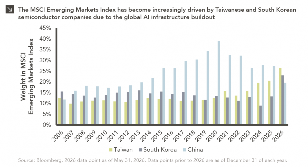
The MSCI Emerging Markets Index has undergone a significant structural transformation in recent years. For much of the past decade,…
05.26.2026
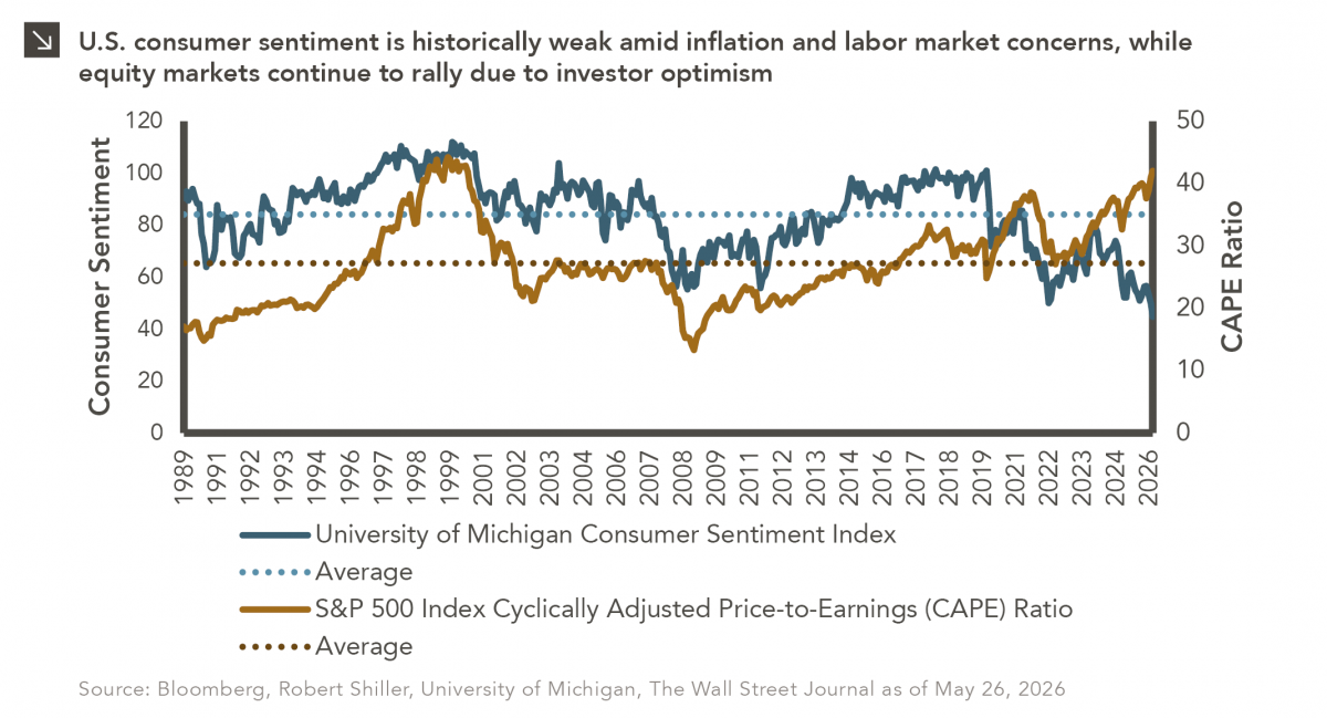
The classic novel A Tale of Two Cities by Charles Dickens begins with the line “It was the best of…
05.18.2026
Over the last few years, equity markets have been defined by a group of stocks often referred to as the…
Research alerts keep you updated on our latest research publications. Simply enter your contact information, choose the research alerts you would like to receive and click Subscribe. Alerts will be sent as research is published.
We respect your privacy. We will never share or sell your information.
If you have questions or need further information, please contact us directly and we will respond to your inquiry within 24 hours.
Contact Us >