10.08.2026
3Q 2026 Market Insights
This video is a recording of a live webinar held October 22 by Marquette’s research team analyzing the third quarter…


This week’s Chart of the Week shows the divergence in Monetary Policy from the ECB, Bank of Japan, and Federal Reserve. The Federal Reserve discontinued its quantitative easing (“QE”) strategy on October 29th, 2014; in contrast, after the end of 3Q14, the Bank of Japan and European Central Bank have increased asset holdings by 30% and 26%, respectively.
During the same time period, the Euro and Yen have depreciated by over 10%, now trading at approximately 85% of their 10-year averages. The Bank of Japan and European Central Bank will continue large asset purchases for the foreseeable future in an effort to reduce borrowing costs and stimulate growth.
In the short term, foreign multinational corporations should utilize suppressed borrowing costs and weaker currencies as tailwinds for exports. This is best explained by third-party consumers’ attraction to the Eurozone and Japan’s relative prices of goods. QE’s goal to stimulate economic growth has had positive externalities on each bank’s respective currency; over the long run, the currency effect should be normalized as foreign direct investment is attracted to higher revenues and profits, yielding currency demand.
The Eurozone growth estimate of 0.3% advocates further action will be taken by the ECB through QE. Increased stimulus levels will force the Euro towards parity with the dollar for the first time in over a decade. Until there are better signs of growth from Eurozone nations, the ECB will be forced to use monetary stimulus and currency demand will continue to decline.
The opinions expressed herein are those of Marquette Associates, Inc. (“Marquette”), and are subject to change without notice. This material is not financial advice or an offer to purchase or sell any product. Marquette reserves the right to modify its current investment strategies and techniques based on changing market dynamics or client needs.

10.08.2026
This video is a recording of a live webinar held October 22 by Marquette’s research team analyzing the third quarter…

10.22.2026
Anyone who has run a marathon knows the last six miles are brutal — no matter how well the first…
10.19.2026
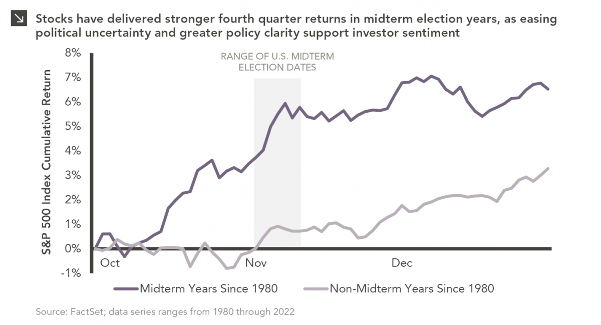
Since 1980, the S&P 500 Index has generally performed well in the weeks surrounding U.S. midterm elections. Specifically, the index…
10.12.2026
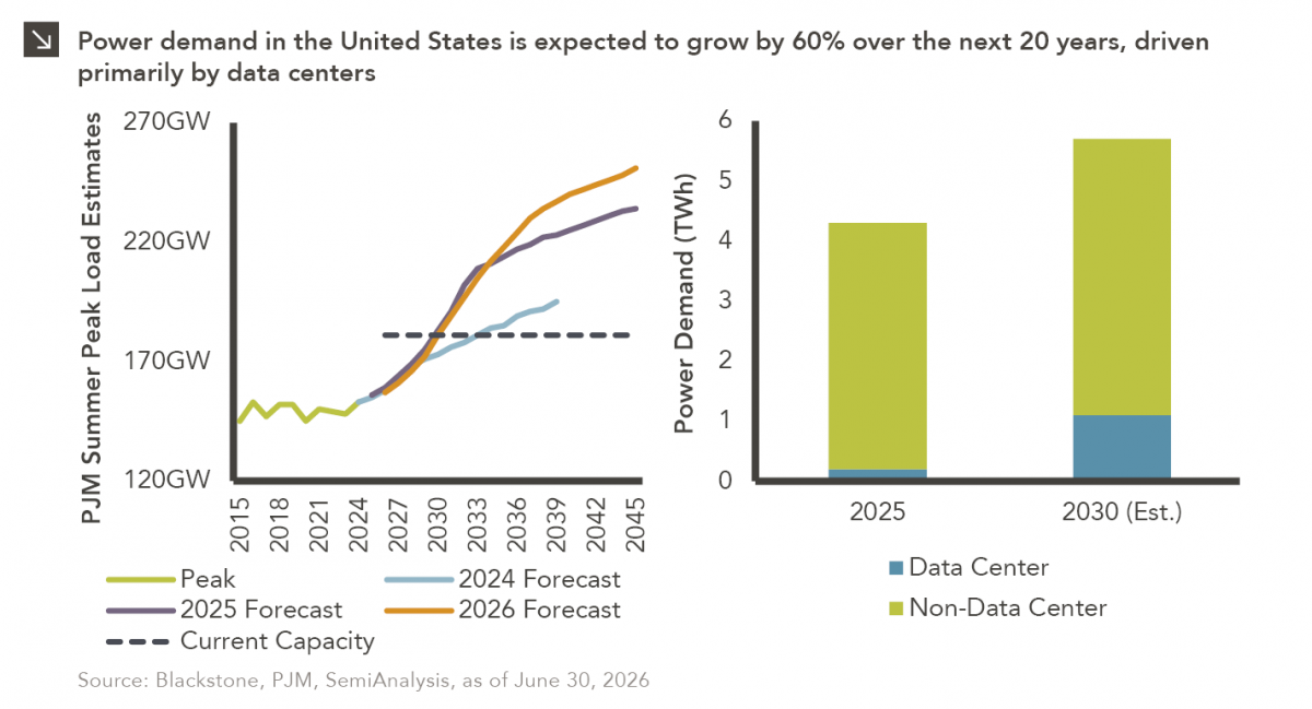
This week’s chart highlights the accelerating growth of electricity demand in the U.S., which has been driven primarily by the…
10.05.2026
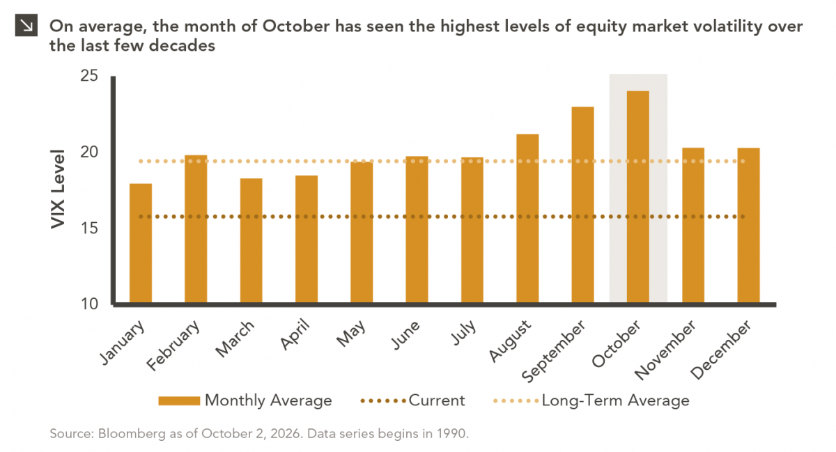
For investors, the spookiest thing about October might not be the ghosts and monsters that are bound to show up…
09.28.2026
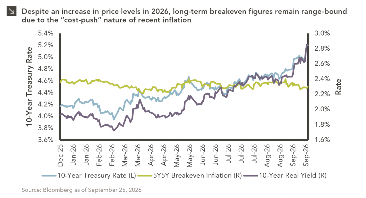
The phrase “expectations of higher inflation” has become a staple in financial news to explain the increase in nominal U.S….
Research alerts keep you updated on our latest research publications. Simply enter your contact information, choose the research alerts you would like to receive and click Subscribe. Alerts will be sent as research is published.
We respect your privacy. We will never share or sell your information.
If you have questions or need further information, please contact us directly and we will respond to your inquiry within 24 hours.
Contact Us >