Ryan Maher
Associate Client Analyst
Get to Know Ryan


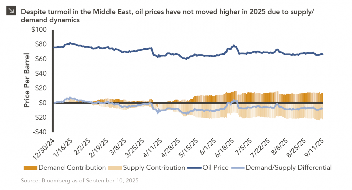
Earlier this year, Marquette published a Chart of the Week that detailed the muted change in oil prices in the aftermath of U.S. strikes on Iranian nuclear facilities. Tensions in the region have persisted in recent time, with last week seeing Israeli airstrikes that targeted Hamas leadership in Qatar. In response to this development, oil ticked higher as investors assessed the increased risk of commodity supply chain disruptions but later gave back most of these gains. This represents a continuation of the trend exhibited during most of 2025, in which geopolitical shocks do not materially increase the price of oil. One possible explanation for this dynamic would be persistently elevated supply of the commodity.
As displayed in the chart above, there has been a sustained imbalance between oil supply and demand for most of the last six months, with supply outpacing demand. Indeed, OPEC+, which includes the Organization of Petroleum Exporting Countries, Russia, and other allied producers, has moved to aggressively raise output in 2025, which has resulted in a production capacity increase of over two million barrels per day since April. Despite this already increasing supply, OPEC+ recently made an agreement to add an additional 137,000 barrels per day to its production capacity in October. These increases in capacity have significantly outpaced global demand, driving prices lower and widening the oil supply glut. Going forward, while geopolitical instability may support temporary price increases, the longer-term outlook for oil remains clouded by excess supply and uncertainty surrounding future consumption of the commodity.
Print PDF
The opinions expressed herein are those of Marquette Associates, Inc. (“Marquette”), and are subject to change without notice. This material is not financial advice or an offer to purchase or sell any product. Marquette reserves the right to modify its current investment strategies and techniques based on changing market dynamics or client needs.

10.12.2026
This week’s chart highlights the accelerating growth of electricity demand in the U.S., which has been driven primarily by the…

10.08.2026
LIVE WEBINAR — OCTOBER 22 Please join Marquette’s research team for our 3Q 2026 Market Insights Webinar…

10.05.2026
For investors, the spookiest thing about October might not be the ghosts and monsters that are bound to show up…

09.28.2026
The phrase “expectations of higher inflation” has become a staple in financial news to explain the increase in nominal U.S….

09.21.2026
For much of the past several years, the conventional view has been that higher interest rates and stretched valuations would…

09.14.2026
There are many great things about working at Marquette Associates, but “Free Lunch Tuesday” is right at the top of…
Research alerts keep you updated on our latest research publications. Simply enter your contact information, choose the research alerts you would like to receive and click Subscribe. Alerts will be sent as research is published.
We respect your privacy. We will never share or sell your information.
If you have questions or need further information, please contact us directly and we will respond to your inquiry within 24 hours.
Contact Us >